- CLASSIC MAGAZINES
- REVIEW CREW
A show recapping what critics thought back
when classic games first came out! - NEXT GENERATION'S BEST & WORST
From the worst 1-star reviews to the best
5-stars can offer, this is Next Generation! - NINTENDO POWER (ARCHIVE)
Experience a variety of shows looking at the
often baffling history of Nintendo Power! - MAGAZINE RETROSPECTIVE
We're looking at the absolutely true history of
some of the most iconic game magazines ever! - SUPER PLAY'S TOP 600
The longest and most ambitious Super NES
countdown on the internet! - THEY SAID WHAT?
Debunking predictions and gossip found
in classic video game magazines! - NEXT GENERATION UNCOVERED
Cyril is back in this spin-off series, featuring the
cover critic review the art of Next Generation! - HARDCORE GAMER MAGAZING (PDF ISSUES)
Download all 36 issues of Hardcore Gamer
Magazine and relive the fun in PDF form!
- REVIEW CREW
- ELECTRONIC GAMING MONTHLY
- ELECTRONIC GAMING MONTHLY RANKS
From Mario to Sonic to Street Fighter, EGM
ranks classic game franchises and consoles! - ELECTRONIC GAMING MONTHLY BEST & WORST
Counting down EGM’s best and worst reviews
going year by year, from 1989 – 2009! - ELECTRONIC GAMING BEST & WORST AWARDS
11-part video series chronicling the ups and
downs of EGM’s Best & Worst Awards!
- ELECTRONIC GAMING MONTHLY RANKS
- GAME HISTORY
- GAME OVER: STORY BREAKDOWNS
Long-running series breaking down game
stories and analyzing their endings! - A BRIEF HISTORY OF GAMING w/ [NAME HERE]
Real history presented in a fun and pithy
format from a variety of game historians! - THE BLACK SHEEP
A series looking back at the black sheep
entries in popular game franchises! - INSTANT EXPERT
Everything you could possibly want to know
about a wide variety of gaming topics! - FREEZE FRAME
When something familiar happens in the games
industry, we're there to take a picture! - I'VE GOT YOUR NUMBER
Learn real video game history through a series
of number-themed episodes, starting at zero! - GREAT MOMENTS IN BAD ACTING
A joyous celebration of some of gaming's
absolute worst voice acting!
- GAME OVER: STORY BREAKDOWNS
- POPULAR SHOWS
- DG NEWS w/ LORNE RISELEY
Newsman Lorne Riseley hosts a regular
series looking at the hottest gaming news! - REVIEW REWIND
Cyril replays a game he reviewed 10+ years
ago to see if he got it right or wrong! - ON-RUNNING FEUDS
Defunct Games' longest-running show, with
editorials, observations and other fun oddities! - DEFUNCT GAMES QUIZ (ARCHIVE)
From online quizzes to game shows, we're
putting your video game knowledge to the test!- QUIZ: ONLINE PASS
Take a weekly quiz to see how well you know
the news and current gaming events! - QUIZ: KNOW THE GAME
One-on-one quiz show where contestants
find out if they actually know classic games! - QUIZ: THE LEADERBOARD
Can you guess the game based on the classic
review? Find out with The Leaderboard!
- QUIZ: ONLINE PASS
- DEFUNCT GAMES VS.
Cyril and the Defunct Games staff isn't afraid
to choose their favorite games and more! - CYRIL READS WORLDS OF POWER
Defunct Games recreates classic game
novelizations through the audio book format!
- DG NEWS w/ LORNE RISELEY
- COMEDY
- GAME EXPECTANCY
How long will your favorite hero live? We crunch
the numbers in this series about dying! - VIDEO GAME ADVICE
Famous game characters answer real personal
advice questions with a humorous slant! - FAKE GAMES: GUERILLA SCRAPBOOK
A long-running series about fake games and
the people who love them (covers included)! - WORST GAME EVER
A contest that attempts to create the worst
video game ever made, complete with covers! - LEVEL 1 STORIES
Literature based on the first stages of some
of your favorite classic video games! - THE COVER CRITIC
One of Defunct Games' earliest shows, Cover
Critic digs up some of the worst box art ever! - COMMERCIAL BREAK
Take a trip through some of the best and
worst video game advertisements of all time! - COMIC BOOK MODS
You've never seen comics like this before.
A curious mix of rewritten video game comics!
- GAME EXPECTANCY
- SERIES ARCHIVE
- NINTENDO SWITCH ONLINE ARCHIVE
A regularly-updated list of every Nintendo
Switch Online release, plus links to review! - PLAYSTATION PLUS CLASSIC ARCHIVE
A comprehensive list of every PlayStation
Plus classic release, including links! - RETRO-BIT PUBLISHING ARCHIVE
A regularly-updated list of every Retro-Bit
game released! - REVIEW MARATHONS w/ ADAM WALLACE
Join critic Adam Wallace as he takes us on a
classic review marathon with different themes!- DEFUNCT GAMES GOLF CLUB
Adam Wallace takes to the links to slice his way
through 72 classic golf game reviews! - 007 IN PIXELS
Adam Wallace takes on the world's greatest spy
as he reviews 15 weeks of James Bond games! - A SALUTE TO VAMPIRES
Adam Wallace is sinking his teeth into a series
covering Castlevania, BloodRayne and more! - CAPCOM'S CURSE
Adam Wallace is celebrating 13 days of Halloween
with a line-up of Capcom's scariest games! - THE FALL OF SUPERMAN
Adam Wallace is a man of steel for playing
some of the absolute worst Superman games! - THE 31 GAMES OF HALLOWEEN
Adam Wallace spends every day of October afraid
as he reviews some of the scariest games ever! - 12 WEEKS OF STAR TREK
Adam Wallace boldly goes where no critic has
gone before in this Star Trek marathon!
- DEFUNCT GAMES GOLF CLUB
- DAYS OF CHRISTMAS (ARCHIVE)
Annual holiday series with themed-episodes
that date all the way back to 2001!- 2015: 30 Ridiculous Retro Rumors
- 2014: 29 Magazines of Christmas
- 2013: 29 Questionable Power-Ups of Christmas
- 2012: 34 Theme Songs of Christmas
- 2011: 32 Game Endings of Christmas
- 2010: 31 Bonus Levels of Christmas
- 2009: 30 Genres of Christmas
- 2008: 29 Controls of Christmas
- 2007: 34 Cliches of Christmas
- 2006: 33 Consoles of Christmas
- 2005: 32 Articles of Christmas
- 2004: 31 Websites of Christmas
- 2003: 29 Issues of Christmas
- 2002: 28 Years of Christmas
- 2001: 33 Days of Christmas
- NINTENDO SWITCH ONLINE ARCHIVE
- REVIEW ARCHIVE
- FULL ARCHIVE
DOOM: The Best & Worst Magazine Covers
This week brings action fans Doom: The Dark Ages, the newest first-person shooter in a series that dates all the way back to 1993. In that time, we've seen good, bad and absolutely wild magazine covers featuring the long-running franchise on publications like Electronic Gaming Monthly, Hyper and Game Informer. These are just a few of the magazines we're going to be looking at today when we rank the Best & Worst Doom Magazine Covers!
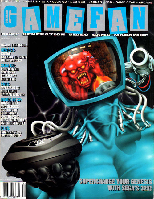





Die Hard Game Fan (December 1994)When I think Doom, this Die Hard Game Fan cover from 1994 is the very first thing that pops into my mind. Sure, it's promoting the Sega 32X version, but it's also one of the very few times where the Monitaur's head is being used as a television screen. On one hand, I really like that the artist had to recreate an iconic moment in the video game. This is also the closest we've ever been to the Monitaur's blue body, giving us a detailed view of his weirdly veiny neck and all of the wiring that goes into his head. I'm not going to lie, the more I look at his neck, the more grossed out I am by the Monitaur. And it's borderline irresponsible to suggest that the 32X cam play Doom without a cartridge or a Genesis. On the other hand, it certainly is memorable and I've seen how bad some of the other magazine covers are, I'm going to give it a 4 out of 5.

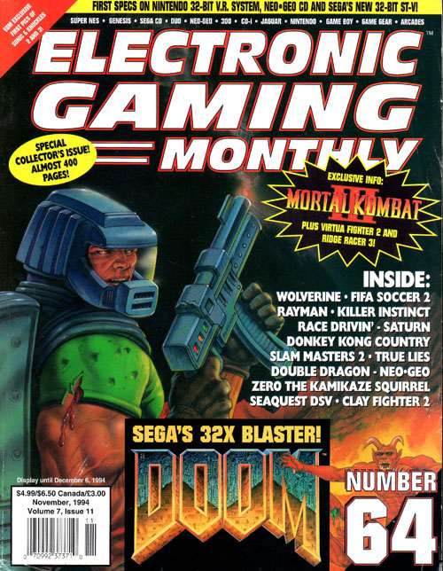
Electronic Gaming Monthly #64One thing that I always liked about Doom's original box art is that, despite having big muscles and dual-wielding a pair of guns, the Doom Guy looks like he's just seconds away from being overwhelmed by the horde of Hellish demons. You don't get that sensation when looking at this Electronic Gaming Monthly cover. With a smoking gun and a glance back at the viewer, it's clear that the Doom Guy has already laid waste of his foes. The action is in the past-tense, which robs this cover of some of its urgency and excitement. EGM does try to make up for this by adding a small demon at the lower-right side of the issue, but it's so disconnected from the action that it might as well be on a different magazine. I don't like this. 2 out of 5.

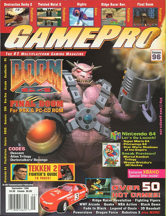
GamePro (September 1996)The first thing you'll likely notice about this cover is just how cluttered it is. As your eyes dart from Super Mario 64 to Ride Racer to Tekken 2, you may not even notice that there's a Doom 64 boss hiding behind all the clutter. I suppose that this may have been impressive back in 1996, when computer graphics were still relatively new. But these days, I can't help but judge how outdated it looks. It makes a strong case for traditional hand-drawn artwork, something that never goes out of style. This is GamePro basically putting a fat naked guy on the cover, and nobody wants to see that. Thankfully, the clutter covers up his bits and bobs, but that's not going to save this design from getting a 1 out of 5.

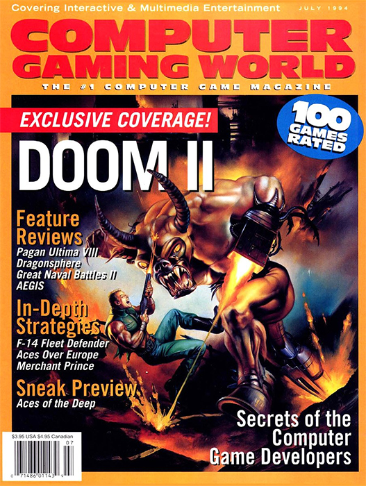
Computer Gaming World #120Now this is more like it. While I'm sure Doom purists will take issue with the redesigned protagonist and the lack of his iconic space suit, you have to admit that this Computer Gaming World cover sure is exciting. I really like the scale between our hero and the horned demon he's fighting. And that background only hints at the nastiness waiting for him after he gets done with this fight. It perfectly captures the spirit of those first couple Doom games, and I like that they didn't just reuse the artwork from the box. This is a great cover. 5 out of 5.

Hyper #12Although I set out to only include one cover from each publication, I wanted to make an exception for two different magazines – Hyper and Total. Both of these magazines fall into the same trap of having one great cover, followed soon after by a terrible cover. In the case of Hyper, I would say that this is easily the better of the two. This is one of the few magazine covers to show the action from the first-person perspective, just like in the game, and having those fangs and claws lunging at you is enough to scare just about anybody, even if you're holding a chainsaw. The more I study the artwork the less I like it, but I can't ignore how eye-catching it is. There's a real urgency to the cover that you don't get from a lot of these magazines, and for that reason alone, I'm going with a 4 out of 5.

Hyper #47What a difference a couple years makes. Everything that I liked about the previous cover is completely absent here. Much like GamePro's terrible design, this is yet another magazine where the hero has been completely removed. There's not even a hint of a chainsaw. From his horse face to the way his horns are pointed, there's so much about this enemy design that annoys me. And that's before I notice the wiring happening between his legs and groin. And why is he firing off to the side but looking straight forward? Who does that? It was also presumptuous to assume that Doom 64 would be the “final” Doom. Not even close. 2 out of 5, and not just for that terrible prediction.

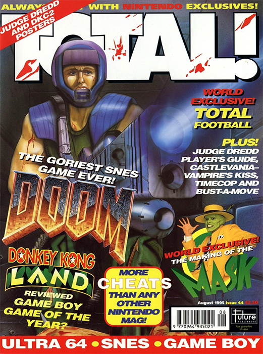
Total! #44The other magazine that doubled up on Doom is Total, which slapped the game on the covers of both issues 44 and 46. Of the two, this earlier issue is definitely the weaker design. Instead of showing the action from a first-person perspective, this cover goes in the complete opposite direction, showing the action from the enemy's point of view. As a result, we have a big effin' gun pointed in our direction, ready to take us out in a single shot. But if that wasn't scary enough, just look at that Doom Guy's face. He looks scared. Terrified, even. It won't take more than a gust of wind or a cat running by for him to unleash all hell on whatever is in front of him. So, I'm just going to stand over here, on his side, giving this cover a very middle-of-the-road 3 out of 5.

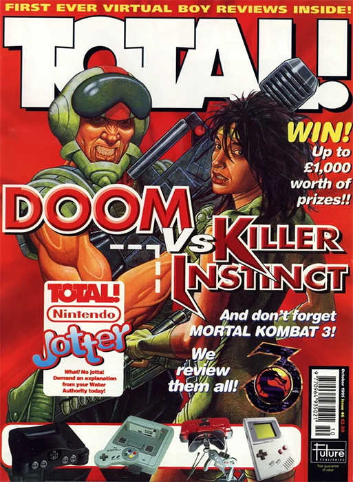
Total! #46Look, I'm not here to defend this second Total issue as one of the greatest cover designs of all time, but at least the Doom Guy doesn't look petrified. Here he's posing with what looks like a very strung-out version of Black Orchid from Killer Instinct. Don't get me wrong, I'm not here to judge, but that girl is in desperate need of a good night's sleep. Doom Guy, on the other hand, doesn't look tired, but rather jacked up on adrenaline and steroids. I don't know if I like the look in his eyes. This is not what healthy looks like. And yet, I can't look away. These two look like they've been through something, which makes me want to root for them. And for that reason, I'm going to give it a 4 out of 5.

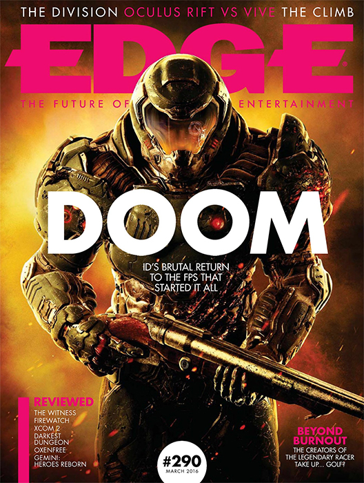
Edge #290If we fast-forward a couple decades, we'll find a lot of magazines celebrating the return of Doom in 2016. While this Edge cover is unquestionably better looking than the drug-riddled design we just looked at, it's also somehow a lot more boring. Sure, it looks fantastic. They've given the Doom Guy a complete redesign, and it's definitely shiny. Personally, I could take or leave it, but there's no question that it would have caught my eye on the newsstand. But there isn't much to it when you get past the character's glow-up. For some, that may be more than enough to rate it higher, but I'm going with a 3 out of 5.

Game Informer #274Now this is more like it. This is another great cover that uses the game's first-person perspective to show us something cool. And while it's a world apart from the artwork found on the original game's box art, it still captures the same hopeless feeling. You may have a massive gun, but what good is that going to do if you're going up against a giant with an even bigger arm cannon. And even if you do manage to kill that hellish beast, there are five more ferocious enemies waiting to pounce on our hero. And that's just on the cover. If you look at the back of the issue, you'll find that things are even more dire for the Doom Guy. It could probably use a little more color, but this is a great cover. 5 out of 5.

Official Xbox Magazine #39Before we finalize the scores, I first want to check in with this Official Xbox Magazine cover, which may actually be the worst design we've seen yet. I'll freely admit that it may just be me, but I'm not a fan of these covers that highlight the Doom villains without showing our hero in some capacity. It doesn't help that this ugly woodsman is hard to look at, and not just because of the outdated computer graphics. This cover is dark and uneventful. And you can even tell that all this is before anything exciting happened, because the chainsaw is spotless. Not a drop of blood on that thing. Even as a big Doom fan, this bland cover would not have made me drop everything to buy Doom 3. 1 out of 5.

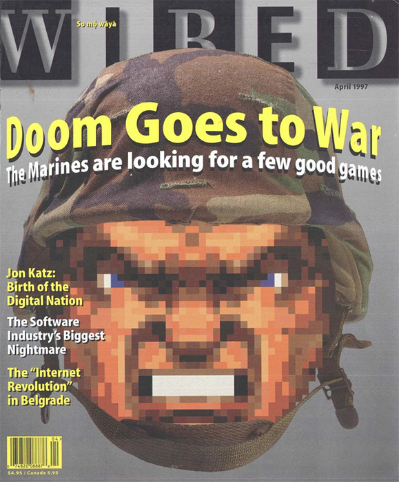
Wired (April 1997)The final magazine cover I want to look at comes from an outlet you might not expect – Wired. This is the one and only Doom cover that isn't promoting game coverage, but rather is highlighting how the military is both recruiting and training soldiers with games. This was all the way back in 1997, before the armed forces really took the mask off and started doing this in the open. That makes for a rather prescient article, as well as one of my absolute favorite magazine covers. There's a simplicity to this design that I really like. They used the head of the Doom Guy and fit him in real life military headgear. It works, giving us a visual that perfectly matches the tone of the article. It's the kind of cover I expect from Wired, and an approach none of the other magazines would have considered. This is a personal favorite. 5 out of 5.
HOME |
CONTACT |
NOW HIRING |
WHAT IS DEFUNCT GAMES? |
NINTENDO SWITCH ONLINE |
RETRO-BIT PUBLISHING
Retro-Bit |
Switch Planet |
The Halcyon Show |
Same Name, Different Game |
Dragnix |
Press the Buttons
Game Zone Online | Hardcore Gamer | The Dreamcast Junkyard | Video Game Blogger
Dr Strife | Games For Lunch | Mondo Cool Cast | Boxed Pixels | Sega CD Universe | Gaming Trend
Game Zone Online | Hardcore Gamer | The Dreamcast Junkyard | Video Game Blogger
Dr Strife | Games For Lunch | Mondo Cool Cast | Boxed Pixels | Sega CD Universe | Gaming Trend
Copyright © 2001-2025 Defunct Games
All rights reserved. All trademarks are properties of their respective owners.
All rights reserved. All trademarks are properties of their respective owners.


