
- CLASSIC MAGAZINES
- REVIEW CREW
A show recapping what critics thought back
when classic games first came out! - NEXT GENERATION'S BEST & WORST
From the worst 1-star reviews to the best
5-stars can offer, this is Next Generation! - NINTENDO POWER (ARCHIVE)
Experience a variety of shows looking at the
often baffling history of Nintendo Power! - MAGAZINE RETROSPECTIVE
We're looking at the absolutely true history of
some of the most iconic game magazines ever! - SUPER PLAY'S TOP 600
The longest and most ambitious Super NES
countdown on the internet! - THEY SAID WHAT?
Debunking predictions and gossip found
in classic video game magazines! - NEXT GENERATION UNCOVERED
Cyril is back in this spin-off series, featuring the
cover critic review the art of Next Generation! - HARDCORE GAMER MAGAZING (PDF ISSUES)
Download all 36 issues of Hardcore Gamer
Magazine and relive the fun in PDF form!
- REVIEW CREW
- REVIEW ARCHIVE
- ELECTRONIC GAMING MONTHLY
- ELECTRONIC GAMING MONTHLY RANKS
From Mario to Sonic to Street Fighter, EGM
ranks classic game franchises and consoles! - ELECTRONIC GAMING MONTHLY BEST & WORST
Counting down EGM’s best and worst reviews
going year by year, from 1989 – 2009! - ELECTRONIC GAMING BEST & WORST AWARDS
11-part video series chronicling the ups and
downs of EGM’s Best & Worst Awards!
- ELECTRONIC GAMING MONTHLY RANKS
- GAME HISTORY
- GAME OVER: STORY BREAKDOWNS
Long-running series breaking down game
stories and analyzing their endings! - A BRIEF HISTORY OF GAMING w/ [NAME HERE]
Real history presented in a fun and pithy
format from a variety of game historians! - THE BLACK SHEEP
A series looking back at the black sheep
entries in popular game franchises! - INSTANT EXPERT
Everything you could possibly want to know
about a wide variety of gaming topics! - FREEZE FRAME
When something familiar happens in the games
industry, we're there to take a picture! - I'VE GOT YOUR NUMBER
Learn real video game history through a series
of number-themed episodes, starting at zero! - GREAT MOMENTS IN BAD ACTING
A joyous celebration of some of gaming's
absolute worst voice acting!
- GAME OVER: STORY BREAKDOWNS
- POPULAR SERIES
- DG NEWS w/ LORNE RISELEY
Newsman Lorne Riseley hosts a regular
series looking at the hottest gaming news! - REVIEW REWIND
Cyril replays a game he reviewed 10+ years
ago to see if he got it right or wrong! - ON-RUNNING FEUDS
Defunct Games' longest-running show, with
editorials, observations and other fun oddities! - DEFUNCT GAMES QUIZ (ARCHIVE)
From online quizzes to game shows, we're
putting your video game knowledge to the test!- QUIZ: ONLINE PASS
Take a weekly quiz to see how well you know
the news and current gaming events! - QUIZ: KNOW THE GAME
One-on-one quiz show where contestants
find out if they actually know classic games! - QUIZ: THE LEADERBOARD
Can you guess the game based on the classic
review? Find out with The Leaderboard!
- QUIZ: ONLINE PASS
- DEFUNCT GAMES VS.
Cyril and the Defunct Games staff isn't afraid
to choose their favorite games and more! - CYRIL READS WORLDS OF POWER
Defunct Games recreates classic game
novelizations through the audio book format!
- DG NEWS w/ LORNE RISELEY
- COMEDY
- GAME EXPECTANCY
How long will your favorite hero live? We crunch
the numbers in this series about dying! - VIDEO GAME ADVICE
Famous game characters answer real personal
advice questions with a humorous slant! - FAKE GAMES: GUERILLA SCRAPBOOK
A long-running series about fake games and
the people who love them (covers included)! - WORST GAME EVER
A contest that attempts to create the worst
video game ever made, complete with covers! - LEVEL 1 STORIES
Literature based on the first stages of some
of your favorite classic video games! - THE COVER CRITIC
One of Defunct Games' earliest shows, Cover
Critic digs up some of the worst box art ever! - COMMERCIAL BREAK
Take a trip through some of the best and
worst video game advertisements of all time! - COMIC BOOK MODS
You've never seen comics like this before.
A curious mix of rewritten video game comics!
- GAME EXPECTANCY
- FULL ARCHIVE
The Best & Worst Magazine Covers from April 1990

April 1990 was the month when the Teenage Mutant Ninja Turtles dominated at the box office, Sinead O'Connor went straight to number 1 with a cover of Nothing Compares 2 U, David Lynch changed television forever with the debut of Twin Peaks and issues of GamePro, Zzap and Nintendo Power took over the newsstand. These are just three of the magazines we're going to be looking at today when we rank the Best & Worst Magazine Covers of April 1990.
So, there we have it. April 1990 is in the books. We'll be back next month looking at a whole new year. Where will we go and what will we see? Find out next time when we look at the Best & Worst Magazine Covers.
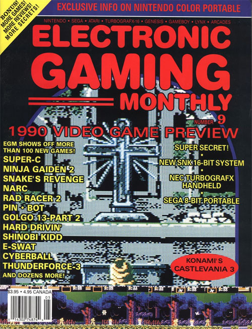
Electronic Gaming MonthlyWe're kicking things off in the most predictable way possible, by checking in with Electronic Gaming Monthly. This is issue 9, which is obviously right at the beginning of their two-decade run. You can tell that it's early in EGM's run, because this cover is crap. It's just so bad. Honestly, had they used the Castlevania III cross as the full cover, I would probably like this more. But what's with the screenshots at the bottom? They aren't even of different parts of Dracula's Curse. And considering how great Castlevania art has been over the years, this feels like the worst way to sell the game. I love Castlevania III, but this is a bad cover. I give it a 1 out of 5.

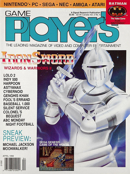
Game Player'sHey, remember when Game Player's was “the leading magazine of video and computer entertainment.” Well, apparently that was back in April of 1990. I've never been a big fan of Game Player's covers, and this Iron Sword design is doing it no favors. Part of the problem is that the white and the very shiny silver armor makes the whole thing look washed out. Like it would blind you use you tried looking at it in the sun. On one hand, it's a little better than the Iron Sword cover EGM came up with, using the Fabio-enhanced box art, but I really don't like this design. It looks cheap and thrown together quickly. I also don't like the way he's holding it. The whole thing just looks awkward to me. I'll give it a bonus point for being original art, but I can't go any higher than a 2 out of 5.

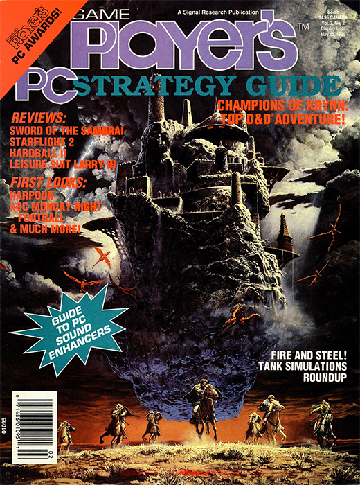
Game Player's PC Strategy GuideNow hang on a second, is this the same Game Player's. As you can tell from the title, this is Game Player's PC Strategy Guide, which is its own magazine, but still connected to the dumpster fire we just talked about. You have to admit, this is a massive step up from that terrible Iron Sword cover. In case you don't recognize it, this is the Champions of Krynn cover art, which is legitimately epic. Is that cheating? Who cares, because it's eye-catching. Especially compared to the other magazines released in April. I can't go all the way up to a five for reusing art, so Game Player's PC Strategy Guide will need to settle for 4 out of 5.

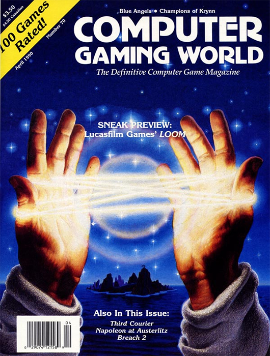
Computer Gaming WorldWhile we're on the topic of reusing box art, we might as well talk about Computer Gaming World. Look, I'm going to sound a bit down on this cover, but it's not because I think it's bad. I actually really like this Loom design. I think it's one of the more striking game boxes of all time, even if it doesn't even come close to hinting at what you do in the game. The problem is that Computer Gaming World has a long history of publishing some of the greatest magazine covers of all time, many with original art. To see them slum around in the same depths as Game Player's PC Strategy Guide is a big disappointing. I can't give this higher than a 3 out of 5, but know that I really want to.

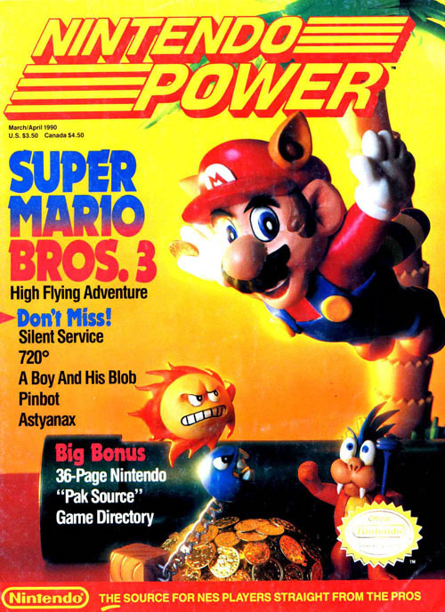
Nintendo PowerNow this is more like it! Only ten months after kicking things off with the iconic Super Mario Bros. 2 cover, Nintendo Power has done it again with Mario 3. This is from an era when Nintendo Power was doing a lot with models, and the attention to detail here is impeccable. I love that we get a nice cross section of bad guys, along with a pipe and a stash of gold coins. Best of all, it has Mario in an action shot, doing something new from the hotly-anticipated sequel – flying with a racoon tail. Sure, if you look closely enough you'll notice that this appears to be on a table, but I love everything about this cover, from the models to the color choices. I honestly like this cover more than the Super Mario Bros. 3 box, so of course I'm going to give it a 5 out of 5.
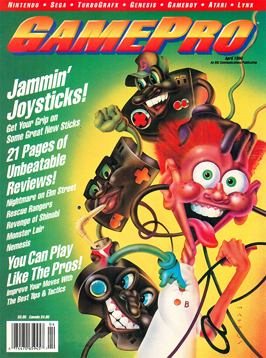
GameProIf you want to know what inspired me to start this series, look no further than this GamePro cover. Is it good ... maybe? I mean, it's not bad. Or maybe it is? Honestly, it's so weird and goofy that it's hard to tell. The assignment was to come up with a cover highlighting the “Jammin' Joysticks,” and even though there are exactly zero joysticks on this cover, it still kind the theme. Name me another magazine cover where the controllers are using the humas as a game pad. And it's weirdly violent, too. That one pad with the big nose and trucker hat literally twisted Howdy Doody's head all the way around, and do you see the cord going through his ears? That's gotta hurt. I can't give it a perfect score, but this definitely would have caught my eye back in 1990, and that alone is worth 4 points out of 5.
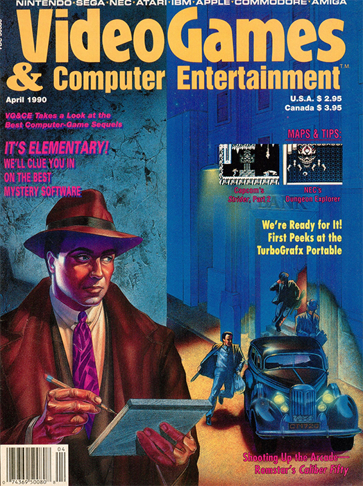
Video Games & Computer EntertainmentBefore we take a trip overseas, let's first check in with our final American magazine – Video Games & Computer Entertainment. Instead of advertising a single game on the cover, this design is more about celebrating a certain type of game. Specifically, the whodunnit. Crime games that have an emphasis on solving the case, like Police Quest II, King of Chicago and J.B Harold's Murder Club. I like this noir design, as well as the use of color. And what's cool is that it's not a Dick Tracy-style hero shooting a gun at the gangsters, but rather a guy jotting down details. I'm not always a big fan of the way Video Games & Computer Entertainment draws regular people, but this cover worked for me. I'll give it a 4 out of 5.
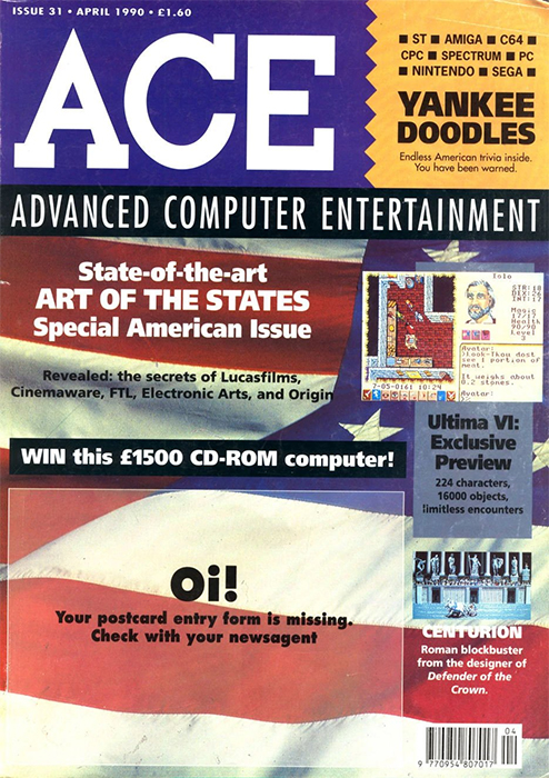
ACEAnd that brings us to Ace, which was celebrating the “Art of the States,” because this is the “Special American Issue.” Look, I suppose I should just be happy that the cover isn't some fat dude eating a hamburger while shooting a gun, but this zoomed in close-up of the flag isn't much better. And did they really need to write “Yankee Doodles” in big text right next to the logo? Oi! This cover sucks! 1 out of 5.
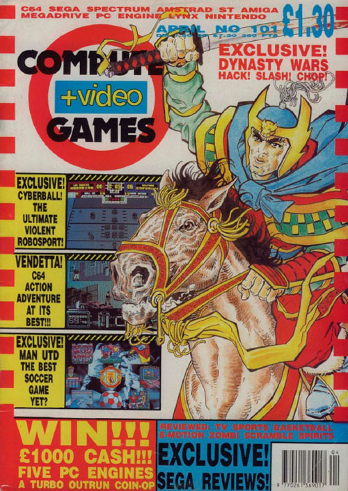
Computer & Video GamesIf you were collecting issues of Computer & Video Games in the early 1990s, then you know this template all too well. They are basically pulling a Game Player's, only with more pictures and clashing colors. In case you're wondering, yes, CVG did in fact dedicate a whole cover to Dynasty Wars, one of Capcom's lesser-known beat ‘em ups. In fact, this cover is very similar to what U.S. Gold used when they ported the game to Amiga and the ZX Spectrum. I will give them a point for actually redrawing the art, but let's not go crazy. This is a 2 out of 5, at best.
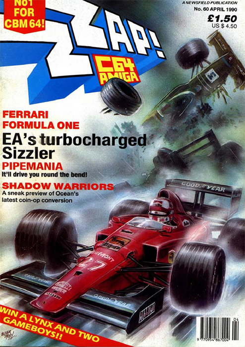
Zzap 64I had to include this issue of Zzap just to prove that the Brits actually did know how to make eye-catching cover art. On paper, this Formula-1 design sounds insanely boring. Yet, this cover is anything but. While the lead car may catch your eye due to the red color, the real action is happening in the background, where at least two cars are getting into an epic crash. It's the kind of multi-car pile up that sends somebody to the hospital, or worse. What it does is it makes F1 look exciting as hell. Honestly, Electronic Arts should have used as the box art. It's a million times better. 4 out of 5.
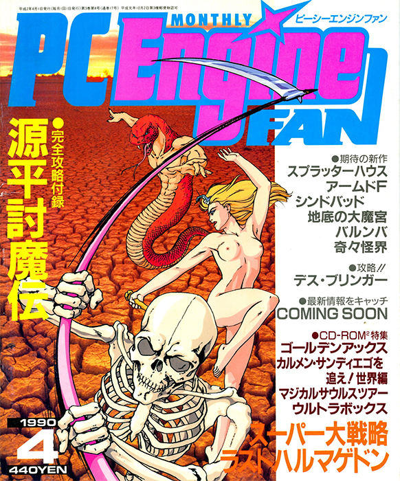
PC Engine FanNow here's a first! PC Engine Fan is the first video game magazine I've ever had to edit to get it past the censors. Okay, look, there's no question that this magazine would have caught my eye, especially back in 1990. You know why. I know why. It's no mystery. But does that make this a good cover? Well ... kind of? I like the look of the three characters, but they aren't really interacting with each other, and a lot of the real estate is used by the plain, flat desert setting. I like skeletons and naked women, but this cover leaves me with a lot of questions. 3 out of 5.
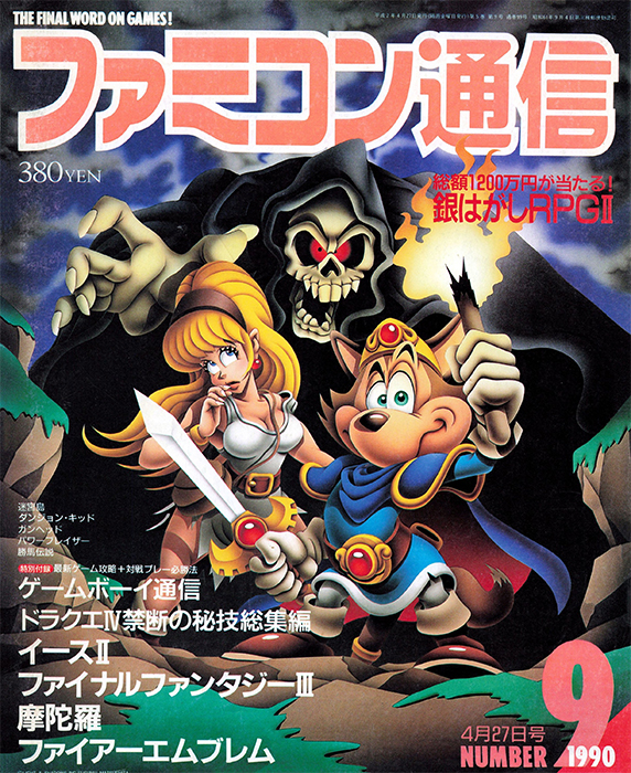
FamitsuAnd finally, we're checking in with Famitsu, “the final word on games.” Unfortunately, I can't read very many of those words, but I do love this artwork. As is so often the case, we see Necky the Fox slumming it in another video game. Now, is it just me, or does it look like he's pretending to be Maximo? I mean, I know he's not, that game came out a decade after this issue. I flipped through the issue trying to figure out what game it was supposed to be, but ultimately gave up, because it doesn't matter. I love Necky's confident stance, even with Death coming for him and the blonde-haired beauty next to him. I love the style and the fact that it reminds me of Ghouls ‘N Ghosts. This is a great cover, 5 out of 5.
So, there we have it. April 1990 is in the books. We'll be back next month looking at a whole new year. Where will we go and what will we see? Find out next time when we look at the Best & Worst Magazine Covers.

Even More Articles

REVIEW - Rose & Locket
June 30th, 2026


REVIEW - Flesh Made Fear
June 24th, 2026


REVIEW - 4PGP
June 18th, 2026
Must-See Videos


Latest Reviews
View all


HOME |
CONTACT |
NOW HIRING |
WHAT IS DEFUNCT GAMES? |
NINTENDO SWITCH ONLINE |
RETRO-BIT PUBLISHING
Retro-Bit |
Switch Planet |
The Halcyon Show |
Same Name, Different Game |
Dragnix |
Press the Buttons
Game Zone Online | Hardcore Gamer | The Dreamcast Junkyard | Video Game Blogger
Dr Strife | Games For Lunch | Mondo Cool Cast | Boxed Pixels | Sega CD Universe | Gaming Trend
Game Zone Online | Hardcore Gamer | The Dreamcast Junkyard | Video Game Blogger
Dr Strife | Games For Lunch | Mondo Cool Cast | Boxed Pixels | Sega CD Universe | Gaming Trend
Copyright © 2001-2026 Defunct Games
All rights reserved. All trademarks are properties of their respective owners.
All rights reserved. All trademarks are properties of their respective owners.