- CLASSIC MAGAZINES
- REVIEW CREW
A show recapping what critics thought back
when classic games first came out! - NEXT GENERATION'S BEST & WORST
From the worst 1-star reviews to the best
5-stars can offer, this is Next Generation! - NINTENDO POWER (ARCHIVE)
Experience a variety of shows looking at the
often baffling history of Nintendo Power! - MAGAZINE RETROSPECTIVE
We're looking at the absolutely true history of
some of the most iconic game magazines ever! - SUPER PLAY'S TOP 600
The longest and most ambitious Super NES
countdown on the internet! - THEY SAID WHAT?
Debunking predictions and gossip found
in classic video game magazines! - NEXT GENERATION UNCOVERED
Cyril is back in this spin-off series, featuring the
cover critic review the art of Next Generation! - HARDCORE GAMER MAGAZING (PDF ISSUES)
Download all 36 issues of Hardcore Gamer
Magazine and relive the fun in PDF form!
- REVIEW CREW
- ELECTRONIC GAMING MONTHLY
- ELECTRONIC GAMING MONTHLY RANKS
From Mario to Sonic to Street Fighter, EGM
ranks classic game franchises and consoles! - ELECTRONIC GAMING MONTHLY BEST & WORST
Counting down EGM’s best and worst reviews
going year by year, from 1989 – 2009! - ELECTRONIC GAMING BEST & WORST AWARDS
11-part video series chronicling the ups and
downs of EGM’s Best & Worst Awards!
- ELECTRONIC GAMING MONTHLY RANKS
- GAME HISTORY
- GAME OVER: STORY BREAKDOWNS
Long-running series breaking down game
stories and analyzing their endings! - A BRIEF HISTORY OF GAMING w/ [NAME HERE]
Real history presented in a fun and pithy
format from a variety of game historians! - THE BLACK SHEEP
A series looking back at the black sheep
entries in popular game franchises! - INSTANT EXPERT
Everything you could possibly want to know
about a wide variety of gaming topics! - FREEZE FRAME
When something familiar happens in the games
industry, we're there to take a picture! - I'VE GOT YOUR NUMBER
Learn real video game history through a series
of number-themed episodes, starting at zero! - GREAT MOMENTS IN BAD ACTING
A joyous celebration of some of gaming's
absolute worst voice acting!
- GAME OVER: STORY BREAKDOWNS
- POPULAR SHOWS
- DG NEWS w/ LORNE RISELEY
Newsman Lorne Riseley hosts a regular
series looking at the hottest gaming news! - REVIEW REWIND
Cyril replays a game he reviewed 10+ years
ago to see if he got it right or wrong! - ON-RUNNING FEUDS
Defunct Games' longest-running show, with
editorials, observations and other fun oddities! - DEFUNCT GAMES QUIZ (ARCHIVE)
From online quizzes to game shows, we're
putting your video game knowledge to the test!- QUIZ: ONLINE PASS
Take a weekly quiz to see how well you know
the news and current gaming events! - QUIZ: KNOW THE GAME
One-on-one quiz show where contestants
find out if they actually know classic games! - QUIZ: THE LEADERBOARD
Can you guess the game based on the classic
review? Find out with The Leaderboard!
- QUIZ: ONLINE PASS
- DEFUNCT GAMES VS.
Cyril and the Defunct Games staff isn't afraid
to choose their favorite games and more! - CYRIL READS WORLDS OF POWER
Defunct Games recreates classic game
novelizations through the audio book format!
- DG NEWS w/ LORNE RISELEY
- COMEDY
- GAME EXPECTANCY
How long will your favorite hero live? We crunch
the numbers in this series about dying! - VIDEO GAME ADVICE
Famous game characters answer real personal
advice questions with a humorous slant! - FAKE GAMES: GUERILLA SCRAPBOOK
A long-running series about fake games and
the people who love them (covers included)! - WORST GAME EVER
A contest that attempts to create the worst
video game ever made, complete with covers! - LEVEL 1 STORIES
Literature based on the first stages of some
of your favorite classic video games! - THE COVER CRITIC
One of Defunct Games' earliest shows, Cover
Critic digs up some of the worst box art ever! - COMMERCIAL BREAK
Take a trip through some of the best and
worst video game advertisements of all time! - COMIC BOOK MODS
You've never seen comics like this before.
A curious mix of rewritten video game comics!
- GAME EXPECTANCY
- SERIES ARCHIVE
- NINTENDO SWITCH ONLINE ARCHIVE
A regularly-updated list of every Nintendo
Switch Online release, plus links to review! - PLAYSTATION PLUS CLASSIC ARCHIVE
A comprehensive list of every PlayStation
Plus classic release, including links! - RETRO-BIT PUBLISHING ARCHIVE
A regularly-updated list of every Retro-Bit
game released! - REVIEW MARATHONS w/ ADAM WALLACE
Join critic Adam Wallace as he takes us on a
classic review marathon with different themes!- DEFUNCT GAMES GOLF CLUB
Adam Wallace takes to the links to slice his way
through 72 classic golf game reviews! - 007 IN PIXELS
Adam Wallace takes on the world's greatest spy
as he reviews 15 weeks of James Bond games! - A SALUTE TO VAMPIRES
Adam Wallace is sinking his teeth into a series
covering Castlevania, BloodRayne and more! - CAPCOM'S CURSE
Adam Wallace is celebrating 13 days of Halloween
with a line-up of Capcom's scariest games! - THE FALL OF SUPERMAN
Adam Wallace is a man of steel for playing
some of the absolute worst Superman games! - THE 31 GAMES OF HALLOWEEN
Adam Wallace spends every day of October afraid
as he reviews some of the scariest games ever! - 12 WEEKS OF STAR TREK
Adam Wallace boldly goes where no critic has
gone before in this Star Trek marathon!
- DEFUNCT GAMES GOLF CLUB
- DAYS OF CHRISTMAS (ARCHIVE)
Annual holiday series with themed-episodes
that date all the way back to 2001!- 2015: 30 Ridiculous Retro Rumors
- 2014: 29 Magazines of Christmas
- 2013: 29 Questionable Power-Ups of Christmas
- 2012: 34 Theme Songs of Christmas
- 2011: 32 Game Endings of Christmas
- 2010: 31 Bonus Levels of Christmas
- 2009: 30 Genres of Christmas
- 2008: 29 Controls of Christmas
- 2007: 34 Cliches of Christmas
- 2006: 33 Consoles of Christmas
- 2005: 32 Articles of Christmas
- 2004: 31 Websites of Christmas
- 2003: 29 Issues of Christmas
- 2002: 28 Years of Christmas
- 2001: 33 Days of Christmas
- NINTENDO SWITCH ONLINE ARCHIVE
- REVIEW ARCHIVE
- FULL ARCHIVE
The Cover Critic Beheads Mortal Kombat
They say you shouldn't judge a book by its cover. But since I've never heard that expression used against video games I figure that it's open season on the box art you see every day. In this episode we take a very special look at Mortal Kombat. With the brand new refresh coming out next week, we thought it would be fun to throw a bunch of artwork at the Cover Critic and see what he says. GET OVER HERE ... and join us as we look at all nine of the main entries in the Mortal Kombat universe. FINISH HIM!
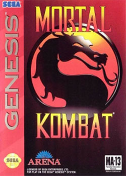
Mortal Kombat
[ System: Genesis - 1993 - Final Rating: B+ ]
We begin our eighteen year journey by looking at the game that started it all -- Mortal Kombat. Instead of focusing on amazing hand-drawn graphics and silky smooth animation, Midway's
action game was full of brutal violence and photo realistic characters. It spit in the face of every video game convention and turned the spotlight of the U.S. government on the entire industry. This 1993 home release was met with just as much controversy. While the Sega Genesis version featured every gruesome fatality move, the Super NES game was censored. This was the Genesis game to own in 1993, making it an excellent first stop on our adventure.[ System: Genesis - 1993 - Final Rating: B+ ]
Although the game was ported to a half dozen consoles, this Genesis box is indicative of the overall design. There's nothing fancy about the cover art, just the game's title and the Mortal Kombat emblem. The game warns you that it's MA-13, meaning that it's not meant for anybody under 13 years old. The artwork's color scheme works well when set against the late generation Genesis logo. Best of all, there's nothing about this cover that would offend the average parent buying it for a holiday gift. Without inspecting the screenshots on the back or asking the store clerk, it's easy to see how kids could sucker adults into buying this innocent looking game. I like that. I also like this cover. It's a solid design, but it lacks that certain spark that would put it over the line.
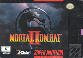
Mortal Kombat II
[ System: Super NES - 1994 - Final Rating: A ]
Now this is the spark I'm talking about! Mortal Kombat II is not only the best game in the series, but also a triumph of box art design. Acclaim was not a company known for subtlety, yet here we have an atmospheric design that evokes the best of classic
box art. The design references the original game, using the large Mortal Kombat emblem and simple logo. What it adds is a stormy background, which goes a long way to set the tone of this gruesome one-on-one fighting game.[ System: Super NES - 1994 - Final Rating: A ]
What I love about this cover is how it commands attention without resorting to ultra-violence or half-naked women. And believe me, Acclaim could have easily gone in both of those directions, there's no end to the gratuitous violence in Mortal Kombat. But they restrained, instead choosing to go with a design that is even more powerful. It's not the kind of artistic choice we see on game boxes very often, which may be why Mortal Kombat II continues to stick with me. Street Fighter II may have been a better game, but Mortal Kombat had better cover art ... for now.
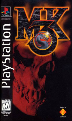
Mortal Kombat 3
[ System: PlayStation - 1995 - Final Rating: F ]
We go from the best Mortal Kombat cover to the worst. Whoever was in charge of putting together this mess of a box deserves to be
fired. Then again, considering how fickle the games industry is, he probably has been fired numerous times. I hate to consider how the instability is hurting his wife and children. On the other hand, he could be the kind of screw-up that never gets fired no matter how bad it gets. I take it back; I want this tasteless jerk to get the axe ... preferably one of the Kombatants using that axe to cut him in two.[ System: PlayStation - 1995 - Final Rating: F ]
By 1995 Mortal Kombat had turned into that douche bag friend you hang out with that always wants to hit on girls at the bar. He's too cool to use his full name; he goes with an abbreviation all the way. He doesn't even have to get made up, that's how cool he is. He just puts on a skull mask and looks real creepy. Hmm ... on second thought, that seems to be where this analogy breaks down. I doubt that anybody associated with the production of this game had anything to do with this PlayStation cover. This has the look and feel of something slapped together at the last minute by an outside company. Perhaps this is what Sony honestly thought would sell the game. Or maybe they just didn't care. After all, everybody knew that Mortal Kombat 3 was a huge get and at the end of the day that's all they needed. I, on the other hand, need something more than a red skull and an abbreviated title. One of the laziest covers of all time.
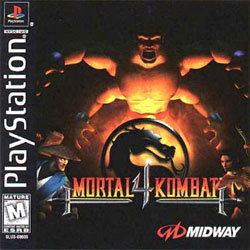
Mortal Kombat 4
[ System: PlayStation - 1998 - Final Rating: D+ ]
The late 1990s marked a tough time for the Mortal Kombat franchise. After having so much success early on, Midway's popular fighting series was having an identity crisis. Thanks to the success of Tekken and Virtua Fighter, arcade goers were giving the cold shoulder to traditional 2D fighters. This left Mortal Kombat and Street Fighter out in the cold, forcing both companies to try something radically different. Feeling the pressure, Midway gave
in and turned their flagship franchise into a 3D fighter. The results were decidedly bad. Not only did the game look bad (even by 1998 standards), but it never once felt like a Mortal Kombat game. Even the return of fan favorite characters is enough to make this anything above a sub-par fighting game. [ System: PlayStation - 1998 - Final Rating: D+ ]
Sadly the game's cover art only helps to reinforce how low the series had sunk. Even with three characters, this cover is too crowded for its own good. Worse yet, Rayden's new design should have been a warning for anybody on the fence about the polygonal facelift. Goro isn't much better. He's mostly covered by shadows, but not in an especially menacing way. He also appears to be protecting that briefcase from Pulp Fiction. Making things even more confusing, Goro was nowhere to be seen in the Mortal Kombat 4 arcade cabinet. Yet judging by this cover art you would think that he is the main character. I would say that unknowing gamers were likely disappointed when they got home, but everything is disappointing when it comes to Mortal Kombat 4.
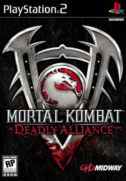
Mortal Kombat: Deadly Alliance
[ System: PlayStation 2 - 2002 - Final Rating: B+ ]
After the disaster that was Mortal Kombat 4, Midway decided to take a good long break. It took Ed Boon's troupe five years to reinvent the Mortal Kombat franchise. Although it remained a 3D fighter (cribbing off of Namco's popular Soul Calibur series), Deadly Alliance was able to successfully reinvent itself in a way the last game could not. It didn't feel like the Mortal Kombat of old, but that wasn't a bad thing. The controls were replaced with weapon-based combat, new stage fatalities and a graphic engine that did the series justice. Mortal Kombat was back in a big way. [ System: PlayStation 2 - 2002 - Final Rating: B+ ]
I like this cover art, it conveys the exact message Midway was going after. Mortal Kombat is back and this is the start of a new trilogy. The box art plays homage to the original games, keeping a simple design that is nothing more than the series' emblem. In this case the Mortal Kombat emblem is is being crushed by that giant "V" (this is the fifth game after all) like a nutcracker at Christmas. The blood at the bottom of the "V" reminds you that in Mortal Kombat ANYTHING goes.
HOME |
CONTACT |
NOW HIRING |
WHAT IS DEFUNCT GAMES? |
NINTENDO SWITCH ONLINE |
RETRO-BIT PUBLISHING
Retro-Bit |
Switch Planet |
The Halcyon Show |
Same Name, Different Game |
Dragnix |
Press the Buttons
Game Zone Online | Hardcore Gamer | The Dreamcast Junkyard | Video Game Blogger
Dr Strife | Games For Lunch | Mondo Cool Cast | Boxed Pixels | Sega CD Universe | Gaming Trend
Game Zone Online | Hardcore Gamer | The Dreamcast Junkyard | Video Game Blogger
Dr Strife | Games For Lunch | Mondo Cool Cast | Boxed Pixels | Sega CD Universe | Gaming Trend
Copyright © 2001-2025 Defunct Games
All rights reserved. All trademarks are properties of their respective owners.
All rights reserved. All trademarks are properties of their respective owners.


