- CLASSIC MAGAZINES
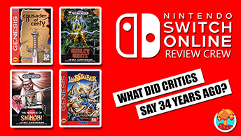
- REVIEW CREW
A show recapping what critics thought back
when classic games first came out! - NEXT GENERATION'S BEST & WORST
From the worst 1-star reviews to the best
5-stars can offer, this is Next Generation! - NINTENDO POWER (ARCHIVE)
Experience a variety of shows looking at the
often baffling history of Nintendo Power! - MAGAZINE RETROSPECTIVE
We're looking at the absolutely true history of
some of the most iconic game magazines ever! - SUPER PLAY'S TOP 600
The longest and most ambitious Super NES
countdown on the internet! - THEY SAID WHAT?
Debunking predictions and gossip found
in classic video game magazines! - NEXT GENERATION UNCOVERED
Cyril is back in this spin-off series, featuring the
cover critic review the art of Next Generation! - HARDCORE GAMER MAGAZING (PDF ISSUES)
Download all 36 issues of Hardcore Gamer
Magazine and relive the fun in PDF form!
- REVIEW CREW
- ELECTRONIC GAMING MONTHLY
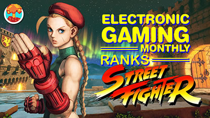
- ELECTRONIC GAMING MONTHLY RANKS
From Mario to Sonic to Street Fighter, EGM
ranks classic game franchises and consoles! - ELECTRONIC GAMING MONTHLY BEST & WORST
Counting down EGM’s best and worst reviews
going year by year, from 1989 – 2009! - ELECTRONIC GAMING BEST & WORST AWARDS
11-part video series chronicling the ups and
downs of EGM’s Best & Worst Awards!
- ELECTRONIC GAMING MONTHLY RANKS
- GAME HISTORY
- GAME OVER: STORY BREAKDOWNS
Long-running series breaking down game
stories and analyzing their endings! - A BRIEF HISTORY OF GAMING w/ [NAME HERE]
Real history presented in a fun and pithy
format from a variety of game historians! - THE BLACK SHEEP
A series looking back at the black sheep
entries in popular game franchises! - INSTANT EXPERT
Everything you could possibly want to know
about a wide variety of gaming topics! - FREEZE FRAME
When something familiar happens in the games
industry, we're there to take a picture! - I'VE GOT YOUR NUMBER
Learn real video game history through a series
of number-themed episodes, starting at zero! - GREAT MOMENTS IN BAD ACTING
A joyous celebration of some of gaming's
absolute worst voice acting!
- GAME OVER: STORY BREAKDOWNS
- POPULAR SHOWS
- DG NEWS w/ LORNE RISELEY
Newsman Lorne Riseley hosts a regular
series looking at the hottest gaming news! - REVIEW REWIND
Cyril replays a game he reviewed 10+ years
ago to see if he got it right or wrong! - ON-RUNNING FEUDS
Defunct Games' longest-running show, with
editorials, observations and other fun oddities! - DEFUNCT GAMES QUIZ (ARCHIVE)
From online quizzes to game shows, we're
putting your video game knowledge to the test!- QUIZ: ONLINE PASS
Take a weekly quiz to see how well you know
the news and current gaming events! - QUIZ: KNOW THE GAME
One-on-one quiz show where contestants
find out if they actually know classic games! - QUIZ: THE LEADERBOARD
Can you guess the game based on the classic
review? Find out with The Leaderboard!
- QUIZ: ONLINE PASS
- DEFUNCT GAMES VS.
Cyril and the Defunct Games staff isn't afraid
to choose their favorite games and more! - CYRIL READS WORLDS OF POWER
Defunct Games recreates classic game
novelizations through the audio book format!
- DG NEWS w/ LORNE RISELEY
- COMEDY
- GAME EXPECTANCY
How long will your favorite hero live? We crunch
the numbers in this series about dying! - VIDEO GAME ADVICE
Famous game characters answer real personal
advice questions with a humorous slant! - FAKE GAMES: GUERILLA SCRAPBOOK
A long-running series about fake games and
the people who love them (covers included)! - WORST GAME EVER
A contest that attempts to create the worst
video game ever made, complete with covers! - LEVEL 1 STORIES
Literature based on the first stages of some
of your favorite classic video games! - THE COVER CRITIC
One of Defunct Games' earliest shows, Cover
Critic digs up some of the worst box art ever! - COMMERCIAL BREAK
Take a trip through some of the best and
worst video game advertisements of all time! - COMIC BOOK MODS
You've never seen comics like this before.
A curious mix of rewritten video game comics!
- GAME EXPECTANCY
- SERIES ARCHIVE
- NINTENDO SWITCH ONLINE ARCHIVE
A regularly-updated list of every Nintendo
Switch Online release, plus links to review! - PLAYSTATION PLUS CLASSIC ARCHIVE
A comprehensive list of every PlayStation
Plus classic release, including links! - RETRO-BIT PUBLISHING ARCHIVE
A regularly-updated list of every Retro-Bit
game released! - REVIEW MARATHONS w/ ADAM WALLACE
Join critic Adam Wallace as he takes us on a
classic review marathon with different themes!- DEFUNCT GAMES GOLF CLUB
Adam Wallace takes to the links to slice his way
through 72 classic golf game reviews! - 007 IN PIXELS
Adam Wallace takes on the world's greatest spy
as he reviews 15 weeks of James Bond games! - A SALUTE TO VAMPIRES
Adam Wallace is sinking his teeth into a series
covering Castlevania, BloodRayne and more! - CAPCOM'S CURSE
Adam Wallace is celebrating 13 days of Halloween
with a line-up of Capcom's scariest games! - THE FALL OF SUPERMAN
Adam Wallace is a man of steel for playing
some of the absolute worst Superman games! - THE 31 GAMES OF HALLOWEEN
Adam Wallace spends every day of October afraid
as he reviews some of the scariest games ever! - 12 WEEKS OF STAR TREK
Adam Wallace boldly goes where no critic has
gone before in this Star Trek marathon!
- DEFUNCT GAMES GOLF CLUB
- DAYS OF CHRISTMAS (ARCHIVE)
Annual holiday series with themed-episodes
that date all the way back to 2001!- 2015: 30 Ridiculous Retro Rumors
- 2014: 29 Magazines of Christmas
- 2013: 29 Questionable Power-Ups of Christmas
- 2012: 34 Theme Songs of Christmas
- 2011: 32 Game Endings of Christmas
- 2010: 31 Bonus Levels of Christmas
- 2009: 30 Genres of Christmas
- 2008: 29 Controls of Christmas
- 2007: 34 Cliches of Christmas
- 2006: 33 Consoles of Christmas
- 2005: 32 Articles of Christmas
- 2004: 31 Websites of Christmas
- 2003: 29 Issues of Christmas
- 2002: 28 Years of Christmas
- 2001: 33 Days of Christmas
- NINTENDO SWITCH ONLINE ARCHIVE
- REVIEW ARCHIVE
- FULL ARCHIVE
The Cover Critic, 3DS and the Headache
They say you shouldn't judge a book by its cover. But since I've never heard that expression used against video games I figure that it's open season on the box art you see every day. This is The Cover Critic, your guide to what's good and bad in the world of video game boxes. In this episode we help celebrate the Nintendo 3DS's launch by looking at five of its biggest releases. Does Ridge Racer or Pilotwings have what it takes to impress the Cover Critic?
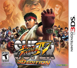
Super Street Fighter IV 3D Edition (Capcom)
[ Nintendo 3DS - 2011 - Final Rating: B+ ]
So let's start with the obvious: There's nothing to buy on the Nintendo 3DS. Oh sure, Nintendo promises a bunch of hot softs by year's end, but that isn't going to help you when buying a launch unit. Critics and consumers seem to agree, Super Street Fighter IV: 3D Edition is the game
to get. It's a competent port of one of my favorite fighting games. Then again, it's also the THIRD version of Street Fighter IV in as many years. I own an arcade stick and two versions of the game at home; do I really need a $40 port I can take on the go? When a three year old port is the must-have game, then you know your launch is troubled.[ Nintendo 3DS - 2011 - Final Rating: B+ ]
But we're not here to talk about the disappointing list of launch titles. Instead we're taking a look at all important cover art. After all, it's the thing that catches your eye in the store. And let me tell you, this Super Street Fighter IV: 3D Edition box is an eye catcher. I was expecting a reworking of the console box art, but Capcom impressed with a cover that manages to include most of the familiar faces found in the game. I'm not a fan of the three god-like figures hovering over the rest of the cast; it reminds me of a poorly Photoshopped movie poster. That minor complaint aside, this is my favorite Street Fighter IV box art.
Pilotwings Resort (Nintendo)
[ Nintendo 3DS - 2011 - Final Rating: B- ]
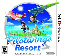
It's too early to tell if this Pilotwings Resort box art is indicative of Nintendo's 3DS releases, but I'm hoping that it's not. On one hand, I do like how simple and clean everything is. However, I can't get over that this is nothing more than a huge rip-off of Capcom's early line of PSP games. Titles like Mega Man Powered Up and the Capcom Classics Collection both feature
the same style. Both Nintendo and Capcom employ the technique in which the game's action is literally bursting out of the circular window. What's more, both feature the same white background and familiar faces. If it wasn't for the group of Mii characters, I would swear this is Capcom re-releasing their greatest hits.[ Nintendo 3DS - 2011 - Final Rating: B- ]
The idea of flying an airplane or strapping on a jetpack seems like an incredibly fun way to pass some time. So why is it that this cover is so boring? I know this is a casual release (you can beat the game in under two hours), but why does everything look so boring? The Mii characters don't help anything. Gone are the days when developers had to come up with compelling characters (something Nintendo was exceptionally good at), this has been replaced by a cast of do-it-yourself people who lack any real emotion or personality. Then again, the original Pilotwings was never about excitement or fully developed characters, so why start now?
Ridge Racer 3D (Namco)
[ Nintendo 3DS - 2011 - Final Rating: D ]
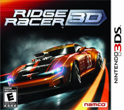
It wouldn't be a system launch without Ridge Racer. While critics are split on whether this Namco racer is completely necessary, there's one thing nobody is defending: The unacceptably awful cover art! In Namco's defense (and
believe me, they need one), it's not easy conveying how cool your 3D technology is on a flat 2D image. Instead of seeing lush backgrounds or an intense race, we're given a single car, neon lights and the smoke of the exhaust. That's it. Imagine how crushed gamers will feel when they tear open the box and discover that you aren't racing in Tron's computer world.[ Nintendo 3DS - 2011 - Final Rating: D ]
Namco used to be really good at this packaging thing. Do you remember all of those covers with the attractive Ridge Racer girl? Where did she go? Instead we're given a close-up look at one of the many ugly fake cars Namco has come up with. I don't buy Ridge Racer for the fake muscle cars, I liked how sleek and attractive Namco's inventions have been in the past. Yet here we are with a monster that makes me want to divert my eyes. To make matter worse, the cover throws in J.J. Abrams-style lens flair. At least the box art references Phozon, a Namco release I would much rather play right now.
Dead or Alive Dimensions (Tecmo)
[ Nintendo 3DS - 2011 - Final Rating: D- ]
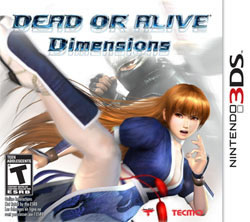
Dead or Alive is the game you bring when there isn't any competition. No offense to the DOA defenders (all dozen of you), but this is not a series that stacks up well against Tekken, Soul Calibur or, in this case, Super Street Fighter IV: 3D Edition. That's not to say it's a bad series, it's not the first choice for amazing 3D fighting. Apparently
that also applies to the cover art. Dead or Alive Dimensions has some incredibly cheesy box art ... which is really saying something when you look at the other 3DS boxes. And worst of all, this American cover has been censored! Oh, this isn't going to end well.[ Nintendo 3DS - 2011 - Final Rating: D- ]
So here we have a picture of Kasumi, the golden haired heroine of the Dead or Alive franchise. Not only is Kasumi the favorite character of Team Ninja's founder, Tomonobu Itagaki, but she also acted as the lead character in several games. Here she is strutting her stuff; staying ready for the next time somebody tries to fight her. Despite being having all of the right elements (a high kick and Ninja Gaiden star Ryu Hayabusa) there's nothing exciting about this artwork. It looks like somebody quickly tossed together two pieces of Dead or Alive 3 artwork and called it a day. What's worse is the fact that our American cover is edited. The original Japanese cover proves that America isn't ready to see a woman's inner thigh. You can beat the stuffing out of a bunch of surgically enhanced women, but don't you dare show a little leg on your cover!
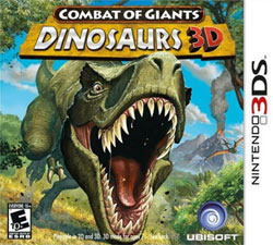
Combat of Giants: Dinosaurs 3D
[ Nintendo 3DS - 2011 - Final Rating: D+ ]
This Combat of Giants cover art singlehandedly confirms every worry I had about the Nintendo 3DS. Look, I don't care much for this push for 3D. As far as I'm concerned it's a gimmick that doesn't improve a single thing. Worst
of all, half the time it gives me a headache. And I'm not alone; millions of other people are reporting discomfort while watching their movies, TV and games in 3D. Believe it or not, there's actual science to back up why this happens. I'm not going to say that this proves that 3D will never work (and thus we should just stop), but it certainly feels like a major blow to the cause. [ Nintendo 3DS - 2011 - Final Rating: D+ ]
Here we have a picture of a T-Rex rushing directly at your face. It's the kind of eye-popping effect you would expect people to be impressed with ... in the 1950s. Yes, this is the kind of gimmicky use of 3D that makes me roll my eyes in disgust. I can see it now: Instead of giving players a fully realized prehistoric world to explore, Dinosaur 3D is going to throw stuff at your face. Ubisoft isn't hoping you'll notice the great gameplay; they want you to be impressed by the T-Rex sticking his head out of Nintendo's brand new portable. Color me unimpressed.
HOME |
CONTACT |
NOW HIRING |
WHAT IS DEFUNCT GAMES? |
NINTENDO SWITCH ONLINE |
RETRO-BIT PUBLISHING
Retro-Bit |
Switch Planet |
The Halcyon Show |
Same Name, Different Game |
Dragnix |
Press the Buttons
Game Zone Online | Hardcore Gamer | The Dreamcast Junkyard | Video Game Blogger
Dr Strife | Games For Lunch | Mondo Cool Cast | Boxed Pixels | Sega CD Universe | Gaming Trend
Game Zone Online | Hardcore Gamer | The Dreamcast Junkyard | Video Game Blogger
Dr Strife | Games For Lunch | Mondo Cool Cast | Boxed Pixels | Sega CD Universe | Gaming Trend
Copyright © 2001-2025 Defunct Games
All rights reserved. All trademarks are properties of their respective owners.
All rights reserved. All trademarks are properties of their respective owners.


