- CLASSIC MAGAZINES
- REVIEW CREW
A show recapping what critics thought back
when classic games first came out! - NEXT GENERATION'S BEST & WORST
From the worst 1-star reviews to the best
5-stars can offer, this is Next Generation! - NINTENDO POWER (ARCHIVE)
Experience a variety of shows looking at the
often baffling history of Nintendo Power! - MAGAZINE RETROSPECTIVE
We're looking at the absolutely true history of
some of the most iconic game magazines ever! - SUPER PLAY'S TOP 600
The longest and most ambitious Super NES
countdown on the internet! - THEY SAID WHAT?
Debunking predictions and gossip found
in classic video game magazines! - NEXT GENERATION UNCOVERED
Cyril is back in this spin-off series, featuring the
cover critic review the art of Next Generation! - HARDCORE GAMER MAGAZING (PDF ISSUES)
Download all 36 issues of Hardcore Gamer
Magazine and relive the fun in PDF form!
- REVIEW CREW
- ELECTRONIC GAMING MONTHLY
- ELECTRONIC GAMING MONTHLY RANKS
From Mario to Sonic to Street Fighter, EGM
ranks classic game franchises and consoles! - ELECTRONIC GAMING MONTHLY BEST & WORST
Counting down EGM’s best and worst reviews
going year by year, from 1989 – 2009! - ELECTRONIC GAMING BEST & WORST AWARDS
11-part video series chronicling the ups and
downs of EGM’s Best & Worst Awards!
- ELECTRONIC GAMING MONTHLY RANKS
- GAME HISTORY
- GAME OVER: STORY BREAKDOWNS
Long-running series breaking down game
stories and analyzing their endings! - A BRIEF HISTORY OF GAMING w/ [NAME HERE]
Real history presented in a fun and pithy
format from a variety of game historians! - THE BLACK SHEEP
A series looking back at the black sheep
entries in popular game franchises! - INSTANT EXPERT
Everything you could possibly want to know
about a wide variety of gaming topics! - FREEZE FRAME
When something familiar happens in the games
industry, we're there to take a picture! - I'VE GOT YOUR NUMBER
Learn real video game history through a series
of number-themed episodes, starting at zero! - GREAT MOMENTS IN BAD ACTING
A joyous celebration of some of gaming's
absolute worst voice acting!
- GAME OVER: STORY BREAKDOWNS
- POPULAR SHOWS
- DG NEWS w/ LORNE RISELEY
Newsman Lorne Riseley hosts a regular
series looking at the hottest gaming news! - REVIEW REWIND
Cyril replays a game he reviewed 10+ years
ago to see if he got it right or wrong! - ON-RUNNING FEUDS
Defunct Games' longest-running show, with
editorials, observations and other fun oddities! - DEFUNCT GAMES QUIZ (ARCHIVE)
From online quizzes to game shows, we're
putting your video game knowledge to the test!- QUIZ: ONLINE PASS
Take a weekly quiz to see how well you know
the news and current gaming events! - QUIZ: KNOW THE GAME
One-on-one quiz show where contestants
find out if they actually know classic games! - QUIZ: THE LEADERBOARD
Can you guess the game based on the classic
review? Find out with The Leaderboard!
- QUIZ: ONLINE PASS
- DEFUNCT GAMES VS.
Cyril and the Defunct Games staff isn't afraid
to choose their favorite games and more! - CYRIL READS WORLDS OF POWER
Defunct Games recreates classic game
novelizations through the audio book format!
- DG NEWS w/ LORNE RISELEY
- COMEDY
- GAME EXPECTANCY
How long will your favorite hero live? We crunch
the numbers in this series about dying! - VIDEO GAME ADVICE
Famous game characters answer real personal
advice questions with a humorous slant! - FAKE GAMES: GUERILLA SCRAPBOOK
A long-running series about fake games and
the people who love them (covers included)! - WORST GAME EVER
A contest that attempts to create the worst
video game ever made, complete with covers! - LEVEL 1 STORIES
Literature based on the first stages of some
of your favorite classic video games! - THE COVER CRITIC
One of Defunct Games' earliest shows, Cover
Critic digs up some of the worst box art ever! - COMMERCIAL BREAK
Take a trip through some of the best and
worst video game advertisements of all time! - COMIC BOOK MODS
You've never seen comics like this before.
A curious mix of rewritten video game comics!
- GAME EXPECTANCY
- SERIES ARCHIVE
- NINTENDO SWITCH ONLINE ARCHIVE
A regularly-updated list of every Nintendo
Switch Online release, plus links to review! - PLAYSTATION PLUS CLASSIC ARCHIVE
A comprehensive list of every PlayStation
Plus classic release, including links! - RETRO-BIT PUBLISHING ARCHIVE
A regularly-updated list of every Retro-Bit
game released! - REVIEW MARATHONS w/ ADAM WALLACE
Join critic Adam Wallace as he takes us on a
classic review marathon with different themes!- DEFUNCT GAMES GOLF CLUB
Adam Wallace takes to the links to slice his way
through 72 classic golf game reviews! - 007 IN PIXELS
Adam Wallace takes on the world's greatest spy
as he reviews 15 weeks of James Bond games! - A SALUTE TO VAMPIRES
Adam Wallace is sinking his teeth into a series
covering Castlevania, BloodRayne and more! - CAPCOM'S CURSE
Adam Wallace is celebrating 13 days of Halloween
with a line-up of Capcom's scariest games! - THE FALL OF SUPERMAN
Adam Wallace is a man of steel for playing
some of the absolute worst Superman games! - THE 31 GAMES OF HALLOWEEN
Adam Wallace spends every day of October afraid
as he reviews some of the scariest games ever! - 12 WEEKS OF STAR TREK
Adam Wallace boldly goes where no critic has
gone before in this Star Trek marathon!
- DEFUNCT GAMES GOLF CLUB
- DAYS OF CHRISTMAS (ARCHIVE)
Annual holiday series with themed-episodes
that date all the way back to 2001!- 2015: 30 Ridiculous Retro Rumors
- 2014: 29 Magazines of Christmas
- 2013: 29 Questionable Power-Ups of Christmas
- 2012: 34 Theme Songs of Christmas
- 2011: 32 Game Endings of Christmas
- 2010: 31 Bonus Levels of Christmas
- 2009: 30 Genres of Christmas
- 2008: 29 Controls of Christmas
- 2007: 34 Cliches of Christmas
- 2006: 33 Consoles of Christmas
- 2005: 32 Articles of Christmas
- 2004: 31 Websites of Christmas
- 2003: 29 Issues of Christmas
- 2002: 28 Years of Christmas
- 2001: 33 Days of Christmas
- NINTENDO SWITCH ONLINE ARCHIVE
- REVIEW ARCHIVE
- FULL ARCHIVE
The Cover Critic Gets Stuck in Heavy Rain
Lately the Cover Critic has been restless. After getting sick and tired of reviewing nothing but terrible box art from twenty years ago, he decided to switch directions and look at the questionable covers of some of the industry's biggest magazines. But even that is starting to get to him. To mellow him out we decided to sit him down in front of Heavy Rain, the brand new game by Quantic Dream. We expected him to be inspired, but had no idea that it would cause him to review every single cover of Heavy Rain (including a couple of Indigo Prophecy boxes). We hope you enjoy this look at Heavy Rain as much as he did, and don't forget to check out Defunct Games' full Heavy Rain review!
Heavy Rain (European)
[ PlayStation 3 - 2010 - Final Rating: A- ]
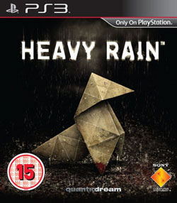
Seeing as developers Quantic Dream is a Paris-based company, it seems only appropriate to lead our Heavy Rain article with the European cover. This is the simplest of all the designs, it offers the hint of the wet, wet rain while including the origami character that is at the center of the game's plot. If Heavy Rain were a feature film, this would likely be its poster. This design doesn't try to convey Heavy Rain's convoluted plot, instead it focuses on a symbolic image and drenches it in water. This is a cover designed to
make you notice it and leave you with questions. What is this Heavy Rain and why is there an origami figure on the front? Even if it doesn't make you pick the box up, you'll no doubt remember the cover when you see a TV advert or when a friend mentions it. Best of all, this artwork tells you right up front that you're in for a dark and dreary adventure, not some generic florescent colored 3D platformer. If you're a fan of rain, origami and dead bodies, then Heavy Rain is the right game for you.[ PlayStation 3 - 2010 - Final Rating: A- ]
But look closer than the obvious tone of the box art. At first glance you see nothing more than the rain and the origami, but the more you study this design the more detail emerge. Take the origami figure as an example of the subtle detail. While it's easy to see nothing more than folded paper, you'll note that part of the leg is bloody. Is this foreshadowing something big in the game? The ground that this figurine sits on is also red, suggesting that perhaps there's more here than meets the eye. What used to look like a game about folding paper now resembles something far more sinister. Whose blood is that? Why is it out in the middle of the rain? And what is that in the distance? At the very least these questions should be enough to make you look at the back of the box, if not buy the game outright. I love the simplicity of this cover; it does a good job of conveying the tone and mood that makes this game so distinctive.
Heavy Rain (American)
[ PlayStation 3 - 2010 - Final Rating: C- ]
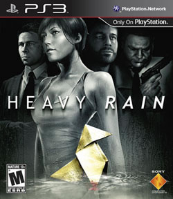
Leave it to the Americans to screw up a wonderful cover. While the European box art was simple and effective, this American artwork is busy and complicated. It isn't interested in making you interested in one symbolic object; it wants you to be intrigued by the four figures on the cover. Even more confusing, the cover art attempts to add sexuality to the mix, giving you the female character right up front (which is ironic, since you play her the least of any of the game's four leads). If perky breasts isn't enough to make
you buy the game, then Sony is hoping that the stoic FBI agent, grizzled father and fat guy with a gun will do the trick. They don't. So all we're left with is the original origami figure, this time stuck in a much larger puddle. Incidentally, we also get a brand new logo design, given added emphasis on the word "Rain". Is there a reason that words needs to be italicized? Is Sony trying to suggest that the title is sarcastic? It makes no sense.[ PlayStation 3 - 2010 - Final Rating: C- ]
The problem I have with this cover is that it's not effective. It's not like having these four characters on the front cover gives you more information about the story. It shows that this game is about more than folding paper, which shouldn't come as much of a surprise to anybody familiar with modern video games. If anything the characters give off the wrong impression, suggesting that the game is a lot more sexy and action-packed than it actually is. The blood is still on the origami's leg, but now it's bigger with a larger puddle of blood. But what's curious about this design is that the blood puddle seems to be at the bottom of a larger water puddle. Which way do you want it, Sony? Do you want us to focus on the blood or the water? You can't have it both ways. I don't believe for a second that Heavy Rain will do better in the retail space by simply slapping four random people on a cover. To me this cover comes off looking over crowded and unfocused. Worst of all, it looks a lot like a bad Photoshop job.
Heavy Rain (Japanese)
[ PlayStation 3 - 2010 - Final Rating: B ]
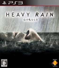
If the Europeans went simple and the Americans overcomplicated things, then leave it to the Japanese to go the complete opposite direction. Gone is the sexy girl. Gone is the origami. Gone is the blood. Instead of using elements from the American and European covers, the Japanese attempt something all together different. Here we have the bottom half of somebody's face coming up for air. The location is hard to determine, but
it looks like it's out in the middle of the ocean on a stormy night. The water is dark, the rain is really pouring down and things look dire for the man grasping for air. Then again, we don't actually see him breathing, so perhaps it's too late. Talk about heavy. Assuming this is indeed a close-up of a dead, floating body, then the Japanese have captured the atmosphere of Heavy Rain perfectly.[ PlayStation 3 - 2010 - Final Rating: B ]
There's just one BIG problem: None of this has anything to do with the story of Heavy Rain. Without spoiling too much before the game comes out, I can tell you that this cover makes almost no sense. To be fair, much of the game's story revolves around a serial killer who drowns people (that's revealed extremely early in the mystery). However, the similarities end there. For one thing, the man on the cover is far too old to be a victim of the Origami Killer. And that's not all; it's also confusing why he's out in the middle of the ocean. When gamers finally get to the end of Heavy Rain they're going to realize that this box art is a complete lie, clearly crafted by people who haven't actually played the game. This is the kind of box art you make when the only information you are given is the name of the game. It looks right and the image will stick in your mind, but it's just not what Heavy Rain is. It's the right concept for the wrong game.
Indigo Prophecy (American)
[ Xbox/PS2/PC - 2005 - Final Rating: B+ ]
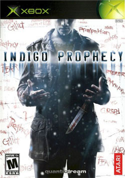
Now that we've taken a trip around the world with Heavy Rain, perhaps we should check out Quantic Dream's other interactive movie. Here we see the cover art for the Xbox version of Indigo Prophecy, the 2005 serial killer
adventure game. Forget about the Xbox for a moment, the artwork is the same for all versions of the game (including the PC and PlayStation 2). Assuming that European boxes are simple and Americans need humans on their cover to know it's not a game about folding paper, then what we have here is the perfect compromise between the different Heavy Rain boxes. Of course, those wild generalizations aren't even close to being accurate. There are terrible covers in every part of the world, so let's not pull too much from the covers above. [ Xbox/PS2/PC - 2005 - Final Rating: B+ ]
What I can say without any hesitation is that this box art will be noticed. Ever single inch of this box art is specifically designed to be noticed on a store shelve. Here we see a nameless man surprised by his actions. There's a bloody knife literally falling out of his hands and his body language suggests that this is news to him. And then there are the words scrolled out behind him. Even if we ignore the man and his knife, we are still looking at words like "guilt," "premonition," "chaos," "fear," and "dead." Clearly something big is going on and I dare you to ignore its calling. This is the exact same hook the movie Se7en used. Adding a bunch of schizophrenic words to a wall is the most compelling way of get people to care about your crime drama. It's true, just ask the guy with the bloody knife.
Fahrenheit (European)
[ Xbox/PS2/PC - 2005 - Final Rating: B- ]
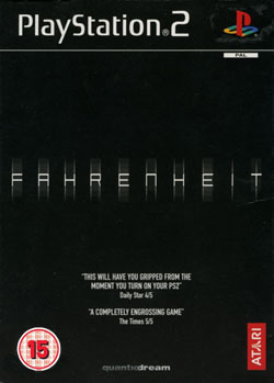
In many parts of the world, Indigo Prophecy was known as Fahrenheit. European gamers who picked the game up at retail were treated to this packaging slip, which features a plain black background, the name of the game and a couple of big time quotes. The style is simple, harkening back to a time when all you needed was a name to sell a game. But something about this plain black box art rubs me the wrong way. Maybe when it comes to a game like this you actually do need something more. I like the simplicity and
the blurry logo, but this cover needs something more than a couple of pull quotes. And while I'm on the subject of reviews, if you're going to use pull quotes, maybe you shouldn't write down the score unless it's really, really good. I don't care how gripped the critic at Daily Star was, he still only gave it a4 out of 5. Not that a 4 out of 5 is bad, but when I see a score like that I always feel like the quote isn't telling me the most important information. I always think that maybe the review will actually read: "This Will have you gripped from the moment you turn on your PlayStation 2 until the moment you turn it off and throw the game away, ten minutes later."[ Xbox/PS2/PC - 2005 - Final Rating: B- ]
Of course, nothing could be further from the truth. Both Indigo Prophecy and Heavy Rain are amazing games, well worth buying at any price. I went all the way through Heavy Rain in one sitting and was ready to start it back up again a day later. The story is instantly gripping and I liked each of the four lead characters. Best of all, this is a game that will genuinely surprise you. Who cares is the American cover doesn't look anywhere near as cool as what was found in France? At least the cover art was connected to the game, which is a lot more than I can say about that Japanese artwork. If you're a fan of murder mysteries and don't mind bad weather, then Heavy Rain was made for you. And who knows, maybe if you like that game you will double back and check out Indigo Prophecy (Fahrenheit). Trust me, these are two games you will never forget.
HOME |
CONTACT |
NOW HIRING |
WHAT IS DEFUNCT GAMES? |
NINTENDO SWITCH ONLINE |
RETRO-BIT PUBLISHING
Retro-Bit |
Switch Planet |
The Halcyon Show |
Same Name, Different Game |
Dragnix |
Press the Buttons
Game Zone Online | Hardcore Gamer | The Dreamcast Junkyard | Video Game Blogger
Dr Strife | Games For Lunch | Mondo Cool Cast | Boxed Pixels | Sega CD Universe | Gaming Trend
Game Zone Online | Hardcore Gamer | The Dreamcast Junkyard | Video Game Blogger
Dr Strife | Games For Lunch | Mondo Cool Cast | Boxed Pixels | Sega CD Universe | Gaming Trend
Copyright © 2001-2025 Defunct Games
All rights reserved. All trademarks are properties of their respective owners.
All rights reserved. All trademarks are properties of their respective owners.


