
- CLASSIC MAGAZINES
- REVIEW CREW
A show recapping what critics thought back
when classic games first came out! - NEXT GENERATION'S BEST & WORST
From the worst 1-star reviews to the best
5-stars can offer, this is Next Generation! - NINTENDO POWER (ARCHIVE)
Experience a variety of shows looking at the
often baffling history of Nintendo Power! - MAGAZINE RETROSPECTIVE
We're looking at the absolutely true history of
some of the most iconic game magazines ever! - SUPER PLAY'S TOP 600
The longest and most ambitious Super NES
countdown on the internet! - THEY SAID WHAT?
Debunking predictions and gossip found
in classic video game magazines! - NEXT GENERATION UNCOVERED
Cyril is back in this spin-off series, featuring the
cover critic review the art of Next Generation! - HARDCORE GAMER MAGAZING (PDF ISSUES)
Download all 36 issues of Hardcore Gamer
Magazine and relive the fun in PDF form!
- REVIEW CREW
- REVIEW ARCHIVE
- ELECTRONIC GAMING MONTHLY
- ELECTRONIC GAMING MONTHLY RANKS
From Mario to Sonic to Street Fighter, EGM
ranks classic game franchises and consoles! - ELECTRONIC GAMING MONTHLY BEST & WORST
Counting down EGM’s best and worst reviews
going year by year, from 1989 – 2009! - ELECTRONIC GAMING BEST & WORST AWARDS
11-part video series chronicling the ups and
downs of EGM’s Best & Worst Awards!
- ELECTRONIC GAMING MONTHLY RANKS
- GAME HISTORY
- GAME OVER: STORY BREAKDOWNS
Long-running series breaking down game
stories and analyzing their endings! - A BRIEF HISTORY OF GAMING w/ [NAME HERE]
Real history presented in a fun and pithy
format from a variety of game historians! - THE BLACK SHEEP
A series looking back at the black sheep
entries in popular game franchises! - INSTANT EXPERT
Everything you could possibly want to know
about a wide variety of gaming topics! - FREEZE FRAME
When something familiar happens in the games
industry, we're there to take a picture! - I'VE GOT YOUR NUMBER
Learn real video game history through a series
of number-themed episodes, starting at zero! - GREAT MOMENTS IN BAD ACTING
A joyous celebration of some of gaming's
absolute worst voice acting!
- GAME OVER: STORY BREAKDOWNS
- POPULAR SERIES
- DG NEWS w/ LORNE RISELEY
Newsman Lorne Riseley hosts a regular
series looking at the hottest gaming news! - REVIEW REWIND
Cyril replays a game he reviewed 10+ years
ago to see if he got it right or wrong! - ON-RUNNING FEUDS
Defunct Games' longest-running show, with
editorials, observations and other fun oddities! - DEFUNCT GAMES QUIZ (ARCHIVE)
From online quizzes to game shows, we're
putting your video game knowledge to the test!- QUIZ: ONLINE PASS
Take a weekly quiz to see how well you know
the news and current gaming events! - QUIZ: KNOW THE GAME
One-on-one quiz show where contestants
find out if they actually know classic games! - QUIZ: THE LEADERBOARD
Can you guess the game based on the classic
review? Find out with The Leaderboard!
- QUIZ: ONLINE PASS
- DEFUNCT GAMES VS.
Cyril and the Defunct Games staff isn't afraid
to choose their favorite games and more! - CYRIL READS WORLDS OF POWER
Defunct Games recreates classic game
novelizations through the audio book format!
- DG NEWS w/ LORNE RISELEY
- COMEDY
- GAME EXPECTANCY
How long will your favorite hero live? We crunch
the numbers in this series about dying! - VIDEO GAME ADVICE
Famous game characters answer real personal
advice questions with a humorous slant! - FAKE GAMES: GUERILLA SCRAPBOOK
A long-running series about fake games and
the people who love them (covers included)! - WORST GAME EVER
A contest that attempts to create the worst
video game ever made, complete with covers! - LEVEL 1 STORIES
Literature based on the first stages of some
of your favorite classic video games! - THE COVER CRITIC
One of Defunct Games' earliest shows, Cover
Critic digs up some of the worst box art ever! - COMMERCIAL BREAK
Take a trip through some of the best and
worst video game advertisements of all time! - COMIC BOOK MODS
You've never seen comics like this before.
A curious mix of rewritten video game comics!
- GAME EXPECTANCY
- FULL ARCHIVE
The Cover Critic Rides Again

They say you shouldn't judge a book by its cover. But since I've never heard that expression used against video games I figure that it's open season on the box art you see every day. This is The Cover Critic, your guide to what's good and bad in the world of video game boxes. In this episode we look at five of the absolute worst covers ever designed. I'm talking about the worst of the worst, box art so bad that you actually feel sorry for the game developers. Join us as we tackle punks in Street Warriors, abuse some animals in Krazy Kreatures, look around for the kid in Cowboy Kid, try to unravel Final Zone II, and wonder what the hell Karnaaj Rally is all about. Find out for yourself when you witness the 63rd episode of The Cover Critic!
Street Warriors (PS2)
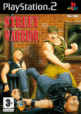
You won't believe me when I tell you this, but by the end of this episode you're going to be coming back to Street Warriors and realizing that this is the best cover of the lot. You're going to be sitting writing me emails letting me know that I was too harsh on Street Warrior, that I should take back my evil words. But before you realize just how terrible the rest of the covers are, let's enjoy Street Warriors while we can still claim to na?ve. (Why do I have a feeling that everybody who read this first paragraph simply skipped ahead to the end to see how much worse this episode gets?)
So here's Street Warrior, which proves that even the Village People can beat up morons with spiky Mohawks! Just once I would like to see the good guy be the person with the bad haircut, maybe it's time for AFI or Rancid to make their own games just to prove that even if you have the worst hair ever you can still be a pretty cool video game character. But I'm getting sidetracked here, the problem with this has nothing to do with Mohawks, it's the crazy fashion sense that the hero is sporting. For a gay man you have to wonder why this street warrior chooses to rock a camo muscle tee and yellow pants. I mean come on, yellow pants were so 1999. Even worse is the various graffiti written on the side of the abandoned building. Instead of realistic graffiti like "MS13" or "fuck the police", we get "Punks Rule". Punks Rule? That's the most threatening things these guys can do? No wonder they were able to get beaten up by some loser in yellow pants.
So here's Street Warrior, which proves that even the Village People can beat up morons with spiky Mohawks! Just once I would like to see the good guy be the person with the bad haircut, maybe it's time for AFI or Rancid to make their own games just to prove that even if you have the worst hair ever you can still be a pretty cool video game character. But I'm getting sidetracked here, the problem with this has nothing to do with Mohawks, it's the crazy fashion sense that the hero is sporting. For a gay man you have to wonder why this street warrior chooses to rock a camo muscle tee and yellow pants. I mean come on, yellow pants were so 1999. Even worse is the various graffiti written on the side of the abandoned building. Instead of realistic graffiti like "MS13" or "fuck the police", we get "Punks Rule". Punks Rule? That's the most threatening things these guys can do? No wonder they were able to get beaten up by some loser in yellow pants.
Krazy Kreatures (NES)
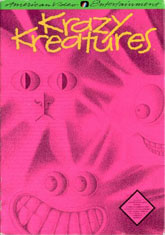
When I see a cover like this the first thing I look for is a disclaimer that lets me know that no animals were hurt in the making of this box art. Unfortunately I do not see such a sticker anywhere on this box, so all I can do is hope for the best (and not show it to any of the nearby animals). There's two schools of thought when it comes to a cover like this, either you like it because it will get your attention when it's on the shelf, or you hate it because the bright pink burns your eyeballs and keeps you from being able to see anything else. The good news is that if the sun ever burns out we can send this cover into the sky as a replacement.
But let's not get sidetracked, this cover is not here because it's bright and has more spelling errors than an official statement from Lindsay Lohan, Krazy Kreatures is here because of the characters on the front of the box. Ever wonder what your cats would look like if they had their faces up against a glass window during a nuclear explosion? Somehow I have a hunch that this would be the result. I can just see it, fifty years into the future documentaries would be made showing the tragic results of atomic energy as a weapon and this cover will show up. Just thinking about it makes me sick; those poor animals never had a chance. This would be the moment in our show when the sad violin music starts playing and everybody in the theater stars tearing up ... unfortunately we don't have the money for anything that extravagant. And apparently American Video Entertainment didn't have the money to create a less freaky cover.
But let's not get sidetracked, this cover is not here because it's bright and has more spelling errors than an official statement from Lindsay Lohan, Krazy Kreatures is here because of the characters on the front of the box. Ever wonder what your cats would look like if they had their faces up against a glass window during a nuclear explosion? Somehow I have a hunch that this would be the result. I can just see it, fifty years into the future documentaries would be made showing the tragic results of atomic energy as a weapon and this cover will show up. Just thinking about it makes me sick; those poor animals never had a chance. This would be the moment in our show when the sad violin music starts playing and everybody in the theater stars tearing up ... unfortunately we don't have the money for anything that extravagant. And apparently American Video Entertainment didn't have the money to create a less freaky cover.
Cowboy Kid (NES)
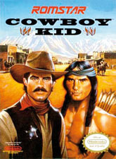
When you buy a game called "Cowboy Kid" you expect certain things. For one thing you expect your game to be set in the Wild West, where you'll see tumbleweeds going by and the mere thought of a paved street is patently ridiculous. The other thing you expect is that you will play some sort of kid, maybe not an infant (that would be stupid), but maybe a teenager just learning how to ride a horse and shoot a gun. Well, Romstar managed to get one of those things right. The only cowboy I see on this box has as mustache and a badge; I hardly think anybody would consider him to be a "kid." Perhaps Cowboy Man just didn't sound right. Or maybe that's just a little too redundant?
Either way, this cover is terrible. But I can't decide whether it's bad because of its ridiculous nature or what I'm bringing into it. I think I may have watched Ang Lee's Brokeback Mountain a few too many times, because every time I look at this cover I a cowboy and Indian who look like they're about to work on a peace treaty ... if you catch my meaning. You can tell because of the look on their face, they both look like they are longing for some kind of affection. And it wouldn't be completely out of the question, it's not like those classic westerns had a lot of women in them. How many female cast members were in Bonanza? One! So either she was really busy or the rest of the town had to make do with what they had. But maybe I'm missing the point of this cover, maybe there's nothing untoward about it. Maybe Mr. Mustache and his shirtless Indian friend are just here to welcome me to town. That seems like a nice thing to do, it's so rare to find people nice enough to greet you as you enter their town. Oh who am I kidding? I think it's just safer to focus on the fact that nobody on this cover even comes close to being a kid.
Either way, this cover is terrible. But I can't decide whether it's bad because of its ridiculous nature or what I'm bringing into it. I think I may have watched Ang Lee's Brokeback Mountain a few too many times, because every time I look at this cover I a cowboy and Indian who look like they're about to work on a peace treaty ... if you catch my meaning. You can tell because of the look on their face, they both look like they are longing for some kind of affection. And it wouldn't be completely out of the question, it's not like those classic westerns had a lot of women in them. How many female cast members were in Bonanza? One! So either she was really busy or the rest of the town had to make do with what they had. But maybe I'm missing the point of this cover, maybe there's nothing untoward about it. Maybe Mr. Mustache and his shirtless Indian friend are just here to welcome me to town. That seems like a nice thing to do, it's so rare to find people nice enough to greet you as you enter their town. Oh who am I kidding? I think it's just safer to focus on the fact that nobody on this cover even comes close to being a kid.
Final Zone II (TG-16)
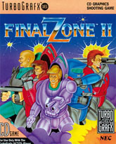
Before I spend too much time complaining about the terrible box art on display here, I think it's important to trot out a tried and true clich? that never gets old. If you're going to use the word "Final" in your game's name, it's important that it actually is the final game. Just knowing that there was a zone before this game that turned out to not be final one leads me to conclude that I shouldn't even bother with earlier game. It also makes me wonder if this zone is going to be final. There's just something unsettling about sequels that use the words "Final" and "Last". Maybe it's just me, but it makes me feel like they are somehow being disingenuous. Maybe that's something I should learn to get over.
What we have here is a cover that is laughably bad. Either the people that owned the TurboGrafz-16 weren't very picky or there was no money left over to turn this first draft into something really cool and eye catching. Either way, this box art drives about five miles past being truly horrible. Let's start with the stupid armor found in this game. When it came to selecting their silly costumes it's clear that each person went for their own individual style ... well, almost all of them. For some odd reason two of the people came to this dance with the same dress on. How embarrassing is that? To make matters even worse, this armor looks bad no matter how you wear it. Three of the fighters have the helmet up so that their head isn't protected. While that's not very wise, I have to say that the armor looks even worse when the helmet is down. And then there's the guy who isn't wearing a helmet at all, but he came with the same suit as the chick, so we already know he has no fashion sense. While we're nitpicking, why is it that most of the people have really big weapons (bazooka, double guns on the arm, etc.), yet the moron in blue came into the battle with a tiny speed gun - the type of weapon a traffic cop might use? And what is it these idiots are fighting? Looks to me like it's some sort of purple smoke coming from below them. This sounds like a perfect time for these guys to put on their masks and get the job done. Otherwise this really will be the final zone ... for them!
What we have here is a cover that is laughably bad. Either the people that owned the TurboGrafz-16 weren't very picky or there was no money left over to turn this first draft into something really cool and eye catching. Either way, this box art drives about five miles past being truly horrible. Let's start with the stupid armor found in this game. When it came to selecting their silly costumes it's clear that each person went for their own individual style ... well, almost all of them. For some odd reason two of the people came to this dance with the same dress on. How embarrassing is that? To make matters even worse, this armor looks bad no matter how you wear it. Three of the fighters have the helmet up so that their head isn't protected. While that's not very wise, I have to say that the armor looks even worse when the helmet is down. And then there's the guy who isn't wearing a helmet at all, but he came with the same suit as the chick, so we already know he has no fashion sense. While we're nitpicking, why is it that most of the people have really big weapons (bazooka, double guns on the arm, etc.), yet the moron in blue came into the battle with a tiny speed gun - the type of weapon a traffic cop might use? And what is it these idiots are fighting? Looks to me like it's some sort of purple smoke coming from below them. This sounds like a perfect time for these guys to put on their masks and get the job done. Otherwise this really will be the final zone ... for them!
Karnaaj Rally (GBA)
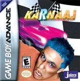
After more than sixty episodes of The Cover Critic I am rarely speechless, but I simply don't know what to say about Karnaaj Rally for the Game Boy Advance. If I didn't know better I would say this game was as fake; how else can you describe what has to be the single worst piece of cover art of all time? This picture alone makes me reevaluate all of the bad things I have said about Frog Bog, ICO, Beauty and the Beast, or Ghost Hunter. By comparison Kasumi Ninja looks like a million dollars! Dammit, it's just not fair. Nothing should make Kasumi Ninja look good! This cover is so bad that I even questioned whether or not I should include it in an episode of The Cover Critic, if you ask me the box art just cheapens the whole show.
But enough debating the merits of including it in this show, maybe we should move on to the real meat and potatoes of Karnaaj Rally. Believe it or not there aren't that many people in the video game industry I want to interview, but I am desperately trying to get a hold of the person that designed this box art so that I can see just what the hell he was thinking. I don't care if anybody else wants to know the story behind Karnaaj Rally, I just want to talk to the person for my own selfish reasons. I want to know why this guy's hair, eyes and eyebrows were PhotoShopped blue. And was there a reason they used somebody who had just been beaten up? And what's with that clip art car in the background? Was that to remind us that this is a racing game and not some portable fighter? And how much pain medication was the artist on when he (or she) decided to put all of these things together to make this horrible, horrible cover? Is the man in the picture making that face because he sees how stupid the cover looks? Did anybody really think this cover was a good idea? Anybody at all? As a fan of bad cover art I know that there is box art that is so bad that it's actually good ... but this is so bad that I have to wonder if a blind monkey simply beating his fist on the keyboard could have designed better art. When I look at this cover I have to focus my attention on the emphasized "R" in the title, because that's the best part of the design. In fact, there's no way I can give this cover an F, an F is simply too good for something like this. Karnaaj Rally deserves something lower, something way down the alphabet. Karnaaj Rally deserves an R!
But enough debating the merits of including it in this show, maybe we should move on to the real meat and potatoes of Karnaaj Rally. Believe it or not there aren't that many people in the video game industry I want to interview, but I am desperately trying to get a hold of the person that designed this box art so that I can see just what the hell he was thinking. I don't care if anybody else wants to know the story behind Karnaaj Rally, I just want to talk to the person for my own selfish reasons. I want to know why this guy's hair, eyes and eyebrows were PhotoShopped blue. And was there a reason they used somebody who had just been beaten up? And what's with that clip art car in the background? Was that to remind us that this is a racing game and not some portable fighter? And how much pain medication was the artist on when he (or she) decided to put all of these things together to make this horrible, horrible cover? Is the man in the picture making that face because he sees how stupid the cover looks? Did anybody really think this cover was a good idea? Anybody at all? As a fan of bad cover art I know that there is box art that is so bad that it's actually good ... but this is so bad that I have to wonder if a blind monkey simply beating his fist on the keyboard could have designed better art. When I look at this cover I have to focus my attention on the emphasized "R" in the title, because that's the best part of the design. In fact, there's no way I can give this cover an F, an F is simply too good for something like this. Karnaaj Rally deserves something lower, something way down the alphabet. Karnaaj Rally deserves an R!

Even More Articles

REVIEW - Rose & Locket
June 30th, 2026


REVIEW - Flesh Made Fear
June 24th, 2026


REVIEW - 4PGP
June 18th, 2026
Must-See Videos


Latest Reviews
View all


HOME |
CONTACT |
NOW HIRING |
WHAT IS DEFUNCT GAMES? |
NINTENDO SWITCH ONLINE |
RETRO-BIT PUBLISHING
Retro-Bit |
Switch Planet |
The Halcyon Show |
Same Name, Different Game |
Dragnix |
Press the Buttons
Game Zone Online | Hardcore Gamer | The Dreamcast Junkyard | Video Game Blogger
Dr Strife | Games For Lunch | Mondo Cool Cast | Boxed Pixels | Sega CD Universe | Gaming Trend
Game Zone Online | Hardcore Gamer | The Dreamcast Junkyard | Video Game Blogger
Dr Strife | Games For Lunch | Mondo Cool Cast | Boxed Pixels | Sega CD Universe | Gaming Trend
Copyright © 2001-2026 Defunct Games
All rights reserved. All trademarks are properties of their respective owners.
All rights reserved. All trademarks are properties of their respective owners.