
- CLASSIC MAGAZINES
- REVIEW CREW
A show recapping what critics thought back
when classic games first came out! - NEXT GENERATION'S BEST & WORST
From the worst 1-star reviews to the best
5-stars can offer, this is Next Generation! - NINTENDO POWER (ARCHIVE)
Experience a variety of shows looking at the
often baffling history of Nintendo Power! - MAGAZINE RETROSPECTIVE
We're looking at the absolutely true history of
some of the most iconic game magazines ever! - SUPER PLAY'S TOP 600
The longest and most ambitious Super NES
countdown on the internet! - THEY SAID WHAT?
Debunking predictions and gossip found
in classic video game magazines! - NEXT GENERATION UNCOVERED
Cyril is back in this spin-off series, featuring the
cover critic review the art of Next Generation! - HARDCORE GAMER MAGAZING (PDF ISSUES)
Download all 36 issues of Hardcore Gamer
Magazine and relive the fun in PDF form!
- REVIEW CREW
- REVIEW ARCHIVE
- ELECTRONIC GAMING MONTHLY
- ELECTRONIC GAMING MONTHLY RANKS
From Mario to Sonic to Street Fighter, EGM
ranks classic game franchises and consoles! - ELECTRONIC GAMING MONTHLY BEST & WORST
Counting down EGM’s best and worst reviews
going year by year, from 1989 – 2009! - ELECTRONIC GAMING BEST & WORST AWARDS
11-part video series chronicling the ups and
downs of EGM’s Best & Worst Awards!
- ELECTRONIC GAMING MONTHLY RANKS
- GAME HISTORY
- GAME OVER: STORY BREAKDOWNS
Long-running series breaking down game
stories and analyzing their endings! - A BRIEF HISTORY OF GAMING w/ [NAME HERE]
Real history presented in a fun and pithy
format from a variety of game historians! - THE BLACK SHEEP
A series looking back at the black sheep
entries in popular game franchises! - INSTANT EXPERT
Everything you could possibly want to know
about a wide variety of gaming topics! - FREEZE FRAME
When something familiar happens in the games
industry, we're there to take a picture! - I'VE GOT YOUR NUMBER
Learn real video game history through a series
of number-themed episodes, starting at zero! - GREAT MOMENTS IN BAD ACTING
A joyous celebration of some of gaming's
absolute worst voice acting!
- GAME OVER: STORY BREAKDOWNS
- POPULAR SERIES
- DG NEWS w/ LORNE RISELEY
Newsman Lorne Riseley hosts a regular
series looking at the hottest gaming news! - REVIEW REWIND
Cyril replays a game he reviewed 10+ years
ago to see if he got it right or wrong! - ON-RUNNING FEUDS
Defunct Games' longest-running show, with
editorials, observations and other fun oddities! - DEFUNCT GAMES QUIZ (ARCHIVE)
From online quizzes to game shows, we're
putting your video game knowledge to the test!- QUIZ: ONLINE PASS
Take a weekly quiz to see how well you know
the news and current gaming events! - QUIZ: KNOW THE GAME
One-on-one quiz show where contestants
find out if they actually know classic games! - QUIZ: THE LEADERBOARD
Can you guess the game based on the classic
review? Find out with The Leaderboard!
- QUIZ: ONLINE PASS
- DEFUNCT GAMES VS.
Cyril and the Defunct Games staff isn't afraid
to choose their favorite games and more! - CYRIL READS WORLDS OF POWER
Defunct Games recreates classic game
novelizations through the audio book format!
- DG NEWS w/ LORNE RISELEY
- COMEDY
- GAME EXPECTANCY
How long will your favorite hero live? We crunch
the numbers in this series about dying! - VIDEO GAME ADVICE
Famous game characters answer real personal
advice questions with a humorous slant! - FAKE GAMES: GUERILLA SCRAPBOOK
A long-running series about fake games and
the people who love them (covers included)! - WORST GAME EVER
A contest that attempts to create the worst
video game ever made, complete with covers! - LEVEL 1 STORIES
Literature based on the first stages of some
of your favorite classic video games! - THE COVER CRITIC
One of Defunct Games' earliest shows, Cover
Critic digs up some of the worst box art ever! - COMMERCIAL BREAK
Take a trip through some of the best and
worst video game advertisements of all time! - COMIC BOOK MODS
You've never seen comics like this before.
A curious mix of rewritten video game comics!
- GAME EXPECTANCY
- FULL ARCHIVE
The Cover Critic Delves Into Obscurity

They say you shouldn't judge a book by its cover. But since I've never heard that expression used against video games I figure that it's open season on the box art you see every day. This is The Cover Critic, your guide to what's good and bad in the world of video game boxes. In this episode of The Cover Critic we go back in time to discover what ever happened to the obscure video game boxes. We delve into the murky waters to uncover games like Amidar, Frantic and the Queen of Queens. And then to wrap it all up we locate two games I bet you've never heard of, Pac-Man and Bomberman. There is nothing more obscure than Pac-Man! Oh, wait ... perhaps we should just let this adventure begin ...
Amidar (Atari 2600)
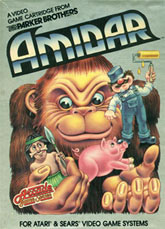
We start our look at obscure cover art with a game called Amidar for the Atari 2600. If you've never experienced Amidar then you probably aren't familiar with what is going on here, especially since this game uses just about everything you see in the artwork. At one point in the game you play a monkey being chased by savages, while in another part of the game you are a man with a paint roller being pursued by pigs. Fans of the game may find that this cover makes complete sense, but for everybody else looking at this 25 year old arcade port it's hard to imagine just what kind of game this could be.
Despite the fact that I actually know what this game is about, I am actually confused by some of the images found on this box art. For example, why is it that the gorilla and the tribesman look like they are in love? Perhaps it's because I've watched every version of King Kong ever created, but there's something about their eyes that gives me a feeling that they are more than friends. And while we're at it, what does that gorilla need a pig for? And what exactly is that painter with the red nose standing on? It looks like the guy is just floating in air, barely out of reach for this little piggy that decided not to go to market. Everybody on this cover looks happy; it's as if everybody is content with their situation. Yet this game is about running away from the pig, avoiding the savages, and so on. If they are all such friends then how do you justify the game? And what do pigs have against painters anyway? Perhaps I shouldn't over think this box art, maybe it's time we just move on to more disturbing covers.
Despite the fact that I actually know what this game is about, I am actually confused by some of the images found on this box art. For example, why is it that the gorilla and the tribesman look like they are in love? Perhaps it's because I've watched every version of King Kong ever created, but there's something about their eyes that gives me a feeling that they are more than friends. And while we're at it, what does that gorilla need a pig for? And what exactly is that painter with the red nose standing on? It looks like the guy is just floating in air, barely out of reach for this little piggy that decided not to go to market. Everybody on this cover looks happy; it's as if everybody is content with their situation. Yet this game is about running away from the pig, avoiding the savages, and so on. If they are all such friends then how do you justify the game? And what do pigs have against painters anyway? Perhaps I shouldn't over think this box art, maybe it's time we just move on to more disturbing covers.
Bomberman (TurboGrafx-16)
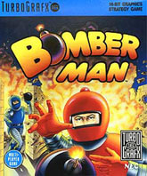
Bomberman is one of the most enduring multiplayer games of all time, an addictive little puzzle game that offers up an exciting party experience that features a combination of luck and skill. These days we've grown fond of the short little Bomberman characters, tiny little humans with huge horizontal eyes and a crazy costume that looks extremely uncomfortable to wear. But this well known Bomberman character hasn't always looked so cute, just check out this funky TurboGrafx-16 cover that gives us realistic characters in real danger of getting blown up.
I'm not sure what's worse, the fact that when I see this cover all of the innocence of Bomberman is gone or the fact that this character makes me feel bad for enjoying this multiplayer bomb fest. The Bomberman design here is simply atrocious, they appear to be wearing spandex pants, a metal shirt, and a helmet that looks a lot like a blown-up condom. What exactly is that nipple at the top of his head for? And what does it appear that the red Bomberman is clutching his chest after throwing his bomb? You would think that with all the fire and explosions going on behind him that red guy would know to check what's going on all around him and see that blue guy just out in the open. If the fire didn't phase you, then certainly the bricks and debris flying around would. And how much protection can that helmet get with that open area for the eyes? Perhaps these questions aren't really that important, especially when the biggest question of all has yet to be answered: who would buy a Bomberman game with these kinds of characters on the box?
I'm not sure what's worse, the fact that when I see this cover all of the innocence of Bomberman is gone or the fact that this character makes me feel bad for enjoying this multiplayer bomb fest. The Bomberman design here is simply atrocious, they appear to be wearing spandex pants, a metal shirt, and a helmet that looks a lot like a blown-up condom. What exactly is that nipple at the top of his head for? And what does it appear that the red Bomberman is clutching his chest after throwing his bomb? You would think that with all the fire and explosions going on behind him that red guy would know to check what's going on all around him and see that blue guy just out in the open. If the fire didn't phase you, then certainly the bricks and debris flying around would. And how much protection can that helmet get with that open area for the eyes? Perhaps these questions aren't really that important, especially when the biggest question of all has yet to be answered: who would buy a Bomberman game with these kinds of characters on the box?
Pac-Man (Atari 400/800)
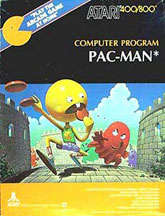
Everybody knows what Pac-Man looks like. This is one of the most popular video game characters of all time, a creation that is easy to draw and hard to mess up. When you see a picture of Pac-Man you know exactly what you're getting, everybody does, that's the brilliance of the Pac-Man design. But apparently Atari didn't feel that the original Pac-Man design was interesting enough, that's why they decided to hire an artist to interpret what the hungry yellow guy should look like. In doing so this artist managed to take one of the most recognizable figures of all time and turn him into a scrawny little dude with a big head and bad taste in fashion. This is one of the worst video game covers of all time. It's so bad that even the ghosts have sympathy for poor Pac-Man.
We would be remiss if we didn't take note of the terrible Pac-Man design featured on this box art; it's among the worst I have ever seen the yellow guy look. Even when he was yucking it up in his very own Saturday morning cartoon, Pac-Man still managed to look half-decent. But here we have a guy with a head the size of a small planet and the body of Clay Aiken. Apparently the artists felt that Pac-Man only weighed 65 pounds, with 64 of those pounds in his over sized head. His arms and legs look like they came off of a 90 year old woman, and his shoes are a size 20. The jean shorts aren't doing much, either. And why does Pac-Man feature buck teeth? And while we're examining this horrible cover art, who knew that Pac-Man was racing around catching Frisbees in a castle environment? With only one tooth it looks like its hard for Pac-Man to chew his food, so why should he even bother collecting more? It's not like the ghosts are there to steal his food, just as long as he can out run the four dead guys he shouldn't have too much trouble getting the sustenance he needs each and every time he gets hungry. And is it just me or is the orange ghost on the left running? I didn't think ghosts had legs. Oh Pac-Man, what have they done to you?
We would be remiss if we didn't take note of the terrible Pac-Man design featured on this box art; it's among the worst I have ever seen the yellow guy look. Even when he was yucking it up in his very own Saturday morning cartoon, Pac-Man still managed to look half-decent. But here we have a guy with a head the size of a small planet and the body of Clay Aiken. Apparently the artists felt that Pac-Man only weighed 65 pounds, with 64 of those pounds in his over sized head. His arms and legs look like they came off of a 90 year old woman, and his shoes are a size 20. The jean shorts aren't doing much, either. And why does Pac-Man feature buck teeth? And while we're examining this horrible cover art, who knew that Pac-Man was racing around catching Frisbees in a castle environment? With only one tooth it looks like its hard for Pac-Man to chew his food, so why should he even bother collecting more? It's not like the ghosts are there to steal his food, just as long as he can out run the four dead guys he shouldn't have too much trouble getting the sustenance he needs each and every time he gets hungry. And is it just me or is the orange ghost on the left running? I didn't think ghosts had legs. Oh Pac-Man, what have they done to you?
Frantic (MSX-2)
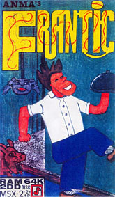
I've made a lot of fun of video game companies that appear to spend very little time working on their box art. Heck, just in this episode alone I have complained about the way Pac-Man looks and how stupid those Bombermen are. But when it comes to companies spending no money or time on their box art there is only one game that can be the absolute worst ... and that game is Frantic. Frantic is the epitome of lazy, it's as if they asked a classroom full of third graders to draw the ugliest thing they could think of and then chose the worst of the submissions. This wouldn't even work as an early morning cartoon, let alone a cover for a full length video game.
Without even playing this game there are a few things you can take from this cover art. For one thing, your main character appears to be a waiter. And while the name is frantic (which goes a long way to explain the life of a waiter) this guy doesn't appear to be in a hurry. He has a big smile on his face and he's taking Monty Python-style steps. And let's not forget that he's not even looking where he's going! From what I can see this guy doesn't seem to be too worried about getting the food to the table in a timely fashion ... or even that there's an angry dog behind him that looks like he wants whatever is under that tray. Oh, and did I mention that the spider seems to be the same size as the dog? And is that a web he's hanging from or a giant rope? But as stupid as all of this is, I can't help but come back to the fact that this artwork appears to be done by somebody who had never drawn before and was in a hurry. If you were to release this box art today I suspect that no store would even stock it, it's about as amateurish as you can possibly get. The only thing remotely good about this artwork is that logo, and even that is kind of confusing.
Without even playing this game there are a few things you can take from this cover art. For one thing, your main character appears to be a waiter. And while the name is frantic (which goes a long way to explain the life of a waiter) this guy doesn't appear to be in a hurry. He has a big smile on his face and he's taking Monty Python-style steps. And let's not forget that he's not even looking where he's going! From what I can see this guy doesn't seem to be too worried about getting the food to the table in a timely fashion ... or even that there's an angry dog behind him that looks like he wants whatever is under that tray. Oh, and did I mention that the spider seems to be the same size as the dog? And is that a web he's hanging from or a giant rope? But as stupid as all of this is, I can't help but come back to the fact that this artwork appears to be done by somebody who had never drawn before and was in a hurry. If you were to release this box art today I suspect that no store would even stock it, it's about as amateurish as you can possibly get. The only thing remotely good about this artwork is that logo, and even that is kind of confusing.
Queens of Queens (PC-FX)
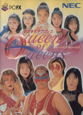
For a lot of American men there is nothing sexier than an Asian woman, there's something intriguing and cute about the look and style of these women. Oh, I'm sure I'll get plenty of angry emails telling me that it's only a stereotype and that I'm racist, but I'm clearly not the only white man to understand the allure of Asian women (just look at James Bond, Woody Allen, and John Lennon). But Queen of Queens, a game for the NEC PC-FX system, is one game that is here to show us that not all Asian women are the petite and sexy kittens we think of, some of them are large man-sized creatures with way too much face paint.
This cover confuses me, it's almost like it's a before (the girls at the top of the screen) and after (the girls they become before they start wrestling) picture. Those girls at the top of the box look like they just got done preparing for the Ice Capades, what with their beautiful outfits and sexy make up. But it's hard to pay too much attention to these beauties when most of the box is made up of the plus-sized group of fighting women we see at the bottom. For one thing the make up doesn't help. It would be unfair of me to simply pick on the two women with giant art pieces on their face, so I will address the one that troubles me the most: the blonde with blue lipstick. Whoever said that blue was a good color for the lips should be taken out back and shot; it's like the Smurf version of the Goth look. And then there's the girl in black who looks like she's shocked that somebody is taking a picture of her. In fact, both girls on the right look kind of shocked. The only one that looks comfortable is the woman in the middle, the one you really don't want to get on the wrong side of. Ah well, at least the Queen of Queens is still better than the King of Queens!
This cover confuses me, it's almost like it's a before (the girls at the top of the screen) and after (the girls they become before they start wrestling) picture. Those girls at the top of the box look like they just got done preparing for the Ice Capades, what with their beautiful outfits and sexy make up. But it's hard to pay too much attention to these beauties when most of the box is made up of the plus-sized group of fighting women we see at the bottom. For one thing the make up doesn't help. It would be unfair of me to simply pick on the two women with giant art pieces on their face, so I will address the one that troubles me the most: the blonde with blue lipstick. Whoever said that blue was a good color for the lips should be taken out back and shot; it's like the Smurf version of the Goth look. And then there's the girl in black who looks like she's shocked that somebody is taking a picture of her. In fact, both girls on the right look kind of shocked. The only one that looks comfortable is the woman in the middle, the one you really don't want to get on the wrong side of. Ah well, at least the Queen of Queens is still better than the King of Queens!

Even More Articles

REVIEW - Rose & Locket
June 30th, 2026


REVIEW - Flesh Made Fear
June 24th, 2026


REVIEW - 4PGP
June 18th, 2026
Must-See Videos


Latest Reviews
View all


HOME |
CONTACT |
NOW HIRING |
WHAT IS DEFUNCT GAMES? |
NINTENDO SWITCH ONLINE |
RETRO-BIT PUBLISHING
Retro-Bit |
Switch Planet |
The Halcyon Show |
Same Name, Different Game |
Dragnix |
Press the Buttons
Game Zone Online | Hardcore Gamer | The Dreamcast Junkyard | Video Game Blogger
Dr Strife | Games For Lunch | Mondo Cool Cast | Boxed Pixels | Sega CD Universe | Gaming Trend
Game Zone Online | Hardcore Gamer | The Dreamcast Junkyard | Video Game Blogger
Dr Strife | Games For Lunch | Mondo Cool Cast | Boxed Pixels | Sega CD Universe | Gaming Trend
Copyright © 2001-2026 Defunct Games
All rights reserved. All trademarks are properties of their respective owners.
All rights reserved. All trademarks are properties of their respective owners.