
- CLASSIC MAGAZINES
- REVIEW CREW
A show recapping what critics thought back
when classic games first came out! - NEXT GENERATION'S BEST & WORST
From the worst 1-star reviews to the best
5-stars can offer, this is Next Generation! - NINTENDO POWER (ARCHIVE)
Experience a variety of shows looking at the
often baffling history of Nintendo Power! - MAGAZINE RETROSPECTIVE
We're looking at the absolutely true history of
some of the most iconic game magazines ever! - SUPER PLAY'S TOP 600
The longest and most ambitious Super NES
countdown on the internet! - THEY SAID WHAT?
Debunking predictions and gossip found
in classic video game magazines! - NEXT GENERATION UNCOVERED
Cyril is back in this spin-off series, featuring the
cover critic review the art of Next Generation! - HARDCORE GAMER MAGAZING (PDF ISSUES)
Download all 36 issues of Hardcore Gamer
Magazine and relive the fun in PDF form!
- REVIEW CREW
- REVIEW ARCHIVE
- ELECTRONIC GAMING MONTHLY
- ELECTRONIC GAMING MONTHLY RANKS
From Mario to Sonic to Street Fighter, EGM
ranks classic game franchises and consoles! - ELECTRONIC GAMING MONTHLY BEST & WORST
Counting down EGM’s best and worst reviews
going year by year, from 1989 – 2009! - ELECTRONIC GAMING BEST & WORST AWARDS
11-part video series chronicling the ups and
downs of EGM’s Best & Worst Awards!
- ELECTRONIC GAMING MONTHLY RANKS
- GAME HISTORY
- GAME OVER: STORY BREAKDOWNS
Long-running series breaking down game
stories and analyzing their endings! - A BRIEF HISTORY OF GAMING w/ [NAME HERE]
Real history presented in a fun and pithy
format from a variety of game historians! - THE BLACK SHEEP
A series looking back at the black sheep
entries in popular game franchises! - INSTANT EXPERT
Everything you could possibly want to know
about a wide variety of gaming topics! - FREEZE FRAME
When something familiar happens in the games
industry, we're there to take a picture! - I'VE GOT YOUR NUMBER
Learn real video game history through a series
of number-themed episodes, starting at zero! - GREAT MOMENTS IN BAD ACTING
A joyous celebration of some of gaming's
absolute worst voice acting!
- GAME OVER: STORY BREAKDOWNS
- POPULAR SERIES
- DG NEWS w/ LORNE RISELEY
Newsman Lorne Riseley hosts a regular
series looking at the hottest gaming news! - REVIEW REWIND
Cyril replays a game he reviewed 10+ years
ago to see if he got it right or wrong! - ON-RUNNING FEUDS
Defunct Games' longest-running show, with
editorials, observations and other fun oddities! - DEFUNCT GAMES QUIZ (ARCHIVE)
From online quizzes to game shows, we're
putting your video game knowledge to the test!- QUIZ: ONLINE PASS
Take a weekly quiz to see how well you know
the news and current gaming events! - QUIZ: KNOW THE GAME
One-on-one quiz show where contestants
find out if they actually know classic games! - QUIZ: THE LEADERBOARD
Can you guess the game based on the classic
review? Find out with The Leaderboard!
- QUIZ: ONLINE PASS
- DEFUNCT GAMES VS.
Cyril and the Defunct Games staff isn't afraid
to choose their favorite games and more! - CYRIL READS WORLDS OF POWER
Defunct Games recreates classic game
novelizations through the audio book format!
- DG NEWS w/ LORNE RISELEY
- COMEDY
- GAME EXPECTANCY
How long will your favorite hero live? We crunch
the numbers in this series about dying! - VIDEO GAME ADVICE
Famous game characters answer real personal
advice questions with a humorous slant! - FAKE GAMES: GUERILLA SCRAPBOOK
A long-running series about fake games and
the people who love them (covers included)! - WORST GAME EVER
A contest that attempts to create the worst
video game ever made, complete with covers! - LEVEL 1 STORIES
Literature based on the first stages of some
of your favorite classic video games! - THE COVER CRITIC
One of Defunct Games' earliest shows, Cover
Critic digs up some of the worst box art ever! - COMMERCIAL BREAK
Take a trip through some of the best and
worst video game advertisements of all time! - COMIC BOOK MODS
You've never seen comics like this before.
A curious mix of rewritten video game comics!
- GAME EXPECTANCY
- FULL ARCHIVE
The Cover Critic Is 8-Bit

They say you shouldn't judge a book by its cover. But since I've never heard that expression used against video games I figure that it's open season on the box art you see every day. This is The Cover Critic, your guide to what's good and bad in the world of video game boxes. In this episode of The Cover Critic we go back in time to discover the best and worst (mostly worst) of 8-Bit box art. It's time to look at the redundant cover that is Shooting Range, the confusing Solomon's Key, the super uncool Kid Kool, and a game that is actually named Attack in New York. And that's not all, somehow we found the time to discuss why Bump 'N' Jump is not a very good name for a racing game! But enough with the yacking, it's time to experience another episode of The Cover Critic! Let the adventure begin ...
Attack in New York (NES)
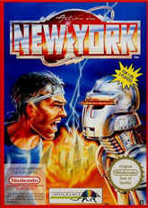
When reviewing a cover like Attack in New York it's probably best we forget any of the REAL attacks in New York. For example, it wouldn't be fair to this game to constantly remind our viewers about September 11th, 2001. And perhaps we should try and forget about the first World Trade Center bombing back in 1993. Instead we should think about a distant time when lightning strikes and thousands of robot-like creatures attack the economic capitol of the United States. This is a fictional Attack in New York, the kind that you and I can get on board with. We won't need the military for this one, you can pretty much forget about air marshals. Oh no, our first line of defense against these Geordi La Forge-like robots is a band of tough New Yorkers who aren't going to take it any more. They just got out of Bally's Total Fitness and are looking to kick some robot ass ... or at least yell at the robots. This cover certainly doesn't make it real clear what the New Yorker is going to do, I can only hope that he doesn't see his city covered in flames.
But you know what, as hard as I try I just can't get over the real attacks in New York. This cover even features the one landmark in New York City that was attacked ... twice. Attack in New York gets a pass since it was released long before any real attacks actually happened, but here in 2006 it's extremely difficult to look at this cover without being reminded of the 3,000 people that died on 9/11. This cover takes us back to a much simpler time, a time when all it took was a guy sporting a stupid headband yelling at the attackers. If only that worked against Al Qaeda.
But you know what, as hard as I try I just can't get over the real attacks in New York. This cover even features the one landmark in New York City that was attacked ... twice. Attack in New York gets a pass since it was released long before any real attacks actually happened, but here in 2006 it's extremely difficult to look at this cover without being reminded of the 3,000 people that died on 9/11. This cover takes us back to a much simpler time, a time when all it took was a guy sporting a stupid headband yelling at the attackers. If only that worked against Al Qaeda.
Kid Kool (NES)
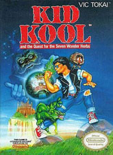
The easiest way to tell if you're a cool character or not is to look at the name; if your name has the word "cool" in it then you, my friend, are absolutely not cool. You are even less cool if that "Cool" is spelled wrong! And buddy, if you're a twentysomething man passing yourself off as a "Kid", then you are beyond anybody's help. I mean, even Lil Bow Wow dropped the "Lil" once he hit puberty. Unfortunately Kool Kid manages to hit all three of those no-no's, he's up there with Blasto and Bubsy as one of the worst video game characters of all time. And it's not just him that's so uncool, look at those threads he's sporting. It's like he's trying to be Fonzie only pants that have the knees warn out. And you know what the real tragedy is? Kid Kool probably bought those pants as is at the Gap. The only person that could possibly think that this guy was cool was the marketing department at Vic Tokai.
And then there's the issue of the name, Kid Kool and the Quest for the Seven Wonder Herbs. First of all, that name is entirely too long. The best games know that you have to keep it snappy. It has to be something like "Resident Evil: Code Veronica" or "Super Mario Advance 4: Super Mario Bros. 3", now that's how you name a video game. And what's up with that Seven Wonder Herbs?? If it's good enough, all you really need is one wonder herb to get you stoned. I don't know why this guy is so damn greedy. And what's he doing going through all this headache to get it? I'm sure if he asked around he wouldn't have a problem finding one of his friends selling the sticky stuff. But then, Kid Kool looks more like a speed freak, the type of cat who will have severe heart problems due to the constant use of steroids and other uppers. Somebody needs to remind Kid Kool that he doesn't have to do everything, the world does not rest on his shoulders. Sometimes it's fine to just sit back with your bong and watch a little Jerry Springer. Trust me on this one, Mr. Kool.
And then there's the issue of the name, Kid Kool and the Quest for the Seven Wonder Herbs. First of all, that name is entirely too long. The best games know that you have to keep it snappy. It has to be something like "Resident Evil: Code Veronica" or "Super Mario Advance 4: Super Mario Bros. 3", now that's how you name a video game. And what's up with that Seven Wonder Herbs?? If it's good enough, all you really need is one wonder herb to get you stoned. I don't know why this guy is so damn greedy. And what's he doing going through all this headache to get it? I'm sure if he asked around he wouldn't have a problem finding one of his friends selling the sticky stuff. But then, Kid Kool looks more like a speed freak, the type of cat who will have severe heart problems due to the constant use of steroids and other uppers. Somebody needs to remind Kid Kool that he doesn't have to do everything, the world does not rest on his shoulders. Sometimes it's fine to just sit back with your bong and watch a little Jerry Springer. Trust me on this one, Mr. Kool.
Solomon's Key (NES)
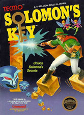
As far as art and style goes, Solomon's Key is probably the high water mark for this episode of The Cover Critic. It has an intriguing look and you have to love the logo that takes full advantage of the key. There's no doubt about it, this cover is a winner as far as 8-Bit boxes go. So what could possibly be wrong? Why should we talk about a cover like this on a feature like The Cover Critic? Perhaps it has something to do with those floating blocks our hero is standing on. I don't know about you, but I don't trust floating blocks, especially the kind where you can't even stand on one single block, it just seems unsafe to me. I don't know about you, but if I saw a floating block way up high I probably wouldn't stand on it, call me a wimp but that just doesn't seem very safe.
My favorite part of the box is at the top where it says "A ? Million Sold in Japan." Certainly there has to be a more awkward way of expressing the high sales in the land of the rising sun. But you know, it's fun to think back at a time when "a ? million" was a high number. These days we live in an era where "a ? million" games is barely enough to break even with the investment. But did we really need to be told that this was a popular game? Couldn't we tell by this badass cover art? It has fairies, any game with fairies right on the cover has to be a worldwide best seller. And those floating heads, I mean, this has to be one of the biggest games of all time if it's going to feature awesome floating heads like that. And just in case you forgot that there were "A ? Million Sold In Japan," Solomon's Key is here to remind you that it's an "Arcade Hit." Of course it is, it has fairies! And we Americans can't get enough of fairies!
My favorite part of the box is at the top where it says "A ? Million Sold in Japan." Certainly there has to be a more awkward way of expressing the high sales in the land of the rising sun. But you know, it's fun to think back at a time when "a ? million" was a high number. These days we live in an era where "a ? million" games is barely enough to break even with the investment. But did we really need to be told that this was a popular game? Couldn't we tell by this badass cover art? It has fairies, any game with fairies right on the cover has to be a worldwide best seller. And those floating heads, I mean, this has to be one of the biggest games of all time if it's going to feature awesome floating heads like that. And just in case you forgot that there were "A ? Million Sold In Japan," Solomon's Key is here to remind you that it's an "Arcade Hit." Of course it is, it has fairies! And we Americans can't get enough of fairies!
Shooting Range (NES)
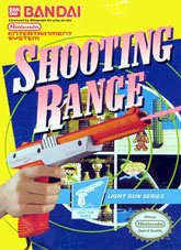
Shooting Range is a light gun game for the Nintendo Entertainment System that uses the NES Zapper. How do I know this? Because the name of the game is Shooting Range and it only makes sense. There's also a picture of a kid holding the NES Zapper right on the cover, front and center. Oh ... and right next to that it actually says, "Light Gun Series." So if you somehow bought this game and didn't own the NES Zapper then you probably don't deserve to own a video game, the concept may just be a little above your head. I'm not sure Bandai could have made this cover any clearer, but I'm sure there were a few kids out there that didn't catch the hint and bought it anyway, since shooting ranges are so popular amongst children.
Beyond the fact that this cover reminds you several times that it is made for the NES Zapper, this is just one box that really makes me mad. For one thing, it's super ugly. That yellow around the edges doesn't go with the dark blue, and the targets look more like something you would see in a 1950s Sci-Fi movie. And from what I can see of the game on the box, it looks like you're shooting aliens, criminals and ... Indians?? I know this was the 1980s, but let's have a little respect for the Native Americans. After all, we already murdered them and took their land, how about we ease up on the virtual killing and virtual taking of their land. The rest of the cover is a mess, especially the kid grasping that gun. Those fingers are so small and boney that it almost looks like an alien holding the Zapper. But it's not, it's just some loser that was tricked into being a hand model for a terrible light gun game.
Beyond the fact that this cover reminds you several times that it is made for the NES Zapper, this is just one box that really makes me mad. For one thing, it's super ugly. That yellow around the edges doesn't go with the dark blue, and the targets look more like something you would see in a 1950s Sci-Fi movie. And from what I can see of the game on the box, it looks like you're shooting aliens, criminals and ... Indians?? I know this was the 1980s, but let's have a little respect for the Native Americans. After all, we already murdered them and took their land, how about we ease up on the virtual killing and virtual taking of their land. The rest of the cover is a mess, especially the kid grasping that gun. Those fingers are so small and boney that it almost looks like an alien holding the Zapper. But it's not, it's just some loser that was tricked into being a hand model for a terrible light gun game.
Bump 'N' Jump (NES)
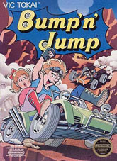
I always like it when the name of the game is so descriptive. This is Bump 'N' Jump, the second game by Vic Tokai we've reviewed in this episode of The Cover Critic. Bump 'N' Jump sounds like it could be any one of the countless Mario-clones released on the NES, but it's actually a racing game that features you and your chubby girlfriend. When you add in the plus-sized woman into the equation all of a sudden the name Bump 'N' Jump has a completely different meaning.
But I digress ... this cover doesn't work for me for a couple of reasons. For one thing, couldn't they find a vehicle that could fit both characters? Apparently the car they chose wasn't even big enough for one person, let alone your fatso girlfriend in back. The main character can't even keep his legs in the car and the girl isn't doing much better with her foot up against the wheel. And the placement of the exhaust seems especially dangerous, if the vehicle decides to accelerate it looks like your Monica Lewinsky look alike girlfriend is going to get a mouth full of pollution. Oh, and while I'm at it, why is there bumping and jumping in a car? Shouldn't the name of the game be Crash 'N' Burn or something? Cars don't jump and a little bumping isn't that big of a deal. And seriously, why did this guy decide to bring his lard ass girlfriend on the adventure? Wouldn't it be a better use of her time to be home doing the Stair Master while watching reruns of Mad About You? Use your noggins, that car just isn't big enough for the two and a half of you!
But I digress ... this cover doesn't work for me for a couple of reasons. For one thing, couldn't they find a vehicle that could fit both characters? Apparently the car they chose wasn't even big enough for one person, let alone your fatso girlfriend in back. The main character can't even keep his legs in the car and the girl isn't doing much better with her foot up against the wheel. And the placement of the exhaust seems especially dangerous, if the vehicle decides to accelerate it looks like your Monica Lewinsky look alike girlfriend is going to get a mouth full of pollution. Oh, and while I'm at it, why is there bumping and jumping in a car? Shouldn't the name of the game be Crash 'N' Burn or something? Cars don't jump and a little bumping isn't that big of a deal. And seriously, why did this guy decide to bring his lard ass girlfriend on the adventure? Wouldn't it be a better use of her time to be home doing the Stair Master while watching reruns of Mad About You? Use your noggins, that car just isn't big enough for the two and a half of you!

Even More Articles

REVIEW - Rose & Locket
June 30th, 2026


REVIEW - Flesh Made Fear
June 24th, 2026


REVIEW - 4PGP
June 18th, 2026
Must-See Videos


Latest Reviews
View all


HOME |
CONTACT |
NOW HIRING |
WHAT IS DEFUNCT GAMES? |
NINTENDO SWITCH ONLINE |
RETRO-BIT PUBLISHING
Retro-Bit |
Switch Planet |
The Halcyon Show |
Same Name, Different Game |
Dragnix |
Press the Buttons
Game Zone Online | Hardcore Gamer | The Dreamcast Junkyard | Video Game Blogger
Dr Strife | Games For Lunch | Mondo Cool Cast | Boxed Pixels | Sega CD Universe | Gaming Trend
Game Zone Online | Hardcore Gamer | The Dreamcast Junkyard | Video Game Blogger
Dr Strife | Games For Lunch | Mondo Cool Cast | Boxed Pixels | Sega CD Universe | Gaming Trend
Copyright © 2001-2026 Defunct Games
All rights reserved. All trademarks are properties of their respective owners.
All rights reserved. All trademarks are properties of their respective owners.