
- CLASSIC MAGAZINES
- REVIEW CREW
A show recapping what critics thought back
when classic games first came out! - NEXT GENERATION'S BEST & WORST
From the worst 1-star reviews to the best
5-stars can offer, this is Next Generation! - NINTENDO POWER (ARCHIVE)
Experience a variety of shows looking at the
often baffling history of Nintendo Power! - MAGAZINE RETROSPECTIVE
We're looking at the absolutely true history of
some of the most iconic game magazines ever! - SUPER PLAY'S TOP 600
The longest and most ambitious Super NES
countdown on the internet! - THEY SAID WHAT?
Debunking predictions and gossip found
in classic video game magazines! - NEXT GENERATION UNCOVERED
Cyril is back in this spin-off series, featuring the
cover critic review the art of Next Generation! - HARDCORE GAMER MAGAZING (PDF ISSUES)
Download all 36 issues of Hardcore Gamer
Magazine and relive the fun in PDF form!
- REVIEW CREW
- REVIEW ARCHIVE
- ELECTRONIC GAMING MONTHLY
- ELECTRONIC GAMING MONTHLY RANKS
From Mario to Sonic to Street Fighter, EGM
ranks classic game franchises and consoles! - ELECTRONIC GAMING MONTHLY BEST & WORST
Counting down EGM’s best and worst reviews
going year by year, from 1989 – 2009! - ELECTRONIC GAMING BEST & WORST AWARDS
11-part video series chronicling the ups and
downs of EGM’s Best & Worst Awards!
- ELECTRONIC GAMING MONTHLY RANKS
- GAME HISTORY
- GAME OVER: STORY BREAKDOWNS
Long-running series breaking down game
stories and analyzing their endings! - A BRIEF HISTORY OF GAMING w/ [NAME HERE]
Real history presented in a fun and pithy
format from a variety of game historians! - THE BLACK SHEEP
A series looking back at the black sheep
entries in popular game franchises! - INSTANT EXPERT
Everything you could possibly want to know
about a wide variety of gaming topics! - FREEZE FRAME
When something familiar happens in the games
industry, we're there to take a picture! - I'VE GOT YOUR NUMBER
Learn real video game history through a series
of number-themed episodes, starting at zero! - GREAT MOMENTS IN BAD ACTING
A joyous celebration of some of gaming's
absolute worst voice acting!
- GAME OVER: STORY BREAKDOWNS
- POPULAR SERIES
- DG NEWS w/ LORNE RISELEY
Newsman Lorne Riseley hosts a regular
series looking at the hottest gaming news! - REVIEW REWIND
Cyril replays a game he reviewed 10+ years
ago to see if he got it right or wrong! - ON-RUNNING FEUDS
Defunct Games' longest-running show, with
editorials, observations and other fun oddities! - DEFUNCT GAMES QUIZ (ARCHIVE)
From online quizzes to game shows, we're
putting your video game knowledge to the test!- QUIZ: ONLINE PASS
Take a weekly quiz to see how well you know
the news and current gaming events! - QUIZ: KNOW THE GAME
One-on-one quiz show where contestants
find out if they actually know classic games! - QUIZ: THE LEADERBOARD
Can you guess the game based on the classic
review? Find out with The Leaderboard!
- QUIZ: ONLINE PASS
- DEFUNCT GAMES VS.
Cyril and the Defunct Games staff isn't afraid
to choose their favorite games and more! - CYRIL READS WORLDS OF POWER
Defunct Games recreates classic game
novelizations through the audio book format!
- DG NEWS w/ LORNE RISELEY
- COMEDY
- GAME EXPECTANCY
How long will your favorite hero live? We crunch
the numbers in this series about dying! - VIDEO GAME ADVICE
Famous game characters answer real personal
advice questions with a humorous slant! - FAKE GAMES: GUERILLA SCRAPBOOK
A long-running series about fake games and
the people who love them (covers included)! - WORST GAME EVER
A contest that attempts to create the worst
video game ever made, complete with covers! - LEVEL 1 STORIES
Literature based on the first stages of some
of your favorite classic video games! - THE COVER CRITIC
One of Defunct Games' earliest shows, Cover
Critic digs up some of the worst box art ever! - COMMERCIAL BREAK
Take a trip through some of the best and
worst video game advertisements of all time! - COMIC BOOK MODS
You've never seen comics like this before.
A curious mix of rewritten video game comics!
- GAME EXPECTANCY
- FULL ARCHIVE
The Return of a Familiar Face

A lot has changed since the last time we featured an episode of the Cover Critic. Both Sony and Nintendo have released new portable game systems, long time companies have shut their doors forever, and the world has been reintroduced to a certain lawyer named Jack Thompson. Heck, even this site you're looking at has changed in many ways. So maybe it's time we take another serious look at video game covers, letting you know which ones we like and which we hate. After two years I invite you to embrace a brand new Cover Critic, one that isn't afraidto tell you what we really think. So enjoy five new covers and one new look!
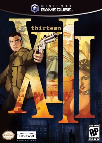
XIII (GCN)
If there's one thing XIII does right, it's the presentation. Though the game is slightly disappointing, I don't think anybody can complain about this first rate cover. Though this is the GameCube version, all of XIII's covers are exactly the same, each with the Roman numerals in very large text, each revealing their own pictures. The figure with the gun wraps everything up nicely, as he is the only figure that is not fragmented. It would be nice if the game was as high quality as the cover, but who am I to complain? If anything, this cover should catch a few people off guard. It's also worth noting that XIII is one of the only games that has its name pointed horizontally, as opposed to the more common vertically, on the spine. An impressive cover all around.
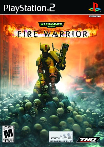
Warhammer 40,000: Fire Warrior (PS2)
Believe it or not, this is another cover I actually really like. Though it's filled with violent imagery, this Warhammer picture is actually very simple in design. Though I don't particularly like the look of the "figure" kneeling down, what the picture shows may just be enough to get somebody to seriously look at the game. There is a lot of destruction in the background, with the city and the fire bellowing up from what looks like a devastated tank. The skulls themselves are all well designed, and require some close inspection to find imperfections. This is another disappointing first person shooter for the PlayStation 2, but that doesn't mean the cover can't be attractive.
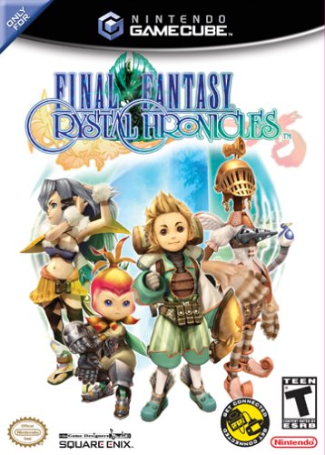
Final Fantasy: Crystal Chronicles (GCN)
Oh goodness, what happened here? It looks like the Kingdom Hearts characters, but without all those Disney characters. And what's with the skinny figure with the Madonna cone-bra thing? She looks like she has Bjork's swan dress from the Oscars a few years ago. The rest of the characters aren't as ugly, except for maybe the short one that looks like a vegetable. Outside of the shoddy character designs, Final Fantasy: Crystal Chronicles manages to have a very simple design, one that doesn't overload your eyes with information. Though this is something I usually like from a box, the simple look just highlights how terrible the character designs are in this game.
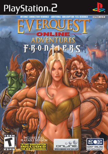
EverQuest Online Adventure Frontiers (PS2)
Sony's Massively Multiplayer Online Role-Playing series has never had very good box art, even before it became a huge disappointment on the PlayStation 2. In its first console expansion pack, EverQuest Online Adventure has spruced up the cover art a little . and when I say "little", I mean it. It features yet another barely attractive girl backed up by a collection of European body builders. You can't argue with the new, sexier look, though. Her top has mysterious fallen down, cleavage hanging out, and not much covering the midriff. It's almost as if this year Sony said, "hey, if the Price is Right can do it, so can we". Even though she's not all that attractive, and kind of looks like a descendant of Spock from Star Trek, compared to the motley crew behind her, she's going to have to do. But then you realize, there's an episode of the Price is Right on right now, and later there will be six straight hours of Star Trek episodes, so what am I doing talking about EverQuest?
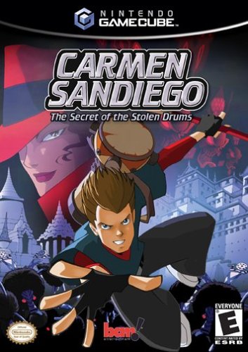
Carmen Sandiego: the Secret of the Stolen Drums (GCN)
If there's one thing XIII does right, it's the presentation. Though the game is slightly disappointing, I don't think anybody can complain about this first rate cover. Though this is the GameCube version, all of XIII's covers are exactly the same, each with the Roman numerals in very large text, each revealing their own pictures. The figure with the gun wraps everything up nicely, as he is the only figure that is not fragmented. It would be nice if the game was as high quality as the cover, but who am I to complain? If anything, this cover should catch a few people off guard. It's also worth noting that XIII is one of the only games that has its name pointed horizontally, as opposed to the more common vertically, on the spine. An impressive cover all around.

Even More Articles

REVIEW - Rose & Locket
June 30th, 2026


REVIEW - Flesh Made Fear
June 24th, 2026


REVIEW - 4PGP
June 18th, 2026
Must-See Videos


Latest Reviews
View all


HOME |
CONTACT |
NOW HIRING |
WHAT IS DEFUNCT GAMES? |
NINTENDO SWITCH ONLINE |
RETRO-BIT PUBLISHING
Retro-Bit |
Switch Planet |
The Halcyon Show |
Same Name, Different Game |
Dragnix |
Press the Buttons
Game Zone Online | Hardcore Gamer | The Dreamcast Junkyard | Video Game Blogger
Dr Strife | Games For Lunch | Mondo Cool Cast | Boxed Pixels | Sega CD Universe | Gaming Trend
Game Zone Online | Hardcore Gamer | The Dreamcast Junkyard | Video Game Blogger
Dr Strife | Games For Lunch | Mondo Cool Cast | Boxed Pixels | Sega CD Universe | Gaming Trend
Copyright © 2001-2026 Defunct Games
All rights reserved. All trademarks are properties of their respective owners.
All rights reserved. All trademarks are properties of their respective owners.