
- CLASSIC MAGAZINES
- REVIEW CREW
A show recapping what critics thought back
when classic games first came out! - NEXT GENERATION'S BEST & WORST
From the worst 1-star reviews to the best
5-stars can offer, this is Next Generation! - NINTENDO POWER (ARCHIVE)
Experience a variety of shows looking at the
often baffling history of Nintendo Power! - MAGAZINE RETROSPECTIVE
We're looking at the absolutely true history of
some of the most iconic game magazines ever! - SUPER PLAY'S TOP 600
The longest and most ambitious Super NES
countdown on the internet! - THEY SAID WHAT?
Debunking predictions and gossip found
in classic video game magazines! - NEXT GENERATION UNCOVERED
Cyril is back in this spin-off series, featuring the
cover critic review the art of Next Generation! - HARDCORE GAMER MAGAZING (PDF ISSUES)
Download all 36 issues of Hardcore Gamer
Magazine and relive the fun in PDF form!
- REVIEW CREW
- REVIEW ARCHIVE
- ELECTRONIC GAMING MONTHLY
- ELECTRONIC GAMING MONTHLY RANKS
From Mario to Sonic to Street Fighter, EGM
ranks classic game franchises and consoles! - ELECTRONIC GAMING MONTHLY BEST & WORST
Counting down EGM’s best and worst reviews
going year by year, from 1989 – 2009! - ELECTRONIC GAMING BEST & WORST AWARDS
11-part video series chronicling the ups and
downs of EGM’s Best & Worst Awards!
- ELECTRONIC GAMING MONTHLY RANKS
- GAME HISTORY
- GAME OVER: STORY BREAKDOWNS
Long-running series breaking down game
stories and analyzing their endings! - A BRIEF HISTORY OF GAMING w/ [NAME HERE]
Real history presented in a fun and pithy
format from a variety of game historians! - THE BLACK SHEEP
A series looking back at the black sheep
entries in popular game franchises! - INSTANT EXPERT
Everything you could possibly want to know
about a wide variety of gaming topics! - FREEZE FRAME
When something familiar happens in the games
industry, we're there to take a picture! - I'VE GOT YOUR NUMBER
Learn real video game history through a series
of number-themed episodes, starting at zero! - GREAT MOMENTS IN BAD ACTING
A joyous celebration of some of gaming's
absolute worst voice acting!
- GAME OVER: STORY BREAKDOWNS
- POPULAR SERIES
- DG NEWS w/ LORNE RISELEY
Newsman Lorne Riseley hosts a regular
series looking at the hottest gaming news! - REVIEW REWIND
Cyril replays a game he reviewed 10+ years
ago to see if he got it right or wrong! - ON-RUNNING FEUDS
Defunct Games' longest-running show, with
editorials, observations and other fun oddities! - DEFUNCT GAMES QUIZ (ARCHIVE)
From online quizzes to game shows, we're
putting your video game knowledge to the test!- QUIZ: ONLINE PASS
Take a weekly quiz to see how well you know
the news and current gaming events! - QUIZ: KNOW THE GAME
One-on-one quiz show where contestants
find out if they actually know classic games! - QUIZ: THE LEADERBOARD
Can you guess the game based on the classic
review? Find out with The Leaderboard!
- QUIZ: ONLINE PASS
- DEFUNCT GAMES VS.
Cyril and the Defunct Games staff isn't afraid
to choose their favorite games and more! - CYRIL READS WORLDS OF POWER
Defunct Games recreates classic game
novelizations through the audio book format!
- DG NEWS w/ LORNE RISELEY
- COMEDY
- GAME EXPECTANCY
How long will your favorite hero live? We crunch
the numbers in this series about dying! - VIDEO GAME ADVICE
Famous game characters answer real personal
advice questions with a humorous slant! - FAKE GAMES: GUERILLA SCRAPBOOK
A long-running series about fake games and
the people who love them (covers included)! - WORST GAME EVER
A contest that attempts to create the worst
video game ever made, complete with covers! - LEVEL 1 STORIES
Literature based on the first stages of some
of your favorite classic video games! - THE COVER CRITIC
One of Defunct Games' earliest shows, Cover
Critic digs up some of the worst box art ever! - COMMERCIAL BREAK
Take a trip through some of the best and
worst video game advertisements of all time! - COMIC BOOK MODS
You've never seen comics like this before.
A curious mix of rewritten video game comics!
- GAME EXPECTANCY
- FULL ARCHIVE
It's a Very Scary Week to be Mario!!

A lot has changed since the last time we featured an episode of the Cover Critic. Both Sony and Nintendo have released new portable game systems, long time companies have shut their doors forever, and the world has been reintroduced to a certain lawyer named Jack Thompson. Heck, even this site you're looking at has changed in many ways. So maybe it's time we take another serious look at video game covers, letting you know which ones we like and which we hate. After two years I invite you to embrace a brand new Cover Critic, one that isn't afraidto tell you what we really think. So enjoy five new covers and one new look!
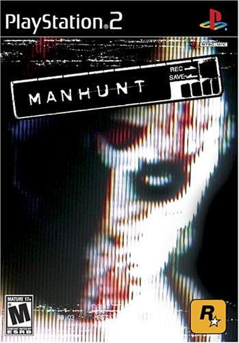
Manhunt (PS2)
I've always stressed that when i t comes to cover art, simplicity works. You've seen it with the Final Fantasy series, you saw it last year with Grand Theft Auto Vice City, and you see it here with Rockstar North's newest violent epic, Manhunt! That face will haunt you until you've played the game, and likely will continue long after that. It's only after you've studied the picture for good ten minutes that you start to enjoy the whole "Way too close to the TV" thing. I found myself watching everything, from Regis and Kelly to Passions to the Deomocratic Presidential Debates while sitting my head no more than three inchese away from the TV. Oh sure, it started to hurt my eyes after about 12 hours of it, but I think it's getting better now. Those dreams, they don't go away, though. If any of you out there know a good doctor for that, you should let me know ...
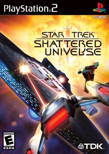
Star Trek: Shattered Universe (PS2)
Hey, I'm all for Star Trek, no matter if it's the Next Generation, original series or whatever ... but had the name not been on the package, I would never have known that this was part of the starfleet. This picture doesn't work for a number of reasons, the most noticable is that it's just so close to the action. It was obviously done to show urgency, but only makes the picture look cramped and unappealing. Plus, there's just too much going on. Between the explosion in the background, various ships, and weapon fire, this cover gives me a full on headache. And one you can get rid of with a Vulcan neck pinch. In the end, this cover doesn't really give you a grasp of the type of game you're about to play, and worse yet, can't seem to find a the look it needs to be a proper tie-in product.
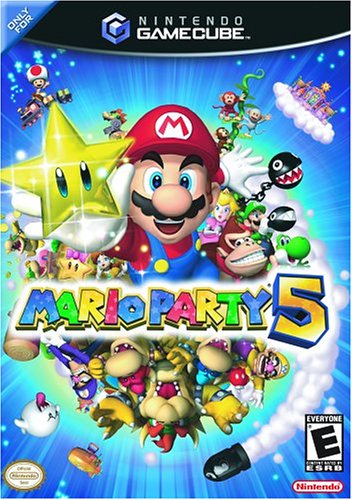
Mario Party 5 (GCN)
When it comes to Mario covers, I'm usually pretty tough. I wasn't all that impressed with the Super Mario Sunshine cover, and you might as well just forget about it when it comes to the silly Super Smash Bros. Melee cover. So what am I doing liking a cover like Mario Party 5? After all, I didn't care much for the fourth cover, however interesting it was. But Mario Party 5 actually gets it right, it has a lot of detail, a clear vision, and doesn't overload your senses. This just may be one of the best Mario covers since the original release of Super Mario Bros. 3 on the N.E.S. If this cover doesn't make you want to play Mario Party, then nothing will. This cover came awfully close to an "A" rating, but ultimately with Waliugi in the picture, Nintendo's long running board game series will have to settle for a "B".
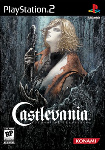
Castlevania: Lament of Innocence (PS2)
If you're going to rebirth a series, you might as well take it as seriously as you can. At least, that's the way Konami seems to be handling their long running, and always entertaining, Castlevania series. This new version, a 3D take on the series, promises to offer a much darker experience, with a lot more depth than we have been used to. And if we were judging it by it's cover (something our moms told us not to do), Lament of Innocence would be a success. This cover looks like a movie poster, or something you'd see associated with a long running book series. It's hard to resit the artwork, which offers a simple premise, yet far more detail than meets the eye. It may not sway the skeptics, but at least it will catch your eye, and perhaps even get you to play it, and then your mom wouldn't be able to complain about your pre-judging things.
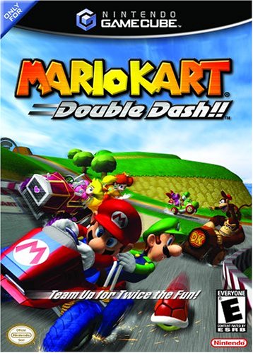
Mario Kart: Double Dash!! (GCN)
Oh my ... what's this? Is this Mario Kart? Oh goodness. Did you read all those nice things I said about Mario Party 5? Do you remember how I commented that it was a nice looking picture, with enough detail to keep you busy, but not overwhelm you?? Well, Mario Kart is pretty much the opposite. It's ugly, loud, and even has words covering up some of the action (and taking your eyes away from the picture). But on an even more serious note, this cover is a little like Nintendo's 2003 line up. It seems like with Mario Kart, Nintendo has all but given up this year. No matter how fun Mario Kart is, it's not the AAA title that Nintendo needed to stay afloat next to the Xbox and PlayStation 2. And compared to last year, which had both Metroid Prime AND Super Mario Sunshine, Nintendo might as well be on auto pilot this year. Nobody doubts that Nintendo can make a great game, but if Mario Kart is the best you have this year, then it's time to stick a fork in it, because you're done!

Even More Articles

REVIEW - Rose & Locket
June 30th, 2026


REVIEW - Flesh Made Fear
June 24th, 2026


REVIEW - 4PGP
June 18th, 2026
Must-See Videos


Latest Reviews
View all


HOME |
CONTACT |
NOW HIRING |
WHAT IS DEFUNCT GAMES? |
NINTENDO SWITCH ONLINE |
RETRO-BIT PUBLISHING
Retro-Bit |
Switch Planet |
The Halcyon Show |
Same Name, Different Game |
Dragnix |
Press the Buttons
Game Zone Online | Hardcore Gamer | The Dreamcast Junkyard | Video Game Blogger
Dr Strife | Games For Lunch | Mondo Cool Cast | Boxed Pixels | Sega CD Universe | Gaming Trend
Game Zone Online | Hardcore Gamer | The Dreamcast Junkyard | Video Game Blogger
Dr Strife | Games For Lunch | Mondo Cool Cast | Boxed Pixels | Sega CD Universe | Gaming Trend
Copyright © 2001-2026 Defunct Games
All rights reserved. All trademarks are properties of their respective owners.
All rights reserved. All trademarks are properties of their respective owners.