
- CLASSIC MAGAZINES
- REVIEW CREW
A show recapping what critics thought back
when classic games first came out! - NEXT GENERATION'S BEST & WORST
From the worst 1-star reviews to the best
5-stars can offer, this is Next Generation! - NINTENDO POWER (ARCHIVE)
Experience a variety of shows looking at the
often baffling history of Nintendo Power! - MAGAZINE RETROSPECTIVE
We're looking at the absolutely true history of
some of the most iconic game magazines ever! - SUPER PLAY'S TOP 600
The longest and most ambitious Super NES
countdown on the internet! - THEY SAID WHAT?
Debunking predictions and gossip found
in classic video game magazines! - NEXT GENERATION UNCOVERED
Cyril is back in this spin-off series, featuring the
cover critic review the art of Next Generation! - HARDCORE GAMER MAGAZING (PDF ISSUES)
Download all 36 issues of Hardcore Gamer
Magazine and relive the fun in PDF form!
- REVIEW CREW
- REVIEW ARCHIVE
- ELECTRONIC GAMING MONTHLY
- ELECTRONIC GAMING MONTHLY RANKS
From Mario to Sonic to Street Fighter, EGM
ranks classic game franchises and consoles! - ELECTRONIC GAMING MONTHLY BEST & WORST
Counting down EGM’s best and worst reviews
going year by year, from 1989 – 2009! - ELECTRONIC GAMING BEST & WORST AWARDS
11-part video series chronicling the ups and
downs of EGM’s Best & Worst Awards!
- ELECTRONIC GAMING MONTHLY RANKS
- GAME HISTORY
- GAME OVER: STORY BREAKDOWNS
Long-running series breaking down game
stories and analyzing their endings! - A BRIEF HISTORY OF GAMING w/ [NAME HERE]
Real history presented in a fun and pithy
format from a variety of game historians! - THE BLACK SHEEP
A series looking back at the black sheep
entries in popular game franchises! - INSTANT EXPERT
Everything you could possibly want to know
about a wide variety of gaming topics! - FREEZE FRAME
When something familiar happens in the games
industry, we're there to take a picture! - I'VE GOT YOUR NUMBER
Learn real video game history through a series
of number-themed episodes, starting at zero! - GREAT MOMENTS IN BAD ACTING
A joyous celebration of some of gaming's
absolute worst voice acting!
- GAME OVER: STORY BREAKDOWNS
- POPULAR SERIES
- DG NEWS w/ LORNE RISELEY
Newsman Lorne Riseley hosts a regular
series looking at the hottest gaming news! - REVIEW REWIND
Cyril replays a game he reviewed 10+ years
ago to see if he got it right or wrong! - ON-RUNNING FEUDS
Defunct Games' longest-running show, with
editorials, observations and other fun oddities! - DEFUNCT GAMES QUIZ (ARCHIVE)
From online quizzes to game shows, we're
putting your video game knowledge to the test!- QUIZ: ONLINE PASS
Take a weekly quiz to see how well you know
the news and current gaming events! - QUIZ: KNOW THE GAME
One-on-one quiz show where contestants
find out if they actually know classic games! - QUIZ: THE LEADERBOARD
Can you guess the game based on the classic
review? Find out with The Leaderboard!
- QUIZ: ONLINE PASS
- DEFUNCT GAMES VS.
Cyril and the Defunct Games staff isn't afraid
to choose their favorite games and more! - CYRIL READS WORLDS OF POWER
Defunct Games recreates classic game
novelizations through the audio book format!
- DG NEWS w/ LORNE RISELEY
- COMEDY
- GAME EXPECTANCY
How long will your favorite hero live? We crunch
the numbers in this series about dying! - VIDEO GAME ADVICE
Famous game characters answer real personal
advice questions with a humorous slant! - FAKE GAMES: GUERILLA SCRAPBOOK
A long-running series about fake games and
the people who love them (covers included)! - WORST GAME EVER
A contest that attempts to create the worst
video game ever made, complete with covers! - LEVEL 1 STORIES
Literature based on the first stages of some
of your favorite classic video games! - THE COVER CRITIC
One of Defunct Games' earliest shows, Cover
Critic digs up some of the worst box art ever! - COMMERCIAL BREAK
Take a trip through some of the best and
worst video game advertisements of all time! - COMIC BOOK MODS
You've never seen comics like this before.
A curious mix of rewritten video game comics!
- GAME EXPECTANCY
- FULL ARCHIVE
All Relaxed, but Still a Little Bitter!!

A lot has changed since the last time we featured an episode of the Cover Critic. Both Sony and Nintendo have released new portable game systems, long time companies have shut their doors forever, and the world has been reintroduced to a certain lawyer named Jack Thompson. Heck, even this site you're looking at has changed in many ways. So maybe it's time we take another serious look at video game covers, letting you know which ones we like and which we hate. After two years I invite you to embrace a brand new Cover Critic, one that isn't afraidto tell you what we really think. So enjoy five new covers and one new look!
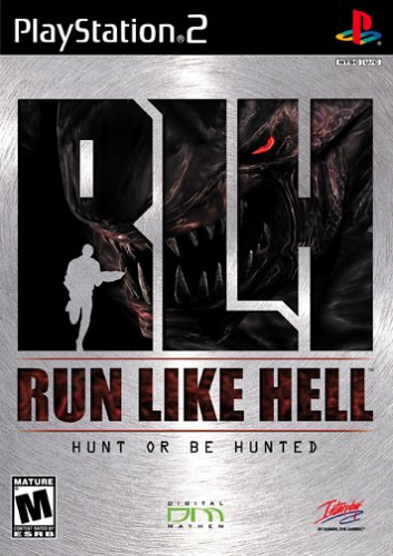
Run Like Hell
Sometimes a game cover just has that movie poster quality, that look that if you were to pass by it you'd have to say: "Whoa! What's that??" Run Like Hell (RLH) is one of those covers. Regardless of how good the game turns out, this game will ultimately have find it's way into many a gamers collection based on the cover alone. I don't know about you, but this looks a lot like a Terminator poster, and is even cooler when I think of it's "Aliens" theme. And not just aliens, but alien wolves. With very little writing on the box, and a kick butt metalic color scheme, this is a front runner for cover of the year. But the year is still only half way over, and you haven't seen what we have in store for you next week.
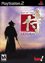
Way of the Samurai
When I look at this cover what do I see? I see posters for all-night Akira Kurosawa film festivals. I see the Samurai series. And I see a ton of other Saturday Samurai movies I've seen on IFC over the years. But you know what, this cover actually works. It works in the same way all of those covers work. And it may be the ultimate proof that no matter what, you can't mess up a samurai cover. Better get this before they turn it into a crummy western game ... oh, too late, Capcom's already working on it ...
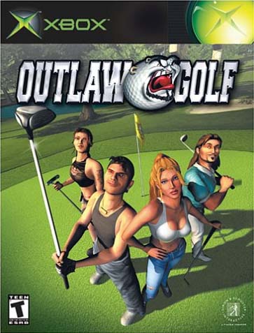
Outlaw Golf
Every year one company finds a game that sounds good on paper, it even looks good in previews, but just can't get passed it's one joke. Outlaw Golf is that game. And the cover proves it. What you get here is a rather pathetic overhead shot of some of the rough and tough golfers. Problem is that the joke in the game isn't any better than the joke on the box. And that logo is pretty damn lame. For a game that promotes itself based on looking up hot girls skirts, the girls in Dead or Alive just look much, much better. Perhaps on the GameCube they'll get their act together and give us more attractive golfers.
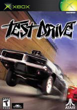
Test Drive
This week we've seen quite a few covers that just don't make any sense to me. The one above is a testiment to that. But this Test Drive cover just perplexes me. Is there a more bland racing cover? And while it tries to sport a rough look, you simply can't see enough of the car to oooh or aaah. It does present speed accurately, but also makes you want to run far far away. In fact, that's not a bad idea. Perhaps you need to run far, far away from this one.
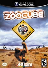
ZooCube
This Cover Critc started out pretty good, didn't it. But as the reviews wore on it's like the writer didn't even care about the cover. Seems like somebody shouldn't slack off like that. Well, when you see the next cover critic there will be some changes. Bunch just a few.

Even More Articles

REVIEW - Rose & Locket
June 30th, 2026


REVIEW - Flesh Made Fear
June 24th, 2026


REVIEW - 4PGP
June 18th, 2026
Must-See Videos


Latest Reviews
View all


HOME |
CONTACT |
NOW HIRING |
WHAT IS DEFUNCT GAMES? |
NINTENDO SWITCH ONLINE |
RETRO-BIT PUBLISHING
Retro-Bit |
Switch Planet |
The Halcyon Show |
Same Name, Different Game |
Dragnix |
Press the Buttons
Game Zone Online | Hardcore Gamer | The Dreamcast Junkyard | Video Game Blogger
Dr Strife | Games For Lunch | Mondo Cool Cast | Boxed Pixels | Sega CD Universe | Gaming Trend
Game Zone Online | Hardcore Gamer | The Dreamcast Junkyard | Video Game Blogger
Dr Strife | Games For Lunch | Mondo Cool Cast | Boxed Pixels | Sega CD Universe | Gaming Trend
Copyright © 2001-2026 Defunct Games
All rights reserved. All trademarks are properties of their respective owners.
All rights reserved. All trademarks are properties of their respective owners.