
- CLASSIC MAGAZINES
- REVIEW CREW
A show recapping what critics thought back
when classic games first came out! - NEXT GENERATION'S BEST & WORST
From the worst 1-star reviews to the best
5-stars can offer, this is Next Generation! - NINTENDO POWER (ARCHIVE)
Experience a variety of shows looking at the
often baffling history of Nintendo Power! - MAGAZINE RETROSPECTIVE
We're looking at the absolutely true history of
some of the most iconic game magazines ever! - SUPER PLAY'S TOP 600
The longest and most ambitious Super NES
countdown on the internet! - THEY SAID WHAT?
Debunking predictions and gossip found
in classic video game magazines! - NEXT GENERATION UNCOVERED
Cyril is back in this spin-off series, featuring the
cover critic review the art of Next Generation! - HARDCORE GAMER MAGAZING (PDF ISSUES)
Download all 36 issues of Hardcore Gamer
Magazine and relive the fun in PDF form!
- REVIEW CREW
- REVIEW ARCHIVE
- ELECTRONIC GAMING MONTHLY
- ELECTRONIC GAMING MONTHLY RANKS
From Mario to Sonic to Street Fighter, EGM
ranks classic game franchises and consoles! - ELECTRONIC GAMING MONTHLY BEST & WORST
Counting down EGM’s best and worst reviews
going year by year, from 1989 – 2009! - ELECTRONIC GAMING BEST & WORST AWARDS
11-part video series chronicling the ups and
downs of EGM’s Best & Worst Awards!
- ELECTRONIC GAMING MONTHLY RANKS
- GAME HISTORY
- GAME OVER: STORY BREAKDOWNS
Long-running series breaking down game
stories and analyzing their endings! - A BRIEF HISTORY OF GAMING w/ [NAME HERE]
Real history presented in a fun and pithy
format from a variety of game historians! - THE BLACK SHEEP
A series looking back at the black sheep
entries in popular game franchises! - INSTANT EXPERT
Everything you could possibly want to know
about a wide variety of gaming topics! - FREEZE FRAME
When something familiar happens in the games
industry, we're there to take a picture! - I'VE GOT YOUR NUMBER
Learn real video game history through a series
of number-themed episodes, starting at zero! - GREAT MOMENTS IN BAD ACTING
A joyous celebration of some of gaming's
absolute worst voice acting!
- GAME OVER: STORY BREAKDOWNS
- POPULAR SERIES
- DG NEWS w/ LORNE RISELEY
Newsman Lorne Riseley hosts a regular
series looking at the hottest gaming news! - REVIEW REWIND
Cyril replays a game he reviewed 10+ years
ago to see if he got it right or wrong! - ON-RUNNING FEUDS
Defunct Games' longest-running show, with
editorials, observations and other fun oddities! - DEFUNCT GAMES QUIZ (ARCHIVE)
From online quizzes to game shows, we're
putting your video game knowledge to the test!- QUIZ: ONLINE PASS
Take a weekly quiz to see how well you know
the news and current gaming events! - QUIZ: KNOW THE GAME
One-on-one quiz show where contestants
find out if they actually know classic games! - QUIZ: THE LEADERBOARD
Can you guess the game based on the classic
review? Find out with The Leaderboard!
- QUIZ: ONLINE PASS
- DEFUNCT GAMES VS.
Cyril and the Defunct Games staff isn't afraid
to choose their favorite games and more! - CYRIL READS WORLDS OF POWER
Defunct Games recreates classic game
novelizations through the audio book format!
- DG NEWS w/ LORNE RISELEY
- COMEDY
- GAME EXPECTANCY
How long will your favorite hero live? We crunch
the numbers in this series about dying! - VIDEO GAME ADVICE
Famous game characters answer real personal
advice questions with a humorous slant! - FAKE GAMES: GUERILLA SCRAPBOOK
A long-running series about fake games and
the people who love them (covers included)! - WORST GAME EVER
A contest that attempts to create the worst
video game ever made, complete with covers! - LEVEL 1 STORIES
Literature based on the first stages of some
of your favorite classic video games! - THE COVER CRITIC
One of Defunct Games' earliest shows, Cover
Critic digs up some of the worst box art ever! - COMMERCIAL BREAK
Take a trip through some of the best and
worst video game advertisements of all time! - COMIC BOOK MODS
You've never seen comics like this before.
A curious mix of rewritten video game comics!
- GAME EXPECTANCY
- FULL ARCHIVE
Sometimes it Doesn't Pay to Wake Up!!

A lot has changed since the last time we featured an episode of the Cover Critic. Both Sony and Nintendo have released new portable game systems, long time companies have shut their doors forever, and the world has been reintroduced to a certain lawyer named Jack Thompson. Heck, even this site you're looking at has changed in many ways. So maybe it's time we take another serious look at video game covers, letting you know which ones we like and which we hate. After two years I invite you to embrace a brand new Cover Critic, one that isn't afraidto tell you what we really think. So enjoy five new covers and one new look!
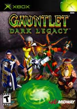
Gauntlet: Dark Legacy
I hope you aren't eating, but I'm afraid we're going to start this Cover Critic with what could be the ugliest cover of the year so far. I don't know if it's just me, but are those the WORST 3D polygon characters you've seen on a video game cover? Even the Virtua Fighter Remix cover had better graphics. And not only is the character design ugly, but the adventurers are all squished together. Considering the legacy of fairly good Gauntlet covers, this is quite a disappointment. In fact, there's very little good I can say about it. As far as I can tell, the only possitive to be found is the green in the picture matches the usually mis-matched green logo on the top. Good show. But when that's the best you can say about a cover, you know something is seriously wrong.
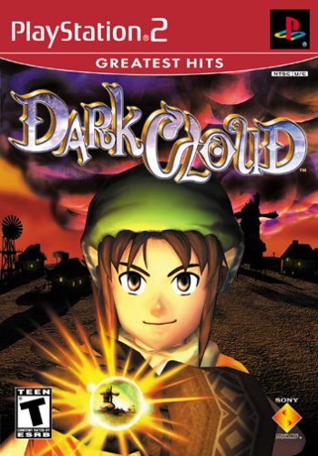
Dark Cloud: Greatest Hits
Holy Crap!! What the heck is this? I don't know what Sony is thinking, but that red top (as opposed to Sony's usual black) has got to go. I thought the GameCube design was lame and the Xbox color was stupid ... well, this puts both to shame! Apart from the horrible Greatest Hits top, this cover never was any good. I just get the feeling people will look at this and say "hmm, if the game looks this stupid it's not worth $20". But for goodness sakes, do something about that top bar color!!
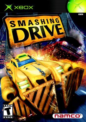
Smashing Drive
Sadly this has been the best cover so far ... but then again, that's not saying anything. So we have the arcade hit, er, arcade success, er ... well, the arcade port to Smashing Drive. For anybody who hasn't played this game, just by looking at this cover you can tell that it's Crazy Taxi, just Crazier. That's right, it's Smashing Drive, and the picture is both ugly and crude. I'm not saying the Crazy Taxi covers were any better, but at least those games were entertaining. But come on, who does this game target?
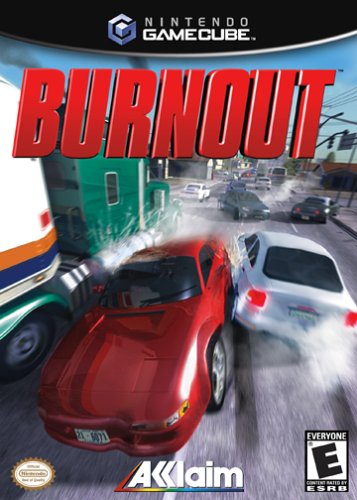
Burnout
Ouch ouch ouch ouch ouch ouch ouch. And you know, it would be much more impressive if they had staged this with real vehicles. Where is the money for cover production?? What are you, a bunch of cheap-skates? Well, regardless, this is a pretty funny cover, if you're a fan of the movie Crash. What the heck is going on here, there's not a lot of burning going on here. And something tells me that there's a disclaimer somewhere on the package that states that "kids should not try this at home". Also, did I mention that the art isn't very attractive?
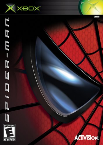
Spider-Man
So, we have the single best cover of the week. It's not perfect, but compared to what else we've seen today it will have to do. I like the design of the picture, very Twisted Metal Black. And I won't even mention how the green top clashes with the rest of the picture. Frankly, after a set like we've had today, it's nice to see a familiar face like Spider-Man. So, if you're lining up to see Spidey (and you're beating up the people waiting for Star Wars), then this is for you.

Even More Articles

REVIEW - Rose & Locket
June 30th, 2026


REVIEW - Flesh Made Fear
June 24th, 2026


REVIEW - 4PGP
June 18th, 2026
Must-See Videos


Latest Reviews
View all


HOME |
CONTACT |
NOW HIRING |
WHAT IS DEFUNCT GAMES? |
NINTENDO SWITCH ONLINE |
RETRO-BIT PUBLISHING
Retro-Bit |
Switch Planet |
The Halcyon Show |
Same Name, Different Game |
Dragnix |
Press the Buttons
Game Zone Online | Hardcore Gamer | The Dreamcast Junkyard | Video Game Blogger
Dr Strife | Games For Lunch | Mondo Cool Cast | Boxed Pixels | Sega CD Universe | Gaming Trend
Game Zone Online | Hardcore Gamer | The Dreamcast Junkyard | Video Game Blogger
Dr Strife | Games For Lunch | Mondo Cool Cast | Boxed Pixels | Sega CD Universe | Gaming Trend
Copyright © 2001-2026 Defunct Games
All rights reserved. All trademarks are properties of their respective owners.
All rights reserved. All trademarks are properties of their respective owners.