
- CLASSIC MAGAZINES
- REVIEW CREW
A show recapping what critics thought back
when classic games first came out! - NEXT GENERATION'S BEST & WORST
From the worst 1-star reviews to the best
5-stars can offer, this is Next Generation! - NINTENDO POWER (ARCHIVE)
Experience a variety of shows looking at the
often baffling history of Nintendo Power! - MAGAZINE RETROSPECTIVE
We're looking at the absolutely true history of
some of the most iconic game magazines ever! - SUPER PLAY'S TOP 600
The longest and most ambitious Super NES
countdown on the internet! - THEY SAID WHAT?
Debunking predictions and gossip found
in classic video game magazines! - NEXT GENERATION UNCOVERED
Cyril is back in this spin-off series, featuring the
cover critic review the art of Next Generation! - HARDCORE GAMER MAGAZING (PDF ISSUES)
Download all 36 issues of Hardcore Gamer
Magazine and relive the fun in PDF form!
- REVIEW CREW
- REVIEW ARCHIVE
- ELECTRONIC GAMING MONTHLY
- ELECTRONIC GAMING MONTHLY RANKS
From Mario to Sonic to Street Fighter, EGM
ranks classic game franchises and consoles! - ELECTRONIC GAMING MONTHLY BEST & WORST
Counting down EGM’s best and worst reviews
going year by year, from 1989 – 2009! - ELECTRONIC GAMING BEST & WORST AWARDS
11-part video series chronicling the ups and
downs of EGM’s Best & Worst Awards!
- ELECTRONIC GAMING MONTHLY RANKS
- GAME HISTORY
- GAME OVER: STORY BREAKDOWNS
Long-running series breaking down game
stories and analyzing their endings! - A BRIEF HISTORY OF GAMING w/ [NAME HERE]
Real history presented in a fun and pithy
format from a variety of game historians! - THE BLACK SHEEP
A series looking back at the black sheep
entries in popular game franchises! - INSTANT EXPERT
Everything you could possibly want to know
about a wide variety of gaming topics! - FREEZE FRAME
When something familiar happens in the games
industry, we're there to take a picture! - I'VE GOT YOUR NUMBER
Learn real video game history through a series
of number-themed episodes, starting at zero! - GREAT MOMENTS IN BAD ACTING
A joyous celebration of some of gaming's
absolute worst voice acting!
- GAME OVER: STORY BREAKDOWNS
- POPULAR SERIES
- DG NEWS w/ LORNE RISELEY
Newsman Lorne Riseley hosts a regular
series looking at the hottest gaming news! - REVIEW REWIND
Cyril replays a game he reviewed 10+ years
ago to see if he got it right or wrong! - ON-RUNNING FEUDS
Defunct Games' longest-running show, with
editorials, observations and other fun oddities! - DEFUNCT GAMES QUIZ (ARCHIVE)
From online quizzes to game shows, we're
putting your video game knowledge to the test!- QUIZ: ONLINE PASS
Take a weekly quiz to see how well you know
the news and current gaming events! - QUIZ: KNOW THE GAME
One-on-one quiz show where contestants
find out if they actually know classic games! - QUIZ: THE LEADERBOARD
Can you guess the game based on the classic
review? Find out with The Leaderboard!
- QUIZ: ONLINE PASS
- DEFUNCT GAMES VS.
Cyril and the Defunct Games staff isn't afraid
to choose their favorite games and more! - CYRIL READS WORLDS OF POWER
Defunct Games recreates classic game
novelizations through the audio book format!
- DG NEWS w/ LORNE RISELEY
- COMEDY
- GAME EXPECTANCY
How long will your favorite hero live? We crunch
the numbers in this series about dying! - VIDEO GAME ADVICE
Famous game characters answer real personal
advice questions with a humorous slant! - FAKE GAMES: GUERILLA SCRAPBOOK
A long-running series about fake games and
the people who love them (covers included)! - WORST GAME EVER
A contest that attempts to create the worst
video game ever made, complete with covers! - LEVEL 1 STORIES
Literature based on the first stages of some
of your favorite classic video games! - THE COVER CRITIC
One of Defunct Games' earliest shows, Cover
Critic digs up some of the worst box art ever! - COMMERCIAL BREAK
Take a trip through some of the best and
worst video game advertisements of all time! - COMIC BOOK MODS
You've never seen comics like this before.
A curious mix of rewritten video game comics!
- GAME EXPECTANCY
- FULL ARCHIVE
Capcom

I don't think anybody will argue Capcom's significance in the history of video games, but lately things have been rock in the house of Mega Man. Capcom's most recent offerings have been a mixed lot, with only a few selling the numbers Capcom wanted. Couple that with two 15 year anniversary collections with incorrect dates, a disappointing Devil May Cry sequel, and a 2D street fighting game that nobody seems to like and you have a company in peril.
But 2005 looks a little brighter for Capcom, as they have a chance to finally make up for the second Devil May Cry game with a third, and hopefully meatier, installment. They are also radically changing the Resident Evil series and releasing it for both the PS2 and GameCube in 2005. And I don't think anybody can forget about Shadow of Rome, the Devil May Cry-like adventure game set in the days of, um, Rome. Capcom has a lot to be excited about, but does their website give us that sense? I suggest you read on to find out.
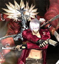
Dante and friends have a lot to make up for this time around, let's hope he's up for it!
Look and Design:
Some companies spend a lot of time and money developing their website, these companies know that it is an extension of the message they are trying to get across and a great way for you to bone up on their products. Capcom is not one of those companies, they would rather you see their TV ads, read about them in a magazine, or simply love the franchise. There's just no two ways around it, Capcom's website is an embarrassment, and shouldn't belong to the smallest video game publisher let alone one of the biggest.
The site is actually very easy to describe, since it features a blue background and only three columns of information. In the middle is a rotating banner advertising their newest games. You get large pictures promoting games like Viewtiful Joe 2, Under the Skin, Devil May Cry 3, and others. To one side of the banner is a list of systems Capcom currently makes games for (with no mention of the DS or PSP). On the other side you'll find a list of the newest games. And that's it. That is basically the full front page. It is about 10% of what you'd expect at any other site, and really feels thrown together in no time. In fact, I wouldn't be surprised if I spend more time writing this review than they did making their U.S. website.
Accessibility: The overall bad look of the site continues when you click on the game pages. Here you'll find nothing more than a short description, a picture of the cover, and some screen shots. These pages are about as informative as what you'd expect from Amazon.com listing, and are pretty weak even for a company website. There's a release schedule, but it's clearly not up to date as it doesn't take into account some recently announced games. The site itself isn't hard to surf, but only because there's nothing to see or find. It's also worth noting that Capcom has no mention of any of their older games, not even classics like Bionic Commando or Final Fight. About the farthest back they go is the Nintendo 64 and even that tells you to come back later when it's done.
If Capcom hasn't already started phasing out Mega Man for Viewtiful Joe, then they really ought to!
Insider Information:
Capcom's website may actually feature the least attractive news section I have yet to see on my journey. For one thing, the list of news is just a mess, it's so unattractive that you'll probably give up long before deciding on a new story. Thing go from bad to much, MUCH worse when you actually get into a news story. Not only are you treated to a bare bones press release, but the background often makes part of the text hard to read. The left side of the page is dark blue making the black text a little hard on the eyes. This would be a larger complaint if Capcom actually had any news worth reading.
Parting Thoughts: I ended up checking on the site several times to make sure this was actually Capcom's website and not some fan site made by a person who hates Capcom. Time after time I was disappointed to find that this was indeed Capcom's real site, this really is the page they wanted to represent them. This site is just terrible, it's much worse than even I made it out to be. I mean, it features a banner that is supposed to be on every page, but isn't. We're talking about a game that gets facts about their games wrong. We're talking about a company that messed up a sequel to Devil May Cry! I'm surprised this site isn't powered by Geocities.
FINAL GRADE: D-
(Important Note: This review was written in 2004. As is the case with websites things tend to change and get moved around. We've decided to cover major companies who should have a presence on the web for many years to come, but the actual reviews of the layout may not be relevant for more than a month to a year. Having said that, we're hoping this article was still interesting, and if not, at least you go this extra little paragraph of explanation that you wouldn't normally get on the other websites.)

But 2005 looks a little brighter for Capcom, as they have a chance to finally make up for the second Devil May Cry game with a third, and hopefully meatier, installment. They are also radically changing the Resident Evil series and releasing it for both the PS2 and GameCube in 2005. And I don't think anybody can forget about Shadow of Rome, the Devil May Cry-like adventure game set in the days of, um, Rome. Capcom has a lot to be excited about, but does their website give us that sense? I suggest you read on to find out.
Dante and friends have a lot to make up for this time around, let's hope he's up for it!
The site is actually very easy to describe, since it features a blue background and only three columns of information. In the middle is a rotating banner advertising their newest games. You get large pictures promoting games like Viewtiful Joe 2, Under the Skin, Devil May Cry 3, and others. To one side of the banner is a list of systems Capcom currently makes games for (with no mention of the DS or PSP). On the other side you'll find a list of the newest games. And that's it. That is basically the full front page. It is about 10% of what you'd expect at any other site, and really feels thrown together in no time. In fact, I wouldn't be surprised if I spend more time writing this review than they did making their U.S. website.
Accessibility: The overall bad look of the site continues when you click on the game pages. Here you'll find nothing more than a short description, a picture of the cover, and some screen shots. These pages are about as informative as what you'd expect from Amazon.com listing, and are pretty weak even for a company website. There's a release schedule, but it's clearly not up to date as it doesn't take into account some recently announced games. The site itself isn't hard to surf, but only because there's nothing to see or find. It's also worth noting that Capcom has no mention of any of their older games, not even classics like Bionic Commando or Final Fight. About the farthest back they go is the Nintendo 64 and even that tells you to come back later when it's done.
If Capcom hasn't already started phasing out Mega Man for Viewtiful Joe, then they really ought to!
Parting Thoughts: I ended up checking on the site several times to make sure this was actually Capcom's website and not some fan site made by a person who hates Capcom. Time after time I was disappointed to find that this was indeed Capcom's real site, this really is the page they wanted to represent them. This site is just terrible, it's much worse than even I made it out to be. I mean, it features a banner that is supposed to be on every page, but isn't. We're talking about a game that gets facts about their games wrong. We're talking about a company that messed up a sequel to Devil May Cry! I'm surprised this site isn't powered by Geocities.
(Important Note: This review was written in 2004. As is the case with websites things tend to change and get moved around. We've decided to cover major companies who should have a presence on the web for many years to come, but the actual reviews of the layout may not be relevant for more than a month to a year. Having said that, we're hoping this article was still interesting, and if not, at least you go this extra little paragraph of explanation that you wouldn't normally get on the other websites.)

Even More Articles

REVIEW - Rose & Locket
June 30th, 2026


REVIEW - Flesh Made Fear
June 24th, 2026


REVIEW - 4PGP
June 18th, 2026
Must-See Videos


Latest Reviews
View all


HOME |
CONTACT |
NOW HIRING |
WHAT IS DEFUNCT GAMES? |
NINTENDO SWITCH ONLINE |
RETRO-BIT PUBLISHING
Retro-Bit |
Switch Planet |
The Halcyon Show |
Same Name, Different Game |
Dragnix |
Press the Buttons
Game Zone Online | Hardcore Gamer | The Dreamcast Junkyard | Video Game Blogger
Dr Strife | Games For Lunch | Mondo Cool Cast | Boxed Pixels | Sega CD Universe | Gaming Trend
Game Zone Online | Hardcore Gamer | The Dreamcast Junkyard | Video Game Blogger
Dr Strife | Games For Lunch | Mondo Cool Cast | Boxed Pixels | Sega CD Universe | Gaming Trend
Copyright © 2001-2026 Defunct Games
All rights reserved. All trademarks are properties of their respective owners.
All rights reserved. All trademarks are properties of their respective owners.