
- CLASSIC MAGAZINES
- REVIEW CREW
A show recapping what critics thought back
when classic games first came out! - NEXT GENERATION'S BEST & WORST
From the worst 1-star reviews to the best
5-stars can offer, this is Next Generation! - NINTENDO POWER (ARCHIVE)
Experience a variety of shows looking at the
often baffling history of Nintendo Power! - MAGAZINE RETROSPECTIVE
We're looking at the absolutely true history of
some of the most iconic game magazines ever! - SUPER PLAY'S TOP 600
The longest and most ambitious Super NES
countdown on the internet! - THEY SAID WHAT?
Debunking predictions and gossip found
in classic video game magazines! - NEXT GENERATION UNCOVERED
Cyril is back in this spin-off series, featuring the
cover critic review the art of Next Generation! - HARDCORE GAMER MAGAZING (PDF ISSUES)
Download all 36 issues of Hardcore Gamer
Magazine and relive the fun in PDF form!
- REVIEW CREW
- REVIEW ARCHIVE
- ELECTRONIC GAMING MONTHLY
- ELECTRONIC GAMING MONTHLY RANKS
From Mario to Sonic to Street Fighter, EGM
ranks classic game franchises and consoles! - ELECTRONIC GAMING MONTHLY BEST & WORST
Counting down EGM’s best and worst reviews
going year by year, from 1989 – 2009! - ELECTRONIC GAMING BEST & WORST AWARDS
11-part video series chronicling the ups and
downs of EGM’s Best & Worst Awards!
- ELECTRONIC GAMING MONTHLY RANKS
- GAME HISTORY
- GAME OVER: STORY BREAKDOWNS
Long-running series breaking down game
stories and analyzing their endings! - A BRIEF HISTORY OF GAMING w/ [NAME HERE]
Real history presented in a fun and pithy
format from a variety of game historians! - THE BLACK SHEEP
A series looking back at the black sheep
entries in popular game franchises! - INSTANT EXPERT
Everything you could possibly want to know
about a wide variety of gaming topics! - FREEZE FRAME
When something familiar happens in the games
industry, we're there to take a picture! - I'VE GOT YOUR NUMBER
Learn real video game history through a series
of number-themed episodes, starting at zero! - GREAT MOMENTS IN BAD ACTING
A joyous celebration of some of gaming's
absolute worst voice acting!
- GAME OVER: STORY BREAKDOWNS
- POPULAR SERIES
- DG NEWS w/ LORNE RISELEY
Newsman Lorne Riseley hosts a regular
series looking at the hottest gaming news! - REVIEW REWIND
Cyril replays a game he reviewed 10+ years
ago to see if he got it right or wrong! - ON-RUNNING FEUDS
Defunct Games' longest-running show, with
editorials, observations and other fun oddities! - DEFUNCT GAMES QUIZ (ARCHIVE)
From online quizzes to game shows, we're
putting your video game knowledge to the test!- QUIZ: ONLINE PASS
Take a weekly quiz to see how well you know
the news and current gaming events! - QUIZ: KNOW THE GAME
One-on-one quiz show where contestants
find out if they actually know classic games! - QUIZ: THE LEADERBOARD
Can you guess the game based on the classic
review? Find out with The Leaderboard!
- QUIZ: ONLINE PASS
- DEFUNCT GAMES VS.
Cyril and the Defunct Games staff isn't afraid
to choose their favorite games and more! - CYRIL READS WORLDS OF POWER
Defunct Games recreates classic game
novelizations through the audio book format!
- DG NEWS w/ LORNE RISELEY
- COMEDY
- GAME EXPECTANCY
How long will your favorite hero live? We crunch
the numbers in this series about dying! - VIDEO GAME ADVICE
Famous game characters answer real personal
advice questions with a humorous slant! - FAKE GAMES: GUERILLA SCRAPBOOK
A long-running series about fake games and
the people who love them (covers included)! - WORST GAME EVER
A contest that attempts to create the worst
video game ever made, complete with covers! - LEVEL 1 STORIES
Literature based on the first stages of some
of your favorite classic video games! - THE COVER CRITIC
One of Defunct Games' earliest shows, Cover
Critic digs up some of the worst box art ever! - COMMERCIAL BREAK
Take a trip through some of the best and
worst video game advertisements of all time! - COMIC BOOK MODS
You've never seen comics like this before.
A curious mix of rewritten video game comics!
- GAME EXPECTANCY
- FULL ARCHIVE
Codemasters

Unfortunately when you're name is Codemasters, people don't expect you to just be "okay" at what you're doing. You can't just get by with a passing grade, you really need to step it up and live up to your name. With disappointing titles like Second Site, American Idol, and MTV Music Generator 3, Codemasters is really more of an ironic name than anything, but that doesn't mean they don't have a few tricks up their sleeve. What we found on their website was truly inspiring, it really was a website coded by people that knew what they were doing. But something is not right in this castle; everything is not as it should be.
Look and Design: This page is busy. It's not just busy; it's also extremely hard to look at. The page is abuzz with all kinds of eye-catching tools, from flashes to blinking to animation; this site does just about everything it can to make you pay attention. The problem I had was that there was just too much to look at, and the flashing, buzzing, blinking, animating pictures were just getting on my nerves. Generally I don't mind these elements, but when they're all done at once it makes your head hurt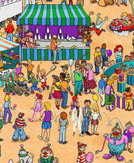
The website is not as crazy chaotic as a Where's Waldo book, but it's not too far off!
and your eyes swell. It may also contain strange subliminal messages your eyes wouldn't normally be able to see, I'm not sure about that though, but I wouldn't be surprised if that was the case.
And this craziness isn't exclusive to the front page, oh no. No matter where you go on the site you can expect to see all kinds of seizure-inducing advertisements and clutter. There are also a lot of links that could have been shrunk down to just a few main tabs. The top bar alone has 16 different links, and that's not including the search. Similar links, such as Customer Support and Contact, could have been turned into one really useful link, and not two that you barely see. Still, when you look at the website these links are really not the problem, the busy look of the site is.
Accessibility: If you can take your eyes off of all the busy things happening on the front page, you will find a fairly easy website to surf. Among the first things you will notice are the large pictures for each of the genres (thankfully not animating). Outside of pushing the Games button, these genre pages are just about the only way you have to search for what you're looking for. Still, most of the games are pretty easy to find and you shouldn't have too much trouble finding your way around the rest of the site.
Although the site is hard to look at, it actually is one of the best designs we have seen so far. When you go to a genre page you will be able to look through genre-specific news, codes, forums, and more. This is easily one of the most accessible sites on the web, full of useful links to help you go from one page to another. But all the explosions and animations might turn you off of this site long before you realize it's potential.

Here's a magazine Codemaster's wants you to buy, we assume the version you'd get would be in English!
Insider Information:
The news page is a strange beast, one that is much different from any we have seen before it. The idea is the same, but the layout may give you pause, if only for a few moments. The section is split into three sections, one for the latest press releases, one for the latest reviews, and another for special Code M offers. The press releases are pretty much what you'd expect, with basic information and some graphics to go along with it, definitely a step up from the regular news page we're used to. The game reviews are taken from the various websites all over the net, generally the more positive ones. The problem is, instead of linking to the review Codemasters decides to take out the most glowing excerpts and forgets to mention the score the game got. Thankfully you can turn any of these mini-sections into larger, easier to surf sections, so finding what you're looking for is rarely a problem. All in all, this is an extremely well put together news section that should be commended for their design.
Parting Thoughts: There are a lot of sites that try to get you to sign up for their mailing lists, announcements, and other spam. But Codemasters takes it a step farther, not only do they want you to sign up to be a Code M member, but they want you to do it without delay. On their front page most of the game news has been overrun by special deals for Code M members ($50 off of a video card, a $9 subscription to a men's magazine, etc.). These links aren't just overrunning the news; they are all over the website, usually at the expensive of advertising one of their real games. Codemasters' might not have the most exciting line-up for this holiday season, but that doesn't mean they should stop promoting their titles. I'm all for fan clubs and community events, but when it starts to overrun your page you might want to reevaluate their performance.
FINAL GRADE: B-
(Important Note: This review was written in 2004. As is the case with websites things tend to change and get moved around. We've decided to cover major companies who should have a presence on the web for many years to come, but the actual reviews of the layout may not be relevant for more than a month to a year. Having said that, we're hoping this article was still interesting, and if not, at least you go this extra little paragraph of explanation that you wouldn't normally get on the other websites.)

Look and Design: This page is busy. It's not just busy; it's also extremely hard to look at. The page is abuzz with all kinds of eye-catching tools, from flashes to blinking to animation; this site does just about everything it can to make you pay attention. The problem I had was that there was just too much to look at, and the flashing, buzzing, blinking, animating pictures were just getting on my nerves. Generally I don't mind these elements, but when they're all done at once it makes your head hurt
The website is not as crazy chaotic as a Where's Waldo book, but it's not too far off!
And this craziness isn't exclusive to the front page, oh no. No matter where you go on the site you can expect to see all kinds of seizure-inducing advertisements and clutter. There are also a lot of links that could have been shrunk down to just a few main tabs. The top bar alone has 16 different links, and that's not including the search. Similar links, such as Customer Support and Contact, could have been turned into one really useful link, and not two that you barely see. Still, when you look at the website these links are really not the problem, the busy look of the site is.
Accessibility: If you can take your eyes off of all the busy things happening on the front page, you will find a fairly easy website to surf. Among the first things you will notice are the large pictures for each of the genres (thankfully not animating). Outside of pushing the Games button, these genre pages are just about the only way you have to search for what you're looking for. Still, most of the games are pretty easy to find and you shouldn't have too much trouble finding your way around the rest of the site.
Although the site is hard to look at, it actually is one of the best designs we have seen so far. When you go to a genre page you will be able to look through genre-specific news, codes, forums, and more. This is easily one of the most accessible sites on the web, full of useful links to help you go from one page to another. But all the explosions and animations might turn you off of this site long before you realize it's potential.
Here's a magazine Codemaster's wants you to buy, we assume the version you'd get would be in English!
Parting Thoughts: There are a lot of sites that try to get you to sign up for their mailing lists, announcements, and other spam. But Codemasters takes it a step farther, not only do they want you to sign up to be a Code M member, but they want you to do it without delay. On their front page most of the game news has been overrun by special deals for Code M members ($50 off of a video card, a $9 subscription to a men's magazine, etc.). These links aren't just overrunning the news; they are all over the website, usually at the expensive of advertising one of their real games. Codemasters' might not have the most exciting line-up for this holiday season, but that doesn't mean they should stop promoting their titles. I'm all for fan clubs and community events, but when it starts to overrun your page you might want to reevaluate their performance.
(Important Note: This review was written in 2004. As is the case with websites things tend to change and get moved around. We've decided to cover major companies who should have a presence on the web for many years to come, but the actual reviews of the layout may not be relevant for more than a month to a year. Having said that, we're hoping this article was still interesting, and if not, at least you go this extra little paragraph of explanation that you wouldn't normally get on the other websites.)

Even More Articles

REVIEW - Rose & Locket
June 30th, 2026


REVIEW - Flesh Made Fear
June 24th, 2026


REVIEW - 4PGP
June 18th, 2026
Must-See Videos


Latest Reviews
View all


HOME |
CONTACT |
NOW HIRING |
WHAT IS DEFUNCT GAMES? |
NINTENDO SWITCH ONLINE |
RETRO-BIT PUBLISHING
Retro-Bit |
Switch Planet |
The Halcyon Show |
Same Name, Different Game |
Dragnix |
Press the Buttons
Game Zone Online | Hardcore Gamer | The Dreamcast Junkyard | Video Game Blogger
Dr Strife | Games For Lunch | Mondo Cool Cast | Boxed Pixels | Sega CD Universe | Gaming Trend
Game Zone Online | Hardcore Gamer | The Dreamcast Junkyard | Video Game Blogger
Dr Strife | Games For Lunch | Mondo Cool Cast | Boxed Pixels | Sega CD Universe | Gaming Trend
Copyright © 2001-2026 Defunct Games
All rights reserved. All trademarks are properties of their respective owners.
All rights reserved. All trademarks are properties of their respective owners.