 EGM in 1990!
For as great as Electronic Gaming Monthly was at the time, their covers were frustratingly inconsistent. Some months would see designs that really stood out on the newsstand, while the very next issue would look like it was assembled by a bunch of screaming pre-schoolers. Couple that with a reliance on screenshots and box art, and EGM covers are a real mixed bag.
But instead of being discouraged by the magazine's varying quality, I have decided to take a closer look at each cover and figure out what it is I like (or, most likely, dislike) about each of them. I'm going to go year-by-year, starting at the very beginning.
Today we'll be looking at all twelve issues from 1990, including the Video Game Buyer's Guide and an issue titled Top Score. In the following weeks I will tackle 1991 through 2009. Here are the best and worst Electronic Gaming Monthly covers of 1990.
PAST YEARS: 1989
THE BEST:
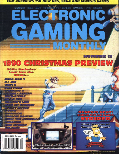
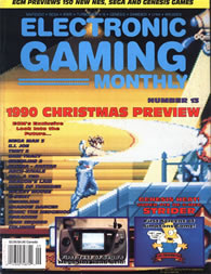
ELECTRONIC GAMING MONTHLY #13
For a mag fond of using screenshots on their covers, EGM wasn't especially good at choosing the most exciting moments. But this time around the magazine did a great job capturing what made Strider the best action game of 1990. We see Hiryu use his lightning fast sword to slice through enemies, causing a cool explosion. There's a drone in the sky and a spotlight in the distance. It couldn't possibly be more exciting. 16-bit is here!
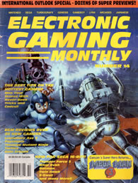
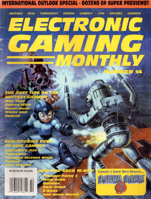
ELECTRONIC GAMING MONTHLY #14
Let's take a moment to acknowledge how great this Mega Man 3 cover art is. After the disaster that was the Mega Man 1 box art, this is a character that has really turned it around. This EGM cover does little more than steal Capcom's artwork, but at least it's exciting and an improvement over the magazine's Mega Man 2 cover. This is also one of the few times when the text is both legible and not in the way. This is a good use of official artwork.

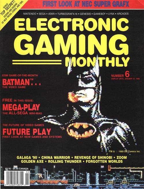
ELECTRONIC GAMING MONTHLY #6
In case you haven't noticed it yet, EGM was a fan of featuring a strip of gameplay at the bottom of some of their covers. They started the trend in 1989 with Ghouls 'N Ghosts, and continue it here with Batman. Of the several times they've employed this design choice, this is the rare occasion when it actually adds something. The close-up of the Dark Knight comes directly from the NES game, showing off just how good those 8-bit cinemas looked. Simple and effective.
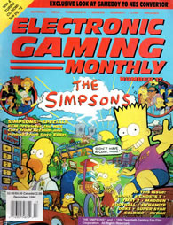
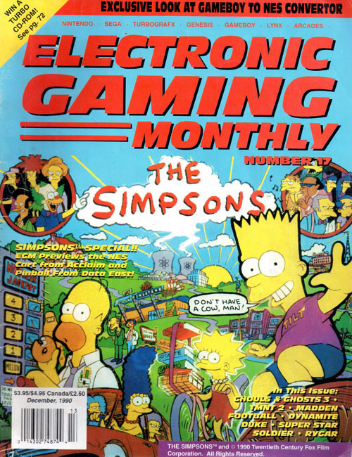
ELECTRONIC GAMING MONTHLY #17
The December 1990 issue not only marks the first appearance of The Simpsons, but also happens to be a historic moment for the magazine. Believe it or not, in EGM's 236 issues, this is the first and only one to solely feature a pinball machine on the cover. Sure, the issue talks about the upcoming NES game, but this artwork comes directly from the Data East pinball machine. The fun cameos largely make up for what appears to be little more than a picture of an arcade machine. Lazy.

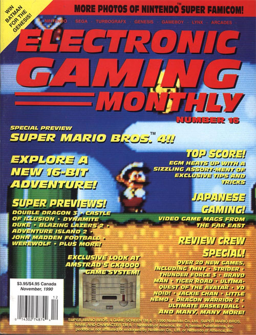
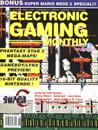
ELECTRONIC GAMING MONTHLY #16
After Super Mario Bros. 3 dominated sales in 1989, the entire world was on pins and needles waiting for any information about the 16-bit follow-up. Unfortunately, this EGM debut of Mario World is the very definition of anticlimactic. The close-up picture looks fine, but not the "quantum leap" Quartermann promised only a few issues back. Despite the lackluster design, the SNES launch game ended up being incredible. Sadly, the same cannot be said about the Amstrad GX4000.

ELECTRONIC GAMING MONTHLY
PRESENTS TOP SCORE!
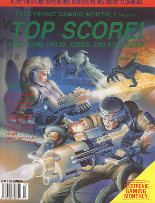
Seven issues in and the magazine was already experimenting with a different name. Don't let the "Top Score!" title fool you; this is a standard issue of EGM, complete with reviews, previews and a cover using video game box art. In this case, the art came from Alien Syndrome, an NES port of the Sega classic. While their ports were questionable, Tengen knew how to make great cover art. That normally would apply to this magazine cover, but it's not entirely clear EGM still wants to be EGM.
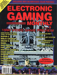
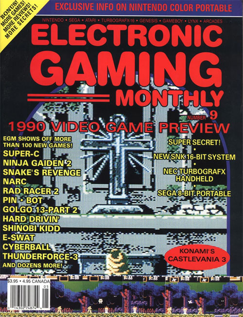
ELECTRONIC GAMING MONTHLY #9
Now here's something you don't see on many classic video game magazine covers -- religious imagery. In a daring move, EGM decided to highlight one of the more somber moments in Castlevania III: Dracula's Curse. We see Trevor Belmont praying to a giant cross, preparing for the battle of his life. Unfortunately, this striking moment is interrupted by a strip of gameplay at the bottom. Not only is this bit unnecessary, but it's ugly and all but ruins an otherwise great design.
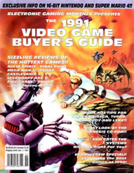
ELECTRONIC GAMING MONTHLY
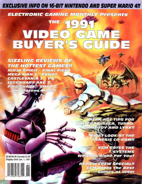
(The 1991 Video Game Buyer's Guide)
Like clockwork, EGM's annual Video Game Buyer's Guide cover disappoints. Instead of highlighting a bunch of games through pictures, this issue opts to use the Street Fighter 2010 box art and then list the rest in text. This defeats the purpose and ends up looking like a standard issue of EGM. Also confusing is the choice in art, which sees Ken in exactly the same pose as Mega Man on the cover of issue 14. Nobody else noticed this?
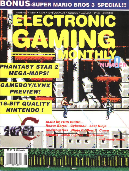
ELECTRONIC GAMING MONTHLY #10
New rule: You can only use a close-up screenshot if it's something exciting. Between taking place during an alien invasion and featuring high-powered weaponry, this Contra sequel is inherently an exciting game. But none of that is conveyed on the cover of issue 10. Things are only made worse with the giant yellow blocks highlighting other games and systems. And to add insult to injury, the magazine's logo seems to get lost in Super C's bombed out background.
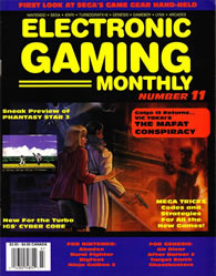
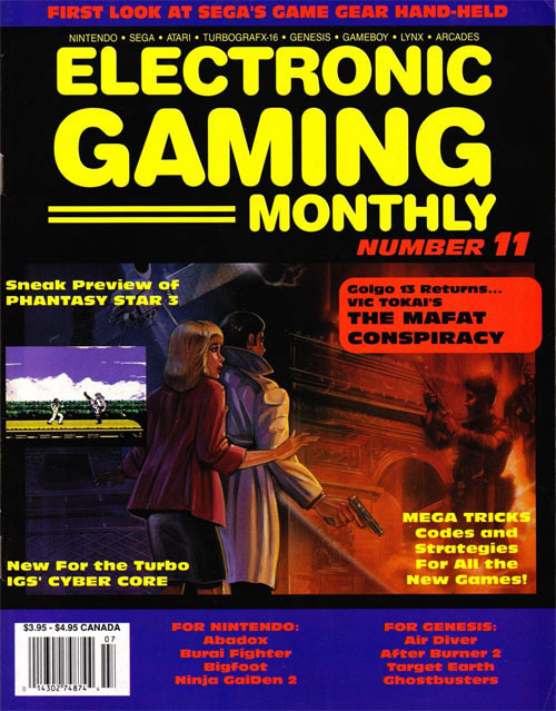
ELECTRONIC GAMING MONTHLY #11
I'm torn on this cover. On one hand, I absolutely love the use of art from The Mafat Conspiracy. It's also a nice touch using a screenshot of an exciting moment from the game, something EGM doesn't do very often. However, I can't look at that without my eyes being drawn to the blue borders with headache-inducing red text. Every time I begin to feel like I'm being too harsh, I wipe away the blood flowing from my eyes and curse EGM's color scheme.
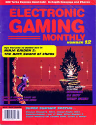
ELECTRONIC GAMING MONTHLY #12
For as much as I love Ryu Hayabusa and all his Ninja Gaiden adventures, I have to bring myself to admit that I hate this cover. The good news is that EGM chose one of the most exciting moments from The Dark Sword of Chaos. Sadly, everything around that screenshot looks like it was designed by the colorblind. The red and blue clash in the worst way, searing my retinas after only a moment of exposure. It's like a box of candy threw up on one of the worst covers of all time.
THE WORST:
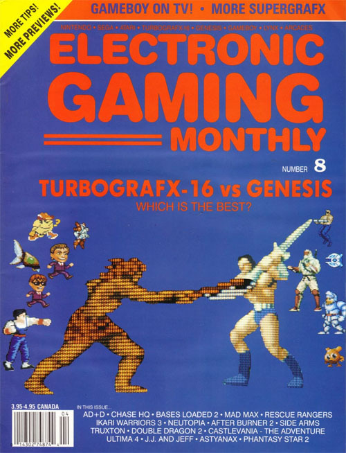
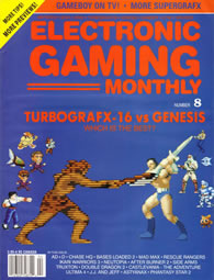
ELECTRONIC GAMING MONTHLY #8
And this is why you cut and paste video game sprites onto a black background. There's no way around it, this cover is rough. I like the intention, which seems to want to bring TurboGrafx and Genesis heroes together in a Westside Story-style street brawl. But that blue background only helps to highlight every incorrect click of the erase tool. There should be dozens of recognizable faces on this cover, not the dozen C-list heroes found on issue 8. This design is hideous.
Still want more magazine reviews? Then don't forget to check out past episodes of both
Nintendo Power Unplugged and
Next Generation Unplugged. Both shows take a longer look at each magazine cover, giving us a chance to add historical context and properly critique the design. And don't forget to
get a hold of me on Twitter to let me know what other magazines you would like Defunct Games to cover.