- CLASSIC MAGAZINES
- REVIEW CREW
A show recapping what critics thought back
when classic games first came out! - NEXT GENERATION'S BEST & WORST
From the worst 1-star reviews to the best
5-stars can offer, this is Next Generation! - NINTENDO POWER (ARCHIVE)
Experience a variety of shows looking at the
often baffling history of Nintendo Power! - MAGAZINE RETROSPECTIVE
We're looking at the absolutely true history of
some of the most iconic game magazines ever! - SUPER PLAY'S TOP 600
The longest and most ambitious Super NES
countdown on the internet! - THEY SAID WHAT?
Debunking predictions and gossip found
in classic video game magazines! - NEXT GENERATION UNCOVERED
Cyril is back in this spin-off series, featuring the
cover critic review the art of Next Generation! - HARDCORE GAMER MAGAZING (PDF ISSUES)
Download all 36 issues of Hardcore Gamer
Magazine and relive the fun in PDF form!
- REVIEW CREW
- ELECTRONIC GAMING MONTHLY
- ELECTRONIC GAMING MONTHLY RANKS
From Mario to Sonic to Street Fighter, EGM
ranks classic game franchises and consoles! - ELECTRONIC GAMING MONTHLY BEST & WORST
Counting down EGM’s best and worst reviews
going year by year, from 1989 – 2009! - ELECTRONIC GAMING BEST & WORST AWARDS
11-part video series chronicling the ups and
downs of EGM’s Best & Worst Awards!
- ELECTRONIC GAMING MONTHLY RANKS
- GAME HISTORY
- GAME OVER: STORY BREAKDOWNS
Long-running series breaking down game
stories and analyzing their endings! - A BRIEF HISTORY OF GAMING w/ [NAME HERE]
Real history presented in a fun and pithy
format from a variety of game historians! - THE BLACK SHEEP
A series looking back at the black sheep
entries in popular game franchises! - INSTANT EXPERT
Everything you could possibly want to know
about a wide variety of gaming topics! - FREEZE FRAME
When something familiar happens in the games
industry, we're there to take a picture! - I'VE GOT YOUR NUMBER
Learn real video game history through a series
of number-themed episodes, starting at zero! - GREAT MOMENTS IN BAD ACTING
A joyous celebration of some of gaming's
absolute worst voice acting!
- GAME OVER: STORY BREAKDOWNS
- POPULAR SHOWS
- DG NEWS w/ LORNE RISELEY
Newsman Lorne Riseley hosts a regular
series looking at the hottest gaming news! - REVIEW REWIND
Cyril replays a game he reviewed 10+ years
ago to see if he got it right or wrong! - ON-RUNNING FEUDS
Defunct Games' longest-running show, with
editorials, observations and other fun oddities! - DEFUNCT GAMES QUIZ (ARCHIVE)
From online quizzes to game shows, we're
putting your video game knowledge to the test!- QUIZ: ONLINE PASS
Take a weekly quiz to see how well you know
the news and current gaming events! - QUIZ: KNOW THE GAME
One-on-one quiz show where contestants
find out if they actually know classic games! - QUIZ: THE LEADERBOARD
Can you guess the game based on the classic
review? Find out with The Leaderboard!
- QUIZ: ONLINE PASS
- DEFUNCT GAMES VS.
Cyril and the Defunct Games staff isn't afraid
to choose their favorite games and more! - CYRIL READS WORLDS OF POWER
Defunct Games recreates classic game
novelizations through the audio book format!
- DG NEWS w/ LORNE RISELEY
- COMEDY
- GAME EXPECTANCY
How long will your favorite hero live? We crunch
the numbers in this series about dying! - VIDEO GAME ADVICE
Famous game characters answer real personal
advice questions with a humorous slant! - FAKE GAMES: GUERILLA SCRAPBOOK
A long-running series about fake games and
the people who love them (covers included)! - WORST GAME EVER
A contest that attempts to create the worst
video game ever made, complete with covers! - LEVEL 1 STORIES
Literature based on the first stages of some
of your favorite classic video games! - THE COVER CRITIC
One of Defunct Games' earliest shows, Cover
Critic digs up some of the worst box art ever! - COMMERCIAL BREAK
Take a trip through some of the best and
worst video game advertisements of all time! - COMIC BOOK MODS
You've never seen comics like this before.
A curious mix of rewritten video game comics!
- GAME EXPECTANCY
- SERIES ARCHIVE
- NINTENDO SWITCH ONLINE ARCHIVE
A regularly-updated list of every Nintendo
Switch Online release, plus links to review! - PLAYSTATION PLUS CLASSIC ARCHIVE
A comprehensive list of every PlayStation
Plus classic release, including links! - RETRO-BIT PUBLISHING ARCHIVE
A regularly-updated list of every Retro-Bit
game released! - REVIEW MARATHONS w/ ADAM WALLACE
Join critic Adam Wallace as he takes us on a
classic review marathon with different themes!- DEFUNCT GAMES GOLF CLUB
Adam Wallace takes to the links to slice his way
through 72 classic golf game reviews! - 007 IN PIXELS
Adam Wallace takes on the world's greatest spy
as he reviews 15 weeks of James Bond games! - A SALUTE TO VAMPIRES
Adam Wallace is sinking his teeth into a series
covering Castlevania, BloodRayne and more! - CAPCOM'S CURSE
Adam Wallace is celebrating 13 days of Halloween
with a line-up of Capcom's scariest games! - THE FALL OF SUPERMAN
Adam Wallace is a man of steel for playing
some of the absolute worst Superman games! - THE 31 GAMES OF HALLOWEEN
Adam Wallace spends every day of October afraid
as he reviews some of the scariest games ever! - 12 WEEKS OF STAR TREK
Adam Wallace boldly goes where no critic has
gone before in this Star Trek marathon!
- DEFUNCT GAMES GOLF CLUB
- DAYS OF CHRISTMAS (ARCHIVE)
Annual holiday series with themed-episodes
that date all the way back to 2001!- 2015: 30 Ridiculous Retro Rumors
- 2014: 29 Magazines of Christmas
- 2013: 29 Questionable Power-Ups of Christmas
- 2012: 34 Theme Songs of Christmas
- 2011: 32 Game Endings of Christmas
- 2010: 31 Bonus Levels of Christmas
- 2009: 30 Genres of Christmas
- 2008: 29 Controls of Christmas
- 2007: 34 Cliches of Christmas
- 2006: 33 Consoles of Christmas
- 2005: 32 Articles of Christmas
- 2004: 31 Websites of Christmas
- 2003: 29 Issues of Christmas
- 2002: 28 Years of Christmas
- 2001: 33 Days of Christmas
- NINTENDO SWITCH ONLINE ARCHIVE
- REVIEW ARCHIVE
- FULL ARCHIVE
The Cover Critic Collects Old EGM Issues
After nine years of reviewing game boxes, The Cover Critic is getting burned out. To help keep him sane, we've decided to give him a break from the box covers and instead look at famous magazine covers. For the next few months The Cover Critic is going to be taking a look at different eras and video game magazines. We'll pick a famous magazine and then he'll choose five covers at random. Will he like what he sees? I guess we're going to have to find out now when he picks through some old school Electronic Gaming Monthly ...
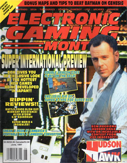
EGM 23: Bruce Willis in Hudson Hawk
[ June - 1991 - Final Rating: F ]
Every magazine has that moment of shame where everybody involved looks back and wonder what they were thinking. I sure hope that the entire staff of Electronic Gaming Monthly looks back at issue 23 in horror and disgust. What were they thinking? There should be a rule against putting up and coming Hollywood celebrities
on your magazine cover. I don't care who it is, if the celebrity has nothing to do with video games, then you should leave them off the cover. Electronic Gaming Monthly looks even worse in retrospect, since Hudson Hawk proved to be one of Bruce's biggest critical and financial disasters. There isn't a person alive that looked at this cover and said: "I can't wait for the upcoming Hudson Hawk game." Not even the people making this turd of a game had high hopes for it. Electronic Gaming Monthly should have known better.[ June - 1991 - Final Rating: F ]
But even if you can get over the crummy movie and its star, that still doesn't explain why this cover is so busy. There isn't much between the picture of Bruce, that weird portable NES thing, screenshots for Super R-Type and Double Dragon, and mountains of yellow text. Trying to focus on any one thing will give you a headache, and the moment you realize that there's yet another (somewhat obscured) picture in the background, it's all over. Incidentally this was the issue of EGM that gave us the first screenshot of what would become Super Mario World. The cover makes mention of that, but with all of the activity it's almost impossible to locate. How is that not the big cover story? Or better yet, why couldn't they come up with a picture of an international game to go along with the huge text that reads "SUPER INTERNATIONAL PREVIEW"? This cover confuses me.
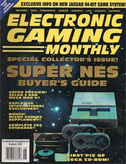
EGM 22: Super NES Buyer's Guide
[ August - 1991 - Final Rating: C- ]
So this is how you introduce one of the most exciting game systems of all time? By August of 1991 the 16-bit wars were already two years old, so maybe there's a reason Electronic Gaming Monthly decided to work up such a hack job for the big Super NES U.S. Buyer's Guide. The cover may say "Special Collector's Issue," but the tacky outlines, the
space motif and the yellow/gold text yells "Average EGM Issue." There's nothing on this cover about games, it's really just a space background and the ugliest 16-bit game console ever produced slapped someplace randomly. And did I mention that EGM spun this issue out into its own special magazine? It's true, for $3 you could pick up the "Special Collector's" inlay that reviews all of the Super NES games and previews the hardware. That doesn't sound very special to me.[ August - 1991 - Final Rating: C- ]
Worst of all, the Super NES isn't even the most exciting thing on this cover. Directly next to the Super NES is the very first picture of the Sega CD. Oh sure, the system was a dud, but for those paying attention this was the beginning of Sega's future. The Genesis was the last home console that used cartridges as the main media, so in a lot of ways the Sega CD's design was a revelation for a lot of eager gamers. Even if you weren't already a huge Sega fanboy, the Sega CD certainly gave you pause. It did for Nintendo, who only months after this issue hit newsstands announced their own CD-ROM peripheral. I'm not saying that EGM shouldn't have bothered with the Sega CD picture, but maybe there was a more diplomatic way of going about advertising this breaking news. Also, did anybody notice that this was the issue where EGM broke the news about the "64-bit" Atari Jaguar? No? Well, they mention it at the top of the issue ... not that anybody cares 19 years later.
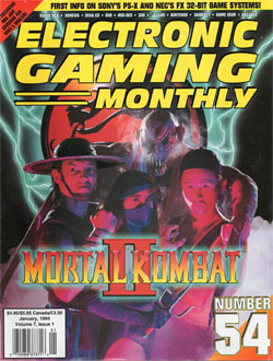
EGM 54: Mortal Kombat II (Arcade)
[ January - 1994 - Final Rating: C ]
What you can't tell from this cover is that EGM #54 is gigantic. Its girth is made out of more than 300 pages, featuring 40 reviews, 8 pages of Mortal Kombat II coverage and a lengthy conversation about the merits of Sega's brand new rating system. This magazine was packed with great articles and, most importantly, terrible
advertising. This book is well over 50% adverts, and yet it feels like no actual money was put into this horrible cover. This is EGM's coming out issue for Mortal Kombat II, a time when they could really get in depth with the nuance of the game and introduce fans to the seven brand new characters. Unfortunately, opting against using a screen shot or even gorgeous artwork inspired by the game, they went with posed actors.[ January - 1994 - Final Rating: C ]
What makes this all the more offensive is that the picture used was taken straight from Midway. This was nothing more than a publicity shot for the game, which means that all Electronic Gaming Monthly had to do was grab the picture and slap a logo on the cover. They literally did the least they had to do in making this old school cover. Getting into specifics, the "Mortal Kombat II" placement is disastrous. The "II" covers us most of Mileena's costume, the smoke makes it hard to see what Shang Tsung is wearing and that Baraka mask looks like the kind of thing you might find at Spencer's Gifts. This is a game with non-stop graphic violence, amazing character designs and inspired backgrounds. There is no shortage of amazing artwork EGM could have used, and yet they went with the man in a fake rubber mask and fake sword-arms.
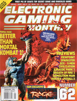
EGM 62: Primal Rage (Arcade)
[ September - 1994 - Final Rating: B+ ]
Is Primal Rage "Better Than Mortal Kombat 2?" Of course it's not, it's a terrible game with even worse gameplay. What it has is a great concept and enough controversial moves (such as peeing on your opponent) to keep it in the back of people's
minds. But it never has been and never will be better than Mortal Kombat II, that's just crazy talk. However, this cover is DEFINITELY better than Mortal Kombat II. This cover gives us everything issue 54 was afraid of. We have incredible action in both the back and foreground, blood flying everywhere and two combatants that really draw your attention. It's impossible to ignore this cover. I don't even like Primal Rage and I think this cover kicks ass.[ September - 1994 - Final Rating: B+ ]
But here's the thing, EGM couldn't just leave it at two dinosaurs kicking butt. They had to throw as many things in front of the action as they possibly could. We get an "exclusive" code to play as Akuma in Super Street Fighter II Turbo, plus previews of everything from Viewpoint to Pitfall 3. Heck, they even talk about Jurassic Park 2 on the cover, as if the Sega game is going to compare in any way to Primal Rage's killer uppercut. I'm proud of EGM for having the guts to go with this controversial cover instead of the more traditional Sonic & Knuckles reveal. Unfortunately this picture makes Primal Rage look much cooler than it actually was, but I'm willing to give Atari's lame fighting game their time in the sun. Looking back at it now, I think EGM owns Mortal Kombat II an apology.
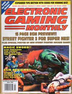
EGM 33: Street Fighter II (Super NES)
[ December - 1991 - Final Rating: A ]
Is there anything worse than the American Street Fighter II artwork? Considering all of the amazing art that was coming out of Japan at the time, it's downright offensive to see such crummy work done exclusively for America's delicate eyes. What's wrong
with just leaving the Japanese art intact? This artwork (which was also used on the Super NES Street Fighter II box) doesn't make anybody look good. Blanka looks even more freakish than usual, Ryu appears to be knocked out on the ground and that outfit Chun Li is wearing isn't doing her any favors. It's as if this artwork sucks all of the charm out of these characters. If I didn't know what this game was about, I would probably think it was a weird pinball game based on this crazy artwork. Few video game covers have been as bad as the Street Fighter II box, and this cover just reinforces that opinion. [ December - 1991 - Final Rating: A ]
Equally puzzling is why Electronic Gaming Monthly chose this horrible cover art for their 33rd issue. As I said before, there was plenty of other (better) artwork they could have gone with, yet they stuck with the generic Capcom of America design? How lazy is this magazine anyway? Unfortunately it's not just the artwork I am troubled by. This cover specifically states that there are "Special Photos" of a brand new Street Fighter arcade game. Okay, that sounds cool, but what exactly do you mean by "Special Photos"? I'm also a little confused by the Magic Sword preview, which states that this upcoming game will be the next "Mega-Hit" for the Super NES. Magic Sword a mega-hit? The arcade game had middling success, at best. So what makes you think this traditional 2D hack and slash is going to be the next big thing? This is the issue where EGM reviews Contra III, and yet Magic Sword is the next big thing? At least Magic Sword's artwork was an affront to nature.
HOME |
CONTACT |
NOW HIRING |
WHAT IS DEFUNCT GAMES? |
NINTENDO SWITCH ONLINE |
RETRO-BIT PUBLISHING
Retro-Bit |
Switch Planet |
The Halcyon Show |
Same Name, Different Game |
Dragnix |
Press the Buttons
Game Zone Online | Hardcore Gamer | The Dreamcast Junkyard | Video Game Blogger
Dr Strife | Games For Lunch | Mondo Cool Cast | Boxed Pixels | Sega CD Universe | Gaming Trend
Game Zone Online | Hardcore Gamer | The Dreamcast Junkyard | Video Game Blogger
Dr Strife | Games For Lunch | Mondo Cool Cast | Boxed Pixels | Sega CD Universe | Gaming Trend
Copyright © 2001-2025 Defunct Games
All rights reserved. All trademarks are properties of their respective owners.
All rights reserved. All trademarks are properties of their respective owners.


