They say you shouldn't judge a book by its cover. But since I've never heard that expression used against video games I figure that it's open season on the box art you see every day. This is The Cover Critic, your guide to what's good and bad in the world of video game boxes. In this episode of The Cover Critic we learn what it's like to be ugly and work on a construction site, we learn that Yo Bro is a really stupid name for a video game, we learn that it's kind of depressing talking about New Orleans, and we finally discover that Capcom isn't very consistent when it comes to their box art. For a company so good at dreaming up cool characters and making great games, you have to wonder why they aren't able to get strong artists to work on their covers. But who am I to judge? I'm just here to tell you what I think of five random covers, the types of covers that probably kept you from giving these games a chance. This may be the 64th episode of The Cover Critic, but I assure you we haven't run out of truly heinous box art to talk about. Now, let's get on with the show!
Hammerin' Harry (NES)
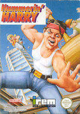
The last time we checked in with The Cover Critic he was throwing up all over some of the worst covers of all time, introducing you to the tragedy that is Karnaaj Rally and Krazy Kreatures. This time around we aren't going to focus on the absolute worst of the worst, just the moderately bad of the moderately bad. None of these games are so hideously terrible that you will want to shield your eyes, but that doesn't mean they are going to get off with only a slap on the wrist. A good example of this is Hammerin' Harry, an NES game from Irem. I'm not sure what this game is all about (or even if it's fun), but I do know that I absolutely hate this cover for about ten different reasons. Maybe it's that I hate the idea of spending all of my time working on a construction site, or maybe it's the bizarre almost deformed face that Harry is making, but whatever it is I think I'm just going to pass on this 8-bit game.
Being that the name of the game is Hammerin' Harry you should expect a dude named Harry packing a hammer, and lo and behold that's exactly what you get with this cover. Except that's not a hammer, that's a cartoon-sized mallet. Perhaps a better name for this game would have been Mallet Matt or Ugly Dude Looking To Beat Your Face In With a Giant Mallet. I think that's my biggest problem with this cover, it looks like I'm the enemy. Hammerin' Harry is here to beat my face in, and it kind of scares me. This is not the kind of guy I can reason with (ugly people are notoriously bad negotiators). And then there's the guy riding the drill. I may not know much about how construction works, but I do know that if you're twenty feet in the air and still holding on to the drill, then dude, you're doing something wrong. I certainly don't want to be around him when he finally does land. What kind of construction site are they running here? I mean, even the
Kids on Site seem more reliable. Please Hammer don't hurt 'em!
Resident Evil 2 (GCN)
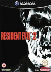
We all know that the Resident Evil series is home to some of the cheesiest voice acting this side of Plan 9 From Outer Space, but who knew that Resident Evil also had some cheesy box art? The only thing scary about this Resident Evil 2 cover is that somebody thought it was a good idea to use this picture instead of the far superior PlayStation artwork. We can argue all day long about bringing the Resident Evil 2 to the GameCube (especially when you don't do anything to enhance it), but I have a hunch that nobody is going to disagree with me when I say that this is one of the absolute worst covers of all time. At best this looks like some stupid homemade cover art somebody did to pass the time until the game was actually released. I've seen temporary cover art at Amazon.com that is better than this piece of garbage. And worse yet, there's no way something like this is going to jump off the shelf and grab you when you're looking for a new game to buy. But then again, considering that this version of Resident Evil 2 was overpriced and did not feature even one improvement, perhaps Capcom did us a favor.
But let's not talk in generalities, let's narrow in on exactly why this cover is so bad. To start with, if it wasn't for that splash of red text you might think that this cover was a bad black & white photocopy. The idea of using half of a character's face to sell your game is nothing new (see:
Music Industry vs. Twisted Metal Black), but it's important to make sure that the half you do show is worth looking at. This zombie isn't creepy or disgusting; he's just out of focus. At first glance you might not even realize it's a zombie, when I first looked saw it I thought it was a picture of Strom Thurmond (which is close enough to a zombie, I guess). But then you actually look at the caved-in eyes, the rotting teeth and the coarse skin and you realize that this one of those slow moving, not very scary zombies from the Resident Evil series. And that's when you realize that this is the closest you ever want to be to these characters, this cover is so close that I can almost smell the brains Mr. Zombie had for breakfast. Needless to say, that's not a very attractive look, and it's not something that's going to help sell copies of your game. Just imagine if Capcom had used this to sell Resident Evil 4, not only would it not have been the game of 2005 but nobody would have bought it. Hopefully Capcom has learned their lesson.
Mega Man (NES)
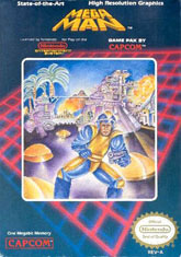
Believing that Capcom has learned its lesson from past box art mistakes is a fool's job, because it's clear that Capcom continues to make terrible art mistakes time and time again. Do you remember the original Street Fighter II box art? Or what about that Resident Evil remake for the GameCube? And should I even bring up the terrible art associated with Resident Evil Zero? I didn't think so. But none of these bad covers holds a candle to one of Capcom's earliest mistakes, Mega Man. If Capcom was going to learn anything from its terrible box art it should have been from Mega Man, because this is easily one of the worst covers you will ever see. Some actually believe that this is the worst cover ever. I'm not going to say they are wrong, but at the same I'm kind of happy I have something like this so that I can fairly judge all of the great covers that have come my way over the years. Mega Man's box art may be terrible, but there's something endearing about it. Something that I wouldn't give up for anything.
While future Mega Man games would end up making our favorite hero robot look like a young boy, this 1987 cover actually goes a long way to make the guy look like a real man. The problem is that they made him look like a real insecure man. You can almost see him shaking in his blue and yellow uniform (which, for what it's worth, is NOT a good look for him). Heck, he's so scared that he didn't even put his helmet on straight, which certainly gives off the impression that he's going to be a push over. And since when did Mega Man pack heat? I thought Dr. Light gave Mega Man some sort of arm cannon? I guess that these are the small details that Capcom filled in later ... when they got around to hiring somebody that actually knew how to draw an attractive cover! As it is it looks like they hired a very nervous Chris Kattan to star in one of the longest running franchises of all time, and don't even get me started on how bad of a choice that was.
Yo Bro (TG16)
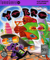
I know I'm supposed to be debating the merits of the cover art, but sometimes we have to slow down and actually appreciate the other aspects of video games. While this artwork may be bad (and trust me, it is), it's no worse than the ludicrous name. Yo Bro?? Are they just stealing names from Teenage Mutant Ninja Turtles cartoons? Too bad this game didn't sell well, I was hoping we could see sequels like Cowabunga Dude and maybe even Yee Haw! Ninja Cowboy! Okay, maybe not the last one, but you can see where this series was headed. When I hear a name like Yo Bro I picture a low IQ womanizing frat boy who is too stupid to realize that there's a connection between his low grades and getting drunk every night. But that's not what Yo Bro is all about; this is a celebration of skater culture ... only with a crazy looking bear doing the Bart Simpson. Tony Hawk must be rolling over in his grave.
So where do I start with a cover like this? It seems like every inch of real estate on this box is full of terrible ideas, but which one is the most heinous? Usually I would start with the actual Yo Bro character, but instead I'm more interested in all of the craziness around him. Like Audrey from Little Shop of Horrors and the mouse who looks like he just came from a wild party at Pee Wee's Playhouse. And then there are all those bees, which are going to be REALLY hard to deal with when all you're packing is a slingshot. Even more confusing is his shirt. On the back it uses the word "mascot," but thankfully this Berenstain Bear wannabe wasn't the official TurboGrafx-16 mascot. I'm not going to say that Bonk is the coolest character of all time, but compared to this guy he's in the same league as Mario and Luigi. Even more confusing is that he appears to be wearing a Beach Boys shirt. I don't think I need to tell you that by the time this game came out the good old days of The Beach Boys were long gone. Dennis Wilson had already passed away, Carl Wilson was battling cancer and their biggest hit was the instantly forgettable song Kokomo (from the Cocktail soundtrack). And even if you liked that horrible, horrible song, by the time this game came out it was several years old. Yet this bear, with his amazing fashion sense and top notch use of popular extreme sports, seemed to be into it. Which is exactly the kind of forward thinking protagonist we expect from a company like NEC. It's a shame they never introduced a second player, Yo Gal, who was totally into swing music and Tony Bennett.
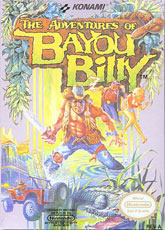
The Adventures of Bayou Billy (NES)
"You call that a knife? THIS is a knife." And this, my friends, is The Adventure of Bayou Billy, a game that I almost feel bad talking about. Set long before Hurricane Katrina ripped through Louisiana, Bayou Billy is the story of a simple man who hates wearing shirts, loves battling crocodiles and has a really, really big knife. Just take a look at that blade, that thing is almost bigger than the box (it's certainly bigger than his jeep). It's funny to see what the Japanese video game makers think of us Americans, clearly it's all about being shirtless and ready to kill at a moment's notice (I don't know about you, but that's certainly how I live my life). But beyond the silly name, stereotyping and complete lack of realism, The Adventures of Bayou Billy is still regarded as a good game. I won't kid you; if this game popped up on the Virtual Console I might just have to buy it ... I certainly remember having a good time with this as a kid.
But forget the game play and how crazy it is to have Konami make a game set in New Orleans; we're here to talk about why this is one terrible cover. What I love about this box art is that they aren't afraid to throw in every action movie clich? and southern stereotype they can think of. You have the guy killing people from his jeep, some historic landmark blowing up, a big fat guy (who smokes, that's how you know he's evil), a busty woman, and the shirtless wonder (who can't be bothered to buy a real belt, hence the makeshift rope belt). He's so cool that even his leg has a bandana. He's so cool he's not afraid to rock a fanny pack. He's so cool that he's willing to mug for the camera while a croc growls mere feet from him. I bet he's not even going to wash his pants after playing in the water. Hell, this is probably the closest he gets to bathing. Bayou Billy, you are the man. But you know what? You would be even cooler in my book if you stopped playing around with that stupid croc and maybe, I don't know, GO RESCUE THAT HELPLESS GIRL!!! I mean, she's right behind you, just turn around and stab that smoker in his big old gut. I bet she'll be so overjoyed that she might even agree to sleep with you. Doesn't that sound awesome? Instead he just stands there mugging for the camera and playing with his crocodile. And that's why Bayou Billy is the man!