- CLASSIC MAGAZINES
- REVIEW CREW
A show recapping what critics thought back
when classic games first came out! - NEXT GENERATION'S BEST & WORST
From the worst 1-star reviews to the best
5-stars can offer, this is Next Generation! - NINTENDO POWER (ARCHIVE)
Experience a variety of shows looking at the
often baffling history of Nintendo Power! - MAGAZINE RETROSPECTIVE
We're looking at the absolutely true history of
some of the most iconic game magazines ever! - SUPER PLAY'S TOP 600
The longest and most ambitious Super NES
countdown on the internet! - THEY SAID WHAT?
Debunking predictions and gossip found
in classic video game magazines! - NEXT GENERATION UNCOVERED
Cyril is back in this spin-off series, featuring the
cover critic review the art of Next Generation! - HARDCORE GAMER MAGAZING (PDF ISSUES)
Download all 36 issues of Hardcore Gamer
Magazine and relive the fun in PDF form!
- REVIEW CREW
- ELECTRONIC GAMING MONTHLY
- ELECTRONIC GAMING MONTHLY RANKS
From Mario to Sonic to Street Fighter, EGM
ranks classic game franchises and consoles! - ELECTRONIC GAMING MONTHLY BEST & WORST
Counting down EGM’s best and worst reviews
going year by year, from 1989 – 2009! - ELECTRONIC GAMING BEST & WORST AWARDS
11-part video series chronicling the ups and
downs of EGM’s Best & Worst Awards!
- ELECTRONIC GAMING MONTHLY RANKS
- GAME HISTORY
- GAME OVER: STORY BREAKDOWNS
Long-running series breaking down game
stories and analyzing their endings! - A BRIEF HISTORY OF GAMING w/ [NAME HERE]
Real history presented in a fun and pithy
format from a variety of game historians! - THE BLACK SHEEP
A series looking back at the black sheep
entries in popular game franchises! - INSTANT EXPERT
Everything you could possibly want to know
about a wide variety of gaming topics! - FREEZE FRAME
When something familiar happens in the games
industry, we're there to take a picture! - I'VE GOT YOUR NUMBER
Learn real video game history through a series
of number-themed episodes, starting at zero! - GREAT MOMENTS IN BAD ACTING
A joyous celebration of some of gaming's
absolute worst voice acting!
- GAME OVER: STORY BREAKDOWNS
- POPULAR SHOWS
- DG NEWS w/ LORNE RISELEY
Newsman Lorne Riseley hosts a regular
series looking at the hottest gaming news! - REVIEW REWIND
Cyril replays a game he reviewed 10+ years
ago to see if he got it right or wrong! - ON-RUNNING FEUDS
Defunct Games' longest-running show, with
editorials, observations and other fun oddities! - DEFUNCT GAMES QUIZ (ARCHIVE)
From online quizzes to game shows, we're
putting your video game knowledge to the test!- QUIZ: ONLINE PASS
Take a weekly quiz to see how well you know
the news and current gaming events! - QUIZ: KNOW THE GAME
One-on-one quiz show where contestants
find out if they actually know classic games! - QUIZ: THE LEADERBOARD
Can you guess the game based on the classic
review? Find out with The Leaderboard!
- QUIZ: ONLINE PASS
- DEFUNCT GAMES VS.
Cyril and the Defunct Games staff isn't afraid
to choose their favorite games and more! - CYRIL READS WORLDS OF POWER
Defunct Games recreates classic game
novelizations through the audio book format!
- DG NEWS w/ LORNE RISELEY
- COMEDY
- GAME EXPECTANCY
How long will your favorite hero live? We crunch
the numbers in this series about dying! - VIDEO GAME ADVICE
Famous game characters answer real personal
advice questions with a humorous slant! - FAKE GAMES: GUERILLA SCRAPBOOK
A long-running series about fake games and
the people who love them (covers included)! - WORST GAME EVER
A contest that attempts to create the worst
video game ever made, complete with covers! - LEVEL 1 STORIES
Literature based on the first stages of some
of your favorite classic video games! - THE COVER CRITIC
One of Defunct Games' earliest shows, Cover
Critic digs up some of the worst box art ever! - COMMERCIAL BREAK
Take a trip through some of the best and
worst video game advertisements of all time! - COMIC BOOK MODS
You've never seen comics like this before.
A curious mix of rewritten video game comics!
- GAME EXPECTANCY
- SERIES ARCHIVE
- NINTENDO SWITCH ONLINE ARCHIVE
A regularly-updated list of every Nintendo
Switch Online release, plus links to review! - PLAYSTATION PLUS CLASSIC ARCHIVE
A comprehensive list of every PlayStation
Plus classic release, including links! - RETRO-BIT PUBLISHING ARCHIVE
A regularly-updated list of every Retro-Bit
game released! - REVIEW MARATHONS w/ ADAM WALLACE
Join critic Adam Wallace as he takes us on a
classic review marathon with different themes!- DEFUNCT GAMES GOLF CLUB
Adam Wallace takes to the links to slice his way
through 72 classic golf game reviews! - 007 IN PIXELS
Adam Wallace takes on the world's greatest spy
as he reviews 15 weeks of James Bond games! - A SALUTE TO VAMPIRES
Adam Wallace is sinking his teeth into a series
covering Castlevania, BloodRayne and more! - CAPCOM'S CURSE
Adam Wallace is celebrating 13 days of Halloween
with a line-up of Capcom's scariest games! - THE FALL OF SUPERMAN
Adam Wallace is a man of steel for playing
some of the absolute worst Superman games! - THE 31 GAMES OF HALLOWEEN
Adam Wallace spends every day of October afraid
as he reviews some of the scariest games ever! - 12 WEEKS OF STAR TREK
Adam Wallace boldly goes where no critic has
gone before in this Star Trek marathon!
- DEFUNCT GAMES GOLF CLUB
- DAYS OF CHRISTMAS (ARCHIVE)
Annual holiday series with themed-episodes
that date all the way back to 2001!- 2015: 30 Ridiculous Retro Rumors
- 2014: 29 Magazines of Christmas
- 2013: 29 Questionable Power-Ups of Christmas
- 2012: 34 Theme Songs of Christmas
- 2011: 32 Game Endings of Christmas
- 2010: 31 Bonus Levels of Christmas
- 2009: 30 Genres of Christmas
- 2008: 29 Controls of Christmas
- 2007: 34 Cliches of Christmas
- 2006: 33 Consoles of Christmas
- 2005: 32 Articles of Christmas
- 2004: 31 Websites of Christmas
- 2003: 29 Issues of Christmas
- 2002: 28 Years of Christmas
- 2001: 33 Days of Christmas
- NINTENDO SWITCH ONLINE ARCHIVE
- REVIEW ARCHIVE
- FULL ARCHIVE
The Cover Critic Beheads Mortal Kombat
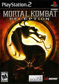
Mortal Kombat: Deception
[ System: PlayStation 2 - 2004 - Final Rating: C ]
Seeing the success of Deadly Alliance, Midway quickly released an online-enabled follow-up called Mortal Kombat: Deception. This middle chapter did a good job of keeping interest in the franchise by receiving high
praise from critics and gamers alike. While the game was financially successful, I can't help but be incredibly bored by this ho-hum cover art. There's almost nothing to it. Just the Mortal Kombat emblem and some guy, the whole thing makes me want to talk about something else. But I have vowed not to go off topic; I need to start taking this job seriously. I mean, the moment I stop caring about my job the whole thing falls apart. That happened to a friend of mine. He stopped caring about his job and suddenly people start dying all around him. Now he's on trial for malpractice, just because he stopped caring. I don't want to be like that guy.[ System: PlayStation 2 - 2004 - Final Rating: C ]
See, I did it right there. I took my eyes off of this boring cover art and went off on a tangent. I promise it won't happen again. This Mortal Kombat: Deception box art deserves to be reviewed. Somebody spent a lot of placing the character and getting the lighting just right. I wonder how much work? Do you think this is the kind of thing somebody busted out in a weekend? And when putting the artwork together, do you think the artist knew that the "PlayStation Online" logo would take up that much real estate? Man, that really is an ugly online logo, I sure am glad Sony ditched that design. Or did they? Maybe I need to go check; it's been awhile since I looked at a PlayStation 3 box. Nope, it's a different logo, I checked. Wait ... what were we talking about?
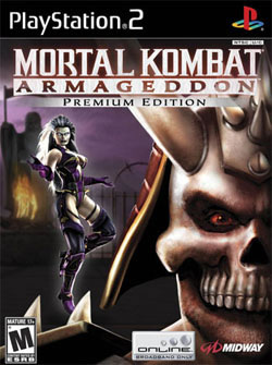
Mortal Kombat: Armageddon
[ System: PlayStation 2 - 2005 - Final Rating: D+ ]
Here we have an example of Midway slipping back into old habits. Mortal Kombat: Armageddon is the final act in the PlayStation 2/Xbox trilogy, so it needed powerful box art to get the point across. Instead what we
got was a weak drawing of a chance encounter. Boring! I want to see explosions, bodies falling from the sky and the rivers flowing with blood. I want to see Liu Kang have to fight through a field of human remains. This is the final act, it's time to go out in style. But that's not what happened. Instead of giving us something truly epic, we're left with one of the worst covers in Mortal Kombat history.[ System: PlayStation 2 - 2005 - Final Rating: D+ ]
It's as if we walked in on an old married couple fighting. He's about to walk away while she nags him, both knowing that it will ultimately lead to passionate make-up sex (or the cops being called, the night's still young). She complains that he never listens, he sends passive aggressive insults back her way. I've seen this movie before; it's the second act of every chick flick your girlfriend dragged you to. The only difference here is that Meg Ryan is floating and Tom Hanks is wearing a skull mask. Oh, and there's a village on fire in the background. Outside of that we're about thirty seconds away from a Burt Bacharach song. The fact that Mortal Kombat makes me yearn for the sweet sounds of Michael McDonald is reason enough to hate this box art!
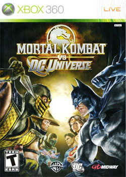
Mortal Kombat vs. DC Universe
[ System: Xbox 360 - 2009 - Final Rating: A- ]
As silly as it sounds at first, this Mortal Kombat vs. DC Universe cover art goes a long way to sell the admittedly cheesy crossover concept. The
idea of Superman fighting Sub-Zero seems crazy, yet I'm completely convinced it could happen when I look at this incredible artwork. It also lets me know that the ultra-violence of Mortal Kombat isn't going anywhere. The T-rating at the bottom of the box reminds me that I won't be decapitating Batman, but I can tell from this cover that something dark is about to take place. I sure am glad I'm not the guy who has to mop up afterwards. [ System: Xbox 360 - 2009 - Final Rating: A- ]
This box seems designed specifically to slap down any worries about Mortal Kombat selling out. And rightfully so, the game, while tamer than past Mortal Kombat incarnations, was still a brutal slugfest that both sides could feel good about. It turns out that some of the DC Universe is just as dark as Scorpion and Shang Tsung. Best of all, this is Midway finally understanding what made the first few games so memorable. Give me goofy storytelling, over-the-top characters and brutal one-on-one battles and I'm good to go. This 2009 crossover does all that and more, proving my skepticism pointless. And for once, a great game is matched with great cover art.
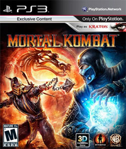
Mortal Kombat
[ System: PlayStation 3 - 2011 - Final Rating: B ]
Eighteen years later we come full circle, with a brand new game simply titled Moral Kombat. This cover looks exactly like what you would expect from 2011 box art, giving us a brief look at the kind of brutal
action you can expect from this M-rated fighting game. We get two the franchise's two biggest stars both performing their signature moves, making the player want to see how it ends. In the background we're given an artistic re-imagining of the classic Mortal Kombat emblem, a perfect way to show long time players that this taking everything that you love about the game and making it better. This box art checks off all the important boxes. It's the kind of cover art that new publishers Warner Bros. can be proud of. So why don't I like it more?[ System: PlayStation 3 - 2011 - Final Rating: B ]
Going into this refresh I was hoping this artwork would mirror the original Mortal Kombat. Instead of cluttering up the box with an unnecessary battle, I would have opted for something simple. I like the simplicity of the first two boxes; they didn't require fancy drawings and explosive action to attract attention. As bad as it is, at least the Mortal Kombat 3 box art doesn't feature Kratos cutting off the top of the artwork. Even with the slightly disappointing artwork, I still can't wait for Mortal Kombat to hit the Xbox 360 and PlayStation3 next week. Fatality!
HOME |
CONTACT |
NOW HIRING |
WHAT IS DEFUNCT GAMES? |
NINTENDO SWITCH ONLINE |
RETRO-BIT PUBLISHING
Retro-Bit |
Switch Planet |
The Halcyon Show |
Same Name, Different Game |
Dragnix |
Press the Buttons
Game Zone Online | Hardcore Gamer | The Dreamcast Junkyard | Video Game Blogger
Dr Strife | Games For Lunch | Mondo Cool Cast | Boxed Pixels | Sega CD Universe | Gaming Trend
Game Zone Online | Hardcore Gamer | The Dreamcast Junkyard | Video Game Blogger
Dr Strife | Games For Lunch | Mondo Cool Cast | Boxed Pixels | Sega CD Universe | Gaming Trend
Copyright © 2001-2024 Defunct Games
All rights reserved. All trademarks are properties of their respective owners.
All rights reserved. All trademarks are properties of their respective owners.


