
- CLASSIC MAGAZINES
- REVIEW CREW
A show recapping what critics thought back
when classic games first came out! - NEXT GENERATION'S BEST & WORST
From the worst 1-star reviews to the best
5-stars can offer, this is Next Generation! - NINTENDO POWER (ARCHIVE)
Experience a variety of shows looking at the
often baffling history of Nintendo Power! - MAGAZINE RETROSPECTIVE
We're looking at the absolutely true history of
some of the most iconic game magazines ever! - SUPER PLAY'S TOP 600
The longest and most ambitious Super NES
countdown on the internet! - THEY SAID WHAT?
Debunking predictions and gossip found
in classic video game magazines! - NEXT GENERATION UNCOVERED
Cyril is back in this spin-off series, featuring the
cover critic review the art of Next Generation! - HARDCORE GAMER MAGAZING (PDF ISSUES)
Download all 36 issues of Hardcore Gamer
Magazine and relive the fun in PDF form!
- REVIEW CREW
- REVIEW ARCHIVE
- ELECTRONIC GAMING MONTHLY
- ELECTRONIC GAMING MONTHLY RANKS
From Mario to Sonic to Street Fighter, EGM
ranks classic game franchises and consoles! - ELECTRONIC GAMING MONTHLY BEST & WORST
Counting down EGM’s best and worst reviews
going year by year, from 1989 – 2009! - ELECTRONIC GAMING BEST & WORST AWARDS
11-part video series chronicling the ups and
downs of EGM’s Best & Worst Awards!
- ELECTRONIC GAMING MONTHLY RANKS
- GAME HISTORY
- GAME OVER: STORY BREAKDOWNS
Long-running series breaking down game
stories and analyzing their endings! - A BRIEF HISTORY OF GAMING w/ [NAME HERE]
Real history presented in a fun and pithy
format from a variety of game historians! - THE BLACK SHEEP
A series looking back at the black sheep
entries in popular game franchises! - INSTANT EXPERT
Everything you could possibly want to know
about a wide variety of gaming topics! - FREEZE FRAME
When something familiar happens in the games
industry, we're there to take a picture! - I'VE GOT YOUR NUMBER
Learn real video game history through a series
of number-themed episodes, starting at zero! - GREAT MOMENTS IN BAD ACTING
A joyous celebration of some of gaming's
absolute worst voice acting!
- GAME OVER: STORY BREAKDOWNS
- POPULAR SERIES
- DG NEWS w/ LORNE RISELEY
Newsman Lorne Riseley hosts a regular
series looking at the hottest gaming news! - REVIEW REWIND
Cyril replays a game he reviewed 10+ years
ago to see if he got it right or wrong! - ON-RUNNING FEUDS
Defunct Games' longest-running show, with
editorials, observations and other fun oddities! - DEFUNCT GAMES QUIZ (ARCHIVE)
From online quizzes to game shows, we're
putting your video game knowledge to the test!- QUIZ: ONLINE PASS
Take a weekly quiz to see how well you know
the news and current gaming events! - QUIZ: KNOW THE GAME
One-on-one quiz show where contestants
find out if they actually know classic games! - QUIZ: THE LEADERBOARD
Can you guess the game based on the classic
review? Find out with The Leaderboard!
- QUIZ: ONLINE PASS
- DEFUNCT GAMES VS.
Cyril and the Defunct Games staff isn't afraid
to choose their favorite games and more! - CYRIL READS WORLDS OF POWER
Defunct Games recreates classic game
novelizations through the audio book format!
- DG NEWS w/ LORNE RISELEY
- COMEDY
- GAME EXPECTANCY
How long will your favorite hero live? We crunch
the numbers in this series about dying! - VIDEO GAME ADVICE
Famous game characters answer real personal
advice questions with a humorous slant! - FAKE GAMES: GUERILLA SCRAPBOOK
A long-running series about fake games and
the people who love them (covers included)! - WORST GAME EVER
A contest that attempts to create the worst
video game ever made, complete with covers! - LEVEL 1 STORIES
Literature based on the first stages of some
of your favorite classic video games! - THE COVER CRITIC
One of Defunct Games' earliest shows, Cover
Critic digs up some of the worst box art ever! - COMMERCIAL BREAK
Take a trip through some of the best and
worst video game advertisements of all time! - COMIC BOOK MODS
You've never seen comics like this before.
A curious mix of rewritten video game comics!
- GAME EXPECTANCY
- FULL ARCHIVE
Sonic the Hedgehog: Which Country Had the Best Cover Art?

Welcome to a brand new episode of Defunct Games Decides, the show that isn't afraid to get to the bottom of classic video game arguments.
Today we're jumping from one mascot to another. While the Review Crew tackles the likes of Knuckles' Chaotix and Sonic Spinball, we thought it would be fun to go back to the game that started it all -- Sonic the Hedgehog. With his bright red running shoes and snarky attitude, it didn't take long for gamers the world over to fall in love with Sega's blue mascot. But did you know that Sonic's cover art changed dramatically depending on where you grew up? Today we're going to decide who had the best Sonic the Hedgehog cover art -- North America or Europe.
VERDICT: I'm sure our European readers will claim I'm biased, but I prefer the original American box art. For what it's worth, I think Sonic the Hedgehog looks better (i.e. slimmer) on the UK box. However, even with the fatter Sonic and boring grid design, I prefer seeing the tropical island setting over pastel artwork of Dr. Robotnik. What I find curious is how neither cover makes an attempt to highlight Sonic's speed, one of the game's biggest selling points. Hell, you can't even see Sonic's running shoes in the American cover. How odd.
Do you agree? Let me know in the comments section. And don't forget to follow Defunct Games on Twitter and recommend future debates to be resolved on Defunct Games Decides!
BRAND NEW DEBATES EVERY
TUESDAY AND THURSDAY

Sonic: North America vs. Europe
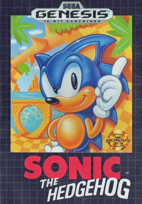
AMERICA: Set against Sega's familiar grid design, this is the Sonic the Hedgehog cover I grew up with in the 1990s. With only a smirk and his finger held high in the air, we get a good sense at Sonic's attitude. He's confident in his blue fur and commands the world around him, which happens to be a gorgeous mix of loops, spiked logs and water as far as the eye can see. This is a tropical playground for the fastest hedgehog on the planet. Not that you get a sense of Sonic's speed by looking at this attractive cover. |
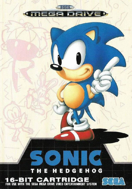
EUROPE: Across the pond, European gamers got a taste of this much different design. While Sonic's pose remains unchanged, the artwork is slightly different. For one thing, Sonic's head appears taller in the Mega Drive design, while U.S. gamers got a 'hog with a perfectly round noggin. Beyond Sonic's design, this European box opts for pastel drawings of the game's friends and foes instead of the lush scenery of the Green Hill Zone. Sega's grid design also makes a cameo, but only in the bottom quarter of the design. |
VERDICT: I'm sure our European readers will claim I'm biased, but I prefer the original American box art. For what it's worth, I think Sonic the Hedgehog looks better (i.e. slimmer) on the UK box. However, even with the fatter Sonic and boring grid design, I prefer seeing the tropical island setting over pastel artwork of Dr. Robotnik. What I find curious is how neither cover makes an attempt to highlight Sonic's speed, one of the game's biggest selling points. Hell, you can't even see Sonic's running shoes in the American cover. How odd.
Do you agree? Let me know in the comments section. And don't forget to follow Defunct Games on Twitter and recommend future debates to be resolved on Defunct Games Decides!
TUESDAY AND THURSDAY

Even More Articles

REVIEW - Rose & Locket
June 30th, 2026


REVIEW - Flesh Made Fear
June 24th, 2026


REVIEW - 4PGP
June 18th, 2026
Must-See Videos


Latest Reviews
View all


HOME |
CONTACT |
NOW HIRING |
WHAT IS DEFUNCT GAMES? |
NINTENDO SWITCH ONLINE |
RETRO-BIT PUBLISHING
Retro-Bit |
Switch Planet |
The Halcyon Show |
Same Name, Different Game |
Dragnix |
Press the Buttons
Game Zone Online | Hardcore Gamer | The Dreamcast Junkyard | Video Game Blogger
Dr Strife | Games For Lunch | Mondo Cool Cast | Boxed Pixels | Sega CD Universe | Gaming Trend
Game Zone Online | Hardcore Gamer | The Dreamcast Junkyard | Video Game Blogger
Dr Strife | Games For Lunch | Mondo Cool Cast | Boxed Pixels | Sega CD Universe | Gaming Trend
Copyright © 2001-2026 Defunct Games
All rights reserved. All trademarks are properties of their respective owners.
All rights reserved. All trademarks are properties of their respective owners.