Okay, these three girls wore it best ... but that's a whole different show!
They may live in a sewer, but the Teenage Mutant Ninja Turtles know a thing or two about getting press coverage. For a few years in the early 1990s, these crime-fighting reptiles managed get themselves on the cover of GamePro, Electronic Gaming Monthly, Nintendo Power and nearly every other major game publication you can think of. Sadly, the results were decidedly mixed.
In this debut episode of Who Wore It Best, we're going to rank the best and worst classic magazine covers featuring the Teenage Mutant Ninja Turtles. Below you will find nine Turtles-enhanced covers released between 1990 and 1993. From best to worst, we'll let you know what we think of the TMNT covers. See if you agree when we play Who Wore It Best: Teenage Mutant Ninja Turtles Edition!

THE BEST:
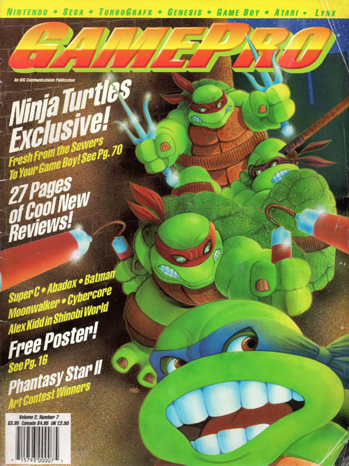
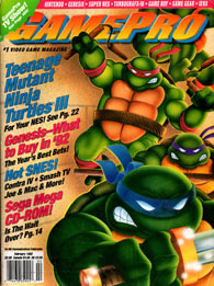
GAMEPRO (July 1990)
GamePro doesn't get enough credit for their early covers. This July 1990 issue is not only the best Teenage Mutant Ninja Turtles cover of the bunch, but it's also one of the few designs that manages to celebrate all four hero turtles. What I love about this cover is how it incorporates each of the turtles weapons. Michelangelo's nunchucks look massive, convincing everybody that he could take out a half dozen foot soldiers. This is better than Ultra's video game box art.
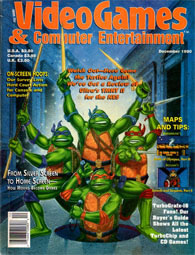
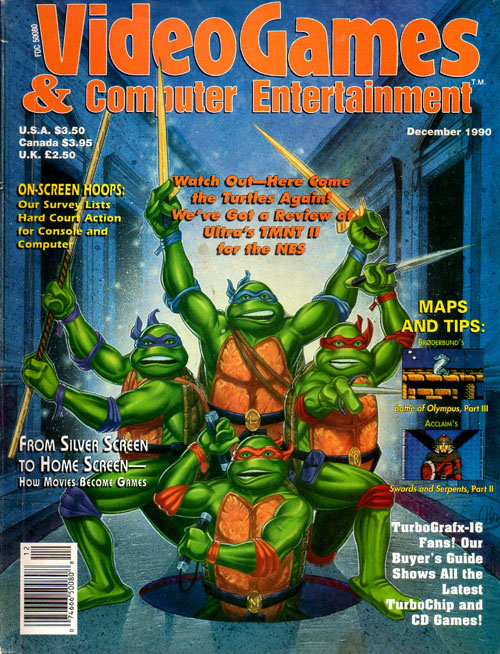
VIDEOGAMES & COMPUTER
ENTERTAINMENT (December 1990)
With their goofy expressions and more pronounced muscles, this cover is bound to be the most controversial. Fans of the magazine will already recognize the patented look, but to others the slightly realistic Turtles may be a bit jarring. And even though they look like they just had a stroke, I can't help but love their celebratory stance. I also appreciate that they incorporated the city streets. Some will hate it, but I love this VG&CE cover.
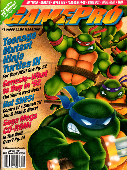
GAMEPRO (February 1992)
Two years after their first Teenage Mutant Ninja Turtles cover, GamePro is back with a very similar design. Here we see all four turtles leaping into action, each clutching their weapon of choice. Sadly, Michelangelo's nunchucks have been toned down and we can only see the bottom half of Raphael green body. Speaking of which, why are the turtles so much darker when compared to the July 1990 cover? Can turtles tan?

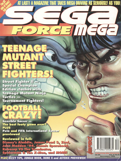
SEGA FORCE MEGA #6
Okay, so it's not exactly Street Fighter vs. Mortal Kombat, but I wouldn't mind seeing a match-up between Ryu and Leonardo. It's hard to tell if the artist is bad at making turtle faces or if it's an ode to Picasso. Either way, the effect is unsettling. And on the subject of effects, there's a weird blur that makes it look like Ryu's face is melting off, almost as if he's a Batman villain or fire survivor. I would like to see this fight play out, but maybe not with this art style.
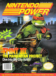
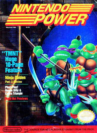
NINTENDO POWER #33
The Teenage Mutant Ninja Turtles are four compelling characters with fun-loving personalities and a great sense of humor. Unfortunately, none of that is conveyed in this baffling Nintendo Power design. With buildings miles away, this cover makes it look like Raphael is posing in the world's largest parking lot. In the distance you can see the World Trade Center, still nine long years away from being knocked to the ground. Not even the nostalgia of the standing towers is enough to make up for this lackluster artwork.

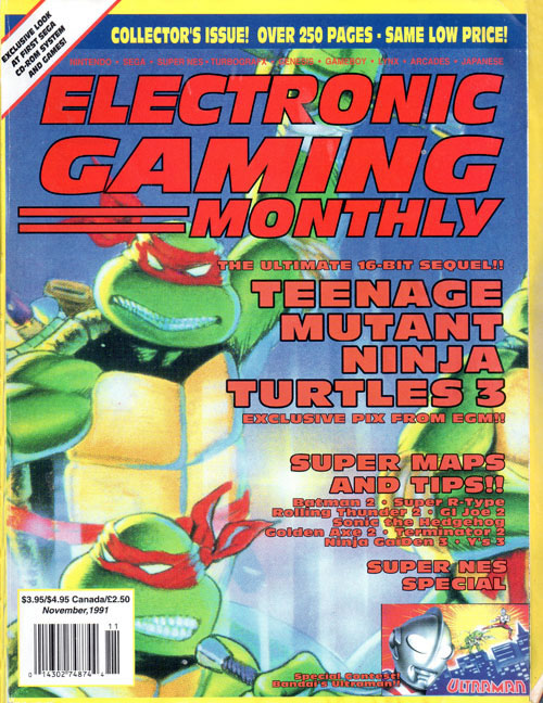
ELECTRONIC GAMING MONTHLY #28
This is another example of Electronic Gaming Monthly not even trying. While every other magazine decided to run their own Turtle-related design, EGM chose to use the box art from the Nintendo Entertainment System game. Worst of all, they zoomed in so far that they're cutting most of the turtles out of the frame. All this does is highlight one of my biggest problems with the original box art: You can't tell the Turtles apart when they all wear red masks.
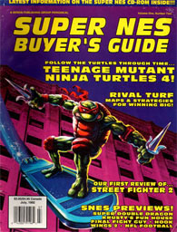
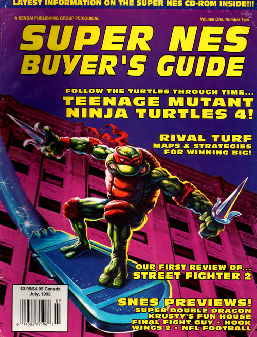
SUPER NES BUYER'S GUIDE (July 1992)
While Sega Force Mega dreamed of a Street Fighter and Teenage Mutant Ninja Turtles mash-up, this Super NES Buyer's Guide design aims a little lower. Here we see Raphael sky surfing next to glowing building from the Rival Turf box art. Perhaps it's because of the building's angle, but it certainly looks like our hero turtle is mere moments away from crashing into the ground. And trust me I've played Rival Turf, Raphael wants nothing to do with that garbage.
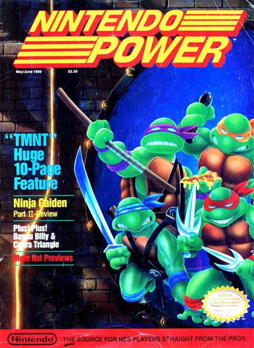
NINTENDO POWER #6
If this was the artwork for the cartoons, the Teenage Mutant Ninja Turtles would have been a giant failure. Nintendo Power's design was drawn by somebody who has no business creating Teenage Mutant Ninja Turtle art. The designs are ugly and Donatello's blank expression freaks me out. Worst of all, they're not doing anything particularly interesting. In fact, the most interesting part of the design is the out-of-place pizza slice. It's disappointing that this is the best Nintendo Power could come up with.
THE WORST:
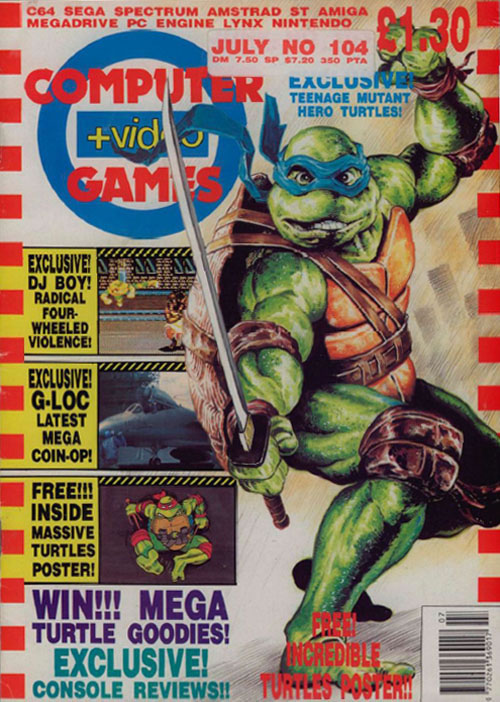
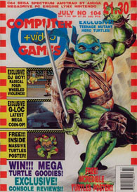
COMPUTERS & VIDEOGAMES #104
Leave it to the Brits to turn something as adorable as the Teenage Mutant Ninja Turtles into a disfigured freak. Look, I get it, Leonardo is a turtle that was mutated thanks to a bunch of goo; by definitely he's already a freak. But this CVG design looks like something out of The Toxic Avenger. The realistic approach makes me face the harsh reality of what a mutant turtle would look like if they actually existed, and it's not a pretty sight. Oh Leonardo, look what they've done to you.
Disagree?
Wait a second ... you think we got something wrong? What was your favorite Teenage Mutant Ninja Turtles magazine design and why? Let us know!